Skip to content
Art Deco furniture already commands attention with its bold curves and glossy wood. Yet bland beige walls often mute that vintage magic. Rich jewel tones solve that problem fast. I swapped my safe gray paint for deep teal last spring, and my 1930s vanity suddenly looked like a million bucks. Ready to give your favorite pieces the spotlight they deserve?
Start With Emerald Velvet Seating
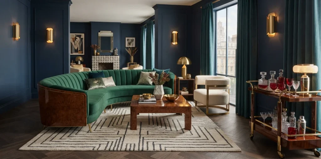
Nothing beats emerald green velvet on a scalloped Art Deco armchair or a curved channel-tufted sofa.
Deep forest and emerald shades naturally spotlight warm burl wood, walnut veneers, and brushed gold legs. Have you ever noticed how flat gray fabric makes antique wood look muddy? Emerald does the exact opposite by bringing out every warm honey undertone in the grain. Skip stiff linen upholstery if you want authentic Jazz Age drama; plush cotton velvet catches ambient room light and gives your vintage frame instant depth. Plus, dark green hides minor coffee spills way better than cream bouclé, IMO. 💎

Layer Sapphire Blue on Walls and Rugs
Feeling brave with a paintbrush? Coat your dining room walls in inky sapphire blue.
Last autumn, I finally painted my cramped breakfast nook deep sapphire behind a vintage waterfall sideboard. Guests stopped asking why the room felt small and started asking where I found the furniture.
A useful little gift for your home
🎁 Free Plant Finder Tool
Filter 250+ houseplants by 6 smart criteria to find your perfect green companion.
We’ll email you the link. Plus, you’ll join our newsletter!
Dark blue recedes visually, which makes crisp geometric silhouettes and chrome hardware pop forward like museum pieces. If you rent, drop that same hue onto the floor instead.
Anchor the seating zone with a Persian-style or geometric sapphire rug so your walnut coffee table never floats in beige limbo.

Pair Rich Burgundy With Warm Brass Accents
Nothing beats deep oxblood or burgundy when you want moody sophistication without turning your home into a gothic dungeon. Paint a recessed bookcase burgundy behind brass-inlaid cabinets, or toss wine-red velvet pillows onto a sleek cognac leather club chair. FYI, burgundy acts almost like a warm neutral next to aged brass and dark mahogany, whereas neon red just screams tacky diner booth. Keep the finish matte on walls so your glossy lacquer furniture steals all the reflections. If you love cocktail-hour elegance, check out these rich burgundy and brass home bar ideas for even more inspiration.

Balance Moody Palettes With Crisp Light
Wait—do dark jewel tones automatically shrink a room? Only if you forget to give the eye a place to breathe.
Pair moody teal, emerald, or plum backdrops with creamy travertine, alabaster lamps, and beveled Deco mirrors. Reflective surfaces bounce natural daylight around the room and keep heavy geometric casegoods from feeling clunky or oppressive in smaller apartments.
I always mix warm ivory curtains or pale plaster accents into saturated spaces so the room feels intentional rather than gloomy. Explore how to balance dark living room colors with light before picking your final paint swatch.

Try Amethyst Purple for Subtle Drama
People rarely pick purple because they picture loud 1990s teenage bedrooms, right? Forget lilac and look at dusty amethyst or deep plum instead. These complex, wine-kissed purples bridge the gap between warm wood tones and cool chrome details on 1930s vanity tables and bar stools.
Skip painting four walls purple unless you genuinely own a velvet cape. Instead, introduce amethyst through Murano-style art glass, plush lumbar pillows, or a tufted vanity bench. Plum velvet sitting against honey-toned oak creates an unexpected, high-fashion tension that feels fresh without trying too hard.

Spotlight Citrine and Mustard Accents
Every dark jewel-toned room needs a wake-up call, and warm citrine or mustard gold delivers that spark instantly. Think of citrine as the sunny cousin that actually knows how to dress up for dinner. Drape an ochre silk throw across a charcoal Deco daybed, or swap plain white drum shades for warm amber-gold linen on your vintage brass sconces. Citrine pulls golden highlights straight out of mahogany and rosewood veneers, whereas neon yellow just makes vintage wood look dated and cheap. One or two saffron accents easily energize an entire moody corner.

Mix Luxurious Textures Like Silk and Lacquer
Color alone falls flat if every single surface in your room shares the exact same matte finish. Texture makes jewel tones sing.
Art Deco design thrives on high-contrast materials working side by side. Try these effortless pairings to give flat colors real dimension:
- High-gloss lacquer + raw silk: Slick cabinets sharpen soft, light-catching silk pillows.
- Fluted wood + mohair velvet: Ribbed timber echoes plush, deep sapphire upholstery.
- Smoked glass + brushed brass: Tinted glass softens bright metal for a sultry evening glow.
Mix at least three textures per room so your eye always catches something rich and tactile.

Frame Your Pieces With Jewel-Toned Drapery
Do your windows still wear flimsy builder-grade blinds right next to a gorgeous 1930s credenza? Floor-to-ceiling jewel-toned curtains fix that mismatch overnight. Hang heavy teal, garnet, or deep peacock velvet drapes high above the window frame to stretch your ceiling height.
Thick drapery softens all the crisp geometric angles that define Art Deco casegoods. Plus, lush fabric folds absorb echo in rooms packed with wood, glass, and marble—your neighbors will thank you too. Just let the hem kiss the floor instead of pooling into a dusty puddle that traps pet hair.

Curate Glassware and Art Deco Decor
Not ready to reupholster a sofa or repaint a wall? Jewel-toned tabletop accents let you test bold color for the price of a nice dinner.
Style these compact treasures on glossy consoles and mantels:
- Jade glass vases: Translucent green glows against dark walnut.
- Cobalt decanters: Deep blue sharpens chrome barware effortlessly.
- Ruby enamel boxes: Glossy crimson hides clutter in plain sight.
Group objects in odd numbers and vary their heights so your sideboard looks like an authentic collection rather than a crowded gift shop shelf. ✨ Swap pieces seasonally if you crave fresh energy without buying new furniture.

Avoid Common Color Clashes in Small Rooms
Throwing emerald, ruby, amethyst, and sapphire into one tiny room sounds magical until it looks like an exploded craft store. Follow the 60-30-10 rule instead: dedicate sixty percent to a calm neutral backdrop, thirty percent to one primary jewel tone, and ten percent to brass or a secondary gem shade.
Compare an overstuffed rainbow lounge to a disciplined two-tone palette. When you limit bold color to one star hue—say emerald velvet—plus warm wood and brass, every curved Art Deco arm and stepped molding reads with razor-sharp clarity. Restraint always looks richer than chaos.

A useful little gift for your home
🎁 Free Plant Finder Tool
Filter 250+ houseplants by 6 smart criteria to find your perfect green companion.
We’ll email you the link. Plus, you’ll join our newsletter!
Conclusion
Rich jewel tones turn standard Art Deco pieces into total showstoppers without requiring a full renovation. Pick one bold shade like emerald, sapphire, or burgundy, balance it with warm brass, and keep plenty of light flowing around your silhouettes. Which gemstone shade are you testing first in your home? Let me know in the comments!