Picking a color palette for your outdoor wedding shouldn’t feel like a high-stakes math exam. I’ve seen too many friends lose sleep over whether sage green fights with the actual grass! You want a vibe that looks effortless, not like a box of crayons exploded in a field. Let’s nail down a scheme that makes your venue shine and your photos pop without the stress.
The Venue’s Natural Canvas
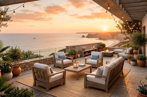
Imagine standing in a sun-drenched vineyard where the rows of grapes perfectly frame your aisle. You can’t just slap any neon pink on that landscape without hurting someone’s eyes, right? I always tell couples to treat the venue like the primary character in their story. Mother Nature already did the heavy lifting with her greens, browns, and blues, so why fight her?
You really want your palette to shake hands with the environment, not start a fistfight. If you’ve picked a beach, lean into those sandy beiges and seafoam greens. Forest weddings practically beg for deep emeralds and woodsy neutrals. Trust me, your photographer will thank you when the background doesn’t compete with your dress for attention. 🥂

The Magic of Color Theory
Ever wondered why some weddings just look ‘right’ the moment you walk in? It usually boils down to the color wheel, even if the couple didn’t realize it. I love using analogous colors—those sitting next to each other on the wheel—because they create an incredibly soothing vibe. Think of shades of sunset like dusty rose, peach, and copper. They blend into each other like a dream and keep things feeling sophisticated rather than chaotic. FYI, this approach works wonders for creating a high-end look on a budget. 🎨

Lighting Changes Everything
Lighting is the ultimate wildcard for outdoor weddings. That perfect shade of periwinkle might look like a sad grey if a cloud rolls in, or turn neon under the midday sun. I suggest checking your fabric swatches at different times of the day to see how they react. You want colors that hold their own when the sun starts its disappearing act.
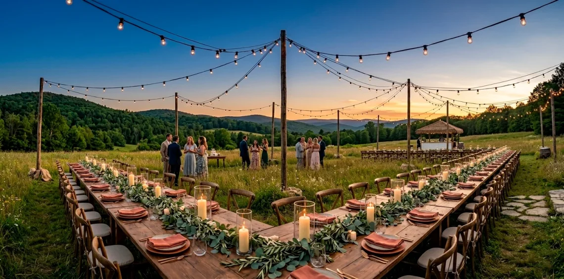
Have you considered how your palette will look during the transition to evening? Golden hour turns everything into a warm, glowing masterpiece, so lean into those tones. Deep berries and rich golds absolutely sing when the sun hits the horizon.
Don’t let the shadows catch you off guard. Darker colors can disappear into the trees once the sun goes down, so keep your accent colors bright enough to be seen. You can find more inspiration for this specific vibe in this guide to golden hour inspired fall decor ideas.

Seasonal Sensibilities
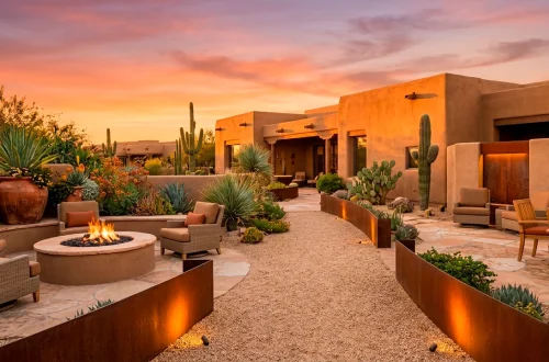
Picking colors that match the season isn’t just a tradition; it’s a practical move. If you choose heavy velvet burgundy for a July wedding in the desert, your guests will sweat just looking at the decor. IMO, spring calls for those airy, breathable pastels that mimic new blooms. Think lilacs and soft mints that feel as fresh as a cool breeze.
When autumn rolls around, you can finally bring out the ‘moody’ vibes without it feeling forced. I’m a huge fan of burnt orange paired with charcoal grey for a modern outdoor look. It feels grounded and cozy, perfect for when the air gets a little crisp. If you’re leaning toward the softer side of things, check out this 15 lavender wedding pastel aesthetic guide.

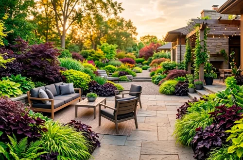
Texture as a Color
Colors aren’t just pigments; they are the materials you touch and feel throughout the day. I find that a flat grey looks boring, but a weathered slate stone adds immediate depth to your table settings. You should treat textures as your ‘secret’ colors that ground the more vibrant hues in your palette.
Design elements to consider:
- Weathered cedar wood planks
- Crinkled silk ribbons
- Matte ceramic plates
- Brushed brass cutlery
Mixing these tactile finishes keeps the eyes moving and prevents your wedding from looking like a staged furniture showroom. IMO, the contrast between a soft linen napkin and a heavy wood table creates a much more expensive vibe than matching everything perfectly.
You should also think about the ground beneath your feet. A jute rug can introduce a sandy neutral that anchors your brighter floral arrangements. It’s all about building layers that feel intentional and organic. 🌿

The Rule of Three
I see people get overwhelmed trying to balance ten different colors, but keep it simple! I suggest picking one primary color, one secondary shade, and one ‘pop’ for accents. This 60-30-10 rule keeps the visual weight balanced so nothing feels cluttered. Your primary color usually covers the big stuff like linens, while the secondary color shows up in the flowers.
That final ten percent is where you get to have some fun with your personality. Maybe it’s a bold metallic or a surprising neon thread in your signage. It’s that little ‘wink’ to your guests that says you didn’t just copy a Pinterest board exactly. Does your current plan feel balanced, or are the colors fighting for the spotlight?

Don’t Forget the Neutrals
Neutrals are the unsung heroes of every great outdoor wedding. Without them, your bold colors will just vibrate against the green grass in a way that’s actually painful to look at. I love using shades of oatmeal, sand, or even a soft ‘greige’ to act as a buffer. They provide a place for the eye to rest between all the gorgeous floral moments. Think of them as the stage that allows your main colors to perform. 🥂

Flower Power Integration
Flowers are usually the biggest source of color at any wedding, so they need to be in the loop! I’ve seen brides pick a color scheme and then choose flowers that completely clash because they didn’t check what was in season. You should talk to your florist about ‘muddy’ or ‘antique’ versions of your colors to make them feel more natural outdoors.
Instead of a flat bright red, maybe look for a deep burgundy with chocolate undertones. It adds a level of sophistication that screams ‘I have great taste’ without you having to say a word.
Remember that greenery is a color too! From the silvery tones of eucalyptus to the waxy deep green of lemon leaves, your foliage choices can shift the entire mood of your palette. Are you going for a tropical vibe or something more English garden?

Weatherproofing Your Palette
Let’s be real: sometimes the weather doesn’t get the memo about your ‘perfect’ day. If you’re worried about a grey, overcast sky, avoid choosing colors that turn ‘muddy’ in low light. I find that warm tones like mustard yellow or coral keep the energy up even if the sun stays hidden. They act like a little bit of artificial sunshine for your guests.
You should also consider the wind if you’re using lots of light fabrics in your color story. A pale blue ribbon looks beautiful, but it can get lost against a grey sky if it’s whipping around too much. Heavier, saturated tones tend to look more intentional when the weather gets a bit moody.

Photography Considerations
At the end of the day, your photos are what live on, so choose colors that play well with a camera lens. I’ve noticed that extreme neons or very high-contrast whites can sometimes ‘blow out’ in digital photos, losing all their detail. I always recommend slightly muted versions of your favorite hues for the best photographic results. This keeps your skin tones looking natural and ensures your decor doesn’t look like a glowing alien artifact in your wedding album. IMO, a timeless look always beats a trendy one! 📸

Conclusion
Your wedding day deserves a palette that feels as natural as your love story. Don’t overthink every tiny swatch; trust your gut and lean into the beauty of your surroundings. Which of these combos are you leaning toward for your big day? Let me know in the comments! I honestly can’t wait to hear how you’ll make the great outdoors look even better. Now, go grab some swatches and start playing!