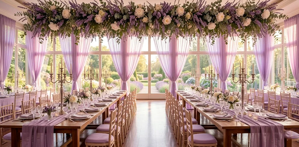
You’ve finally picked lavender as your primary wedding hue, but now you’re staring at a mood board that looks dangerously like a grandma’s guest room. How do we fix that? I’ve spent way too many hours scrolling through bridal galleries to know that lavender needs a supporting cast of soft pastels to truly sing. We want ‘ethereal woodland fairy’ vibes, not ‘scented candle aisle’ energy. Let’s look at fifteen pastel accents that will transform your lavender aesthetic into a sophisticated masterpiece that your guests won’t stop talking about. 💍
Dusty Lilac Base Layers
I always tell my friends that the secret to a high-end look lies in the subtle shift of tones. Dusty lilac acts as the sophisticated older sister to standard lavender. It carries a gray undertone that keeps the whole scene grounded. Have you ever noticed how bright purple can sometimes look a bit… cheap? By choosing dusty lilac for your heavy-hitting fabrics like table linens or bridesmaid dresses, you create a muted canvas that allows other colors to pop. I personally used this for my cousin’s garden party, and the way it caught the sunset light was honestly a core memory for everyone there.
Essential linen items:
- 120-inch round dusty lilac tablecloths
- Stonewashed linen napkins in muted purple
- Sheer chiffon table runners in smoke lilac

Muted Sage Green Foliage
Why fight against nature when nature already gave us the perfect partner? Sage green provides the organic contrast that every lavender wedding desperately needs. It mimics the stems of the lavender plant itself, which makes the whole palette feel incredibly cohesive.
I’m not just talking about the leaves in your bouquet. Think about incorporating sage through velvet ribbons or even the stationery. It breaks up the sea of purple without being loud or obnoxious. Don’t you think a pop of green makes everything look fresher?
IMO, if you skip the sage, you’re missing out on that effortless garden-party charm that everyone is chasing right now. It adds a breath of fresh air to an otherwise dense color scheme.

Warm Peach Fuzz Accents
If the lavender and sage feel a bit too ‘cool’ for your taste, you need to invite peach fuzz to the party. This warm, citrusy pastel acts like a tiny shot of sunshine. It warms up the purple and prevents the venue from feeling cold or sterile.
You can easily tuck peach-colored ranunculus into your centerpieces or use peach-tinted glassware. It creates a sunset-inspired glow that looks incredible in photos. Just remember to keep the peach ‘soft’—we are going for a gentle whisper of color, not a neon sign.

Buttercream Yellow Lighting
I’m going to be a bit picky here: stark white light ruins everything. If you want that dreamy lavender glow, you must embrace buttercream yellow.
Think about your candles and your overhead bulbs. A soft, buttery yellow light filters through lavender drapes and turns the whole room into a literal fairy tale. I once attended a wedding where they used cool-toned LEDs, and I promise you, everyone looked like they were in a hospital waiting room. No one wants that.
Essential lighting elements:
- Beeswax taper candles in ivory yellow
- Warm white fairy lights with gold wire
- Buttercream tinted parchment lamp shades

Soft Sky Blue Ribbons
Adding a touch of sky blue creates a ‘something blue’ moment that feels totally integrated. It’s a classic pairing that reminds me of a clear spring morning.
I love seeing thin blue ribbons trailing from a bouquet of lavender and white roses. It adds movement and a touch of whimsy that stops the look from being too stiff. Ever wondered how to make a bouquet look more expensive? It’s all in the ribbon trails.

Rose Water Pink Textures
Rose water pink is basically the ultimate wingman for lavender. It’s romantic, soft, and adds a layer of femininity that isn’t too ‘saccharine sweet.’ I find that using pink in textured ways—like velvet chair cushions or crinkled silk—works best. It prevents the wedding from looking like a baby shower, which is a common fear for pastel lovers. For those looking to see how pastels can be used in other areas of the home, you might enjoy these pastel goth bedroom decor ideas.

Mint Cream Glassware
Mint cream is the cooler, more sophisticated cousin of mint green. It’s so pale it almost looks white, but it has enough ‘kick’ to stand out against a lavender plate.
I’m obsessed with vintage-style mint glassware. It feels nostalgic and fresh at the same time. Plus, it’s a great way to introduce a second ‘cool’ tone that isn’t just more purple.
Don’t you think it’s time we moved past standard clear glass? Adding a hint of color to the table settings instantly elevates the design from basic to ‘Pinterest-worthy’ in seconds.

Pale Apricot Florals
While peach fuzz is light and airy, pale apricot has a bit more depth. It’s a fantastic choice for focal flowers like garden roses or dahlias.
I’ve seen this used in ‘ombre’ style centerpieces where the colors transition from deep lavender to pale apricot. It looks like a painting come to life. If you’re worried about the lavender looking too monochromatic, this is your solution. It breaks the visual monotony while staying firmly within the ‘dreamy’ category.

Mauve Mist Velvet
Mauve mist is that gorgeous, moody color that sits right between pink and purple. Using it in velvet form adds a ‘weight’ to the decor that sheer fabrics lack.
I suggest using mauve mist for things guests will touch, like chair wraps or even the groom’s tie. FYI, velvet absorbs light differently than silk, which creates a rich, matte look in your professional wedding photos. It feels expensive and deliberate.
If you love playing with rich textures like this, you should definitely check out these cozy velvet wedding decor ideas for even more inspiration.

Periwinkle Paper Goods
Periwinkle is the ‘bridge’ color. It’s blue enough to be interesting but purple enough to stay on theme. I love using periwinkle for the smaller details like place cards or menu prints.
It’s a bold choice that shows you aren’t afraid of a little color saturation. Do you want your guests to remember the tiny details? Periwinkle cardstock with white ink calligraphy is a guaranteed way to make your paper goods stand out. It’s punchy but still maintains that soft, pastel integrity we are going for.

Champagne Gold Metallics
Let’s be honest: every wedding needs a little shine. Champagne gold is the only metallic I’d recommend for a lavender theme. Silver can feel too cold, and copper can feel too ‘industrial.’ Champagne gold is soft, sparkling, and perfectly mimics the bubbles in your toast. Use it for your cutlery, the rims of your plates, or even the lettering on your welcome sign. It adds that ‘luxury’ finish that makes the lavender feel like it belongs in a ballroom. It’s the ultimate finishing touch that ties the pastels together.

Cool Gray Stone Accents
This might sound weird, but bear with me. Cool gray stone—think marble or slate—provides a beautiful, architectural contrast to soft lavender petals.
I love using gray marble coasters or even stone-textured vases. It brings an earthy, grounded element to an otherwise ‘fluffy’ aesthetic.
Does your venue have stone walls or floors? Lean into it! Gray is a neutral that doesn’t compete with lavender; it simply holds space for it to shine. It’s the perfect way to add a bit of ‘modern edge’ to your romantic day without ruining the vibe.

Creamy Ivory Foundations
You can’t have a wedding without a solid foundation of ivory. Pure white can be too harsh against lavender, making the purple look darker than it actually is. Creamy ivory, however, softens the blow.
I recommend ivory for your large-scale items like tent draping or the aisle runner. It provides a warm, clean background that lets your lavender accents take center stage. It’s the unsung hero of the pastel world, honestly. Without ivory, the whole palette would feel a little unmoored.

Wisteria Purple Draping
Wisteria purple is slightly more saturated than lavender, and it works wonders for overhead decor. Imagine long trails of wisteria hanging from the ceiling or a pergola.
It adds a vertical dimension to your decor that makes the space feel larger and more immersive. I’ve noticed that when people only decorate the tables, the room feels ’empty.’ By pulling that wisteria purple upwards, you create a 360-degree experience.
Recommended hanging items:
- Artificial wisteria vine garlands
- Purple silk hanging lanterns
- Wisteria watercolor fabric banners
It’s a bold move, but if you want that ‘secret garden’ feeling, this is how you get it. Just make sure the installers secure them properly—no one wants a face full of silk flowers during the first dance!

Seafoam Pearl Details
Finally, we have seafoam pearl. This isn’t quite green and isn’t quite blue; it’s a shimmering, iridescent pastel that adds a touch of magic. Think about using this for your jewelry or even the buttons on a bridal gown. It’s a very subtle way to introduce a final layer of color that feels totally unique.
If you want to keep the pastel vibes going even after the wedding, you might want to look at these pastel entryway ideas to refresh your home. It’s a great way to bring that ‘wedding day’ joy into your everyday life.
Which of these pastels are you most excited to mix with your lavender? Let me know which combo stole your heart!

Conclusion
Creating a lavender wedding aesthetic is all about balance and avoiding the ‘monocolor’ trap. By mixing in these fifteen soft pastels, you’ve built a palette that is complex, romantic, and totally modern. From the warmth of peach fuzz to the grounding presence of sage green, your wedding will look like a curated work of art. Now that the hard part is over, which pastel are you grabbing first? Let me know in the comments, and good luck with the rest of your planning—you’ve totally got this! Just don’t forget to stop and smell the actual lavender once in a while.