Skip to content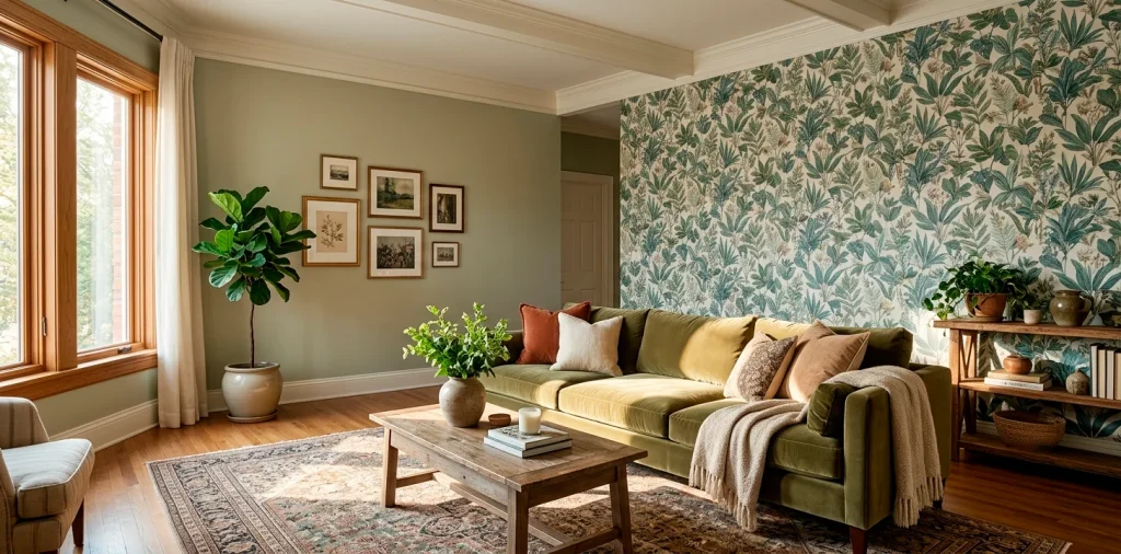
Ready to transform your boring walls into a visual masterpiece? Coordinating wallpaper and paint feels intimidating, but I promise it is totally doable. I completely ruined my first dining room by winging it, so I learned the hard way! Let’s ditch the guesswork and nail your perfect wall combo right out of the gate.
Understanding the Color Wheel Basics
Ever wonder why some rooms just look right? They usually follow basic color theory. You need to grasp the color wheel before slapping anything on your walls. Complementary colors create vibrant contrast, while analogous colors offer a serene vibe.
I love using an analogous scheme for bedrooms. It keeps things calm. 🎨 Don’t stress about memorizing every shade, just keep a basic wheel handy on your phone while shopping.

Matching Paint to Wallpaper (Not the Other Way Around)
Here is the ultimate golden rule: always pick your wallpaper first. Why? Because paint comes in literally thousands of tintable shades, but wallpaper designs are finite. You can effortlessly custom-mix a paint color to match a quirky floral leaf, but finding a wallpaper to match a highly specific custom eggshell blue paint? Nightmare fuel. Save yourself the migraine and start with the paper.
A useful little gift for your home
🎁 Free Plant Finder Tool
Filter 250+ houseplants by style, size, and care level to find your perfect green companion in seconds.
We’ll email you the link. Plus, you’ll join our newsletter for fresh home inspiration.

The “Pulling a Color” Trick
Want my absolute favorite designer secret? It involves pulling a secondary color right out of your wallpaper.
Look closely at your chosen pattern. Ignore the dominant background color and hunt for the sneaky accent shades hiding in the details.
Identify that subtle terra-cotta vein or muted olive stem. Take that exact accent color and use it as your wall paint.
This technique instantly grounds the room and makes the wallpaper pop effortlessly. It makes you look like an absolute design genius, IMO.

Playing with Patterns and Solids
Balance is everything when mixing intense patterns with solid walls. If you choose a loud, chaotic wallpaper, pair it with a very calm, muted solid paint. A busy room desperately needs a place for your eyes to rest. Conversely, if your wallpaper features a quiet, minimalist texture, you can absolutely get away with a much bolder, punchy paint choice to inject some life into the space.

Neutral Walls with Bold Paper
Neutral paint works magic alongside wild wallpaper designs. It acts as a grounding force.
Design elements list:
- Crisp white for high contrast
- Warm taupe for subtle harmony
- Soft gray for modern edge
I recently paired a crazy tropical monkey print with a soft cream paint, and the result blew my mind. The neutrals let the bold paper do all the heavy lifting without overwhelming the room.

Creating Drama with Dark Pairings
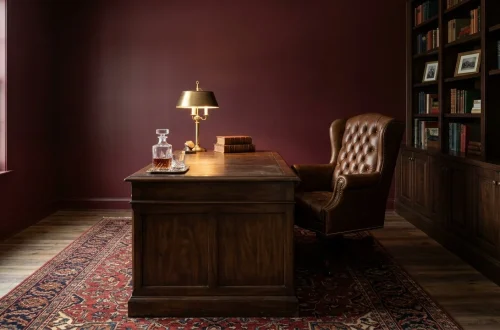
Feeling a little adventurous? Pair dark, moody wallpaper with an equally dark paint color. This creates an incredibly cozy, jewel-box effect that wraps around you like a warm hug.
Imagine an emerald green botanical paper matched with deep charcoal wainscoting. The sheer drama elevates any boring space into a stunning retreat. Speaking of dramatic spaces, check out these dark dramatic laundry room wallpaper trends.

Testing Swatches Like a Pro
Never, ever skip the swatch phase. I cannot emphasize this enough!
Buy actual samples of your top three wallpapers and a few small paint testers.
Tape them all to the same wall you plan to cover. Leave them up for at least three days.
You must observe how the shifting sunlight changes the hues from morning coffee time to midnight snacking. Colors trick your eyes constantly. 😉

Considering the Room’s Lighting
Natural light drastically alters how your paint and wallpaper interact. A northern-facing room pulls cool, blue tones out of everything, making grays look icy. To combat this, you need warm undertones in both your paper and your paint. Meanwhile, southern-facing rooms bathe in warm, golden light all day, allowing you to easily pull off cooler, moodier palettes. Always test your pairings in the actual room’s lighting.

Accent Walls vs. Full Room Coverage
Deciding between one accent wall or wrapping the entire room changes your coordination strategy entirely.
Accent walls demand a higher contrast between the paper and the surrounding painted walls to truly stand out.
Wrapping a whole room in wallpaper? You only need to coordinate the trim, doors, and ceiling paint. For these spaces, I usually match the trim paint directly to the background color of the wallpaper to create a seamless, built-in look.

A useful little gift for your home
🎁 Free Plant Finder Tool
Filter 250+ houseplants by style, size, and care level to find your perfect green companion in seconds.
We’ll email you the link. Plus, you’ll join our newsletter for fresh home inspiration.
Conclusion
Mastering wallpaper and paint coordination just takes a little patience and a lot of swatching. You now possess the exact tricks needed to tackle your walls with confidence. Stop stalling, grab those samples, and start transforming your space! Which room are you giving a makeover first? Let me know in the comments!