Your balcony currently looks like a graveyard for dead plants and dusty folding chairs, right? I get it; urban living usually leaves us with a gray concrete slab and zero inspiration. But we can fix that with a little paint and some soft hues. I honestly think pastel palettes offer the easiest way to make a tiny space feel like a high-end retreat. Ready to finally outshine your neighbor’s boring patio setup? Let’s turn that balcony into a vibe.
Lavender and Sage Green
I love how lavender and sage green play off each other like a dream. This combination mimics a Mediterranean garden even if your view is just a brick wall. Why settle for boring neutrals when you can have a space that actually breathes? Sage green anchors the floor with earthy vibes while lavender pops on the furniture.
I personally found that adding a few lavender-colored cushions to a sage metal chair completely changes the mood. It feels fresh, intentional, and surprisingly sophisticated. FYI, these colors also hide a bit of city dust better than pure white! 🌿

Mint and Peach Punch
Imagine a refreshing sorbet on a hot July afternoon. That’s exactly what mint and peach bring to your balcony. I think this duo works perfectly for people who want energy without the eye-searing brightness of neon colors. You can use a mint green outdoor rug to define the area and then toss peach-colored throws over your seating. Does your balcony feel too small for this? Light pastels actually make tight corners feel more expansive because they reflect so much light. Stick to one dominant color and use the other for small accents like mugs or plant markers to keep it cohesive.

Dusty Rose and Slate Blue
Are you looking for something a bit more grown-up? Dusty rose and slate blue provide a moody yet soft aesthetic that screams ‘I have my life together.’ I find this palette works best when you want a transition from day to night. The blue grounds the space, preventing the pink from looking like a toddler’s playroom.
I suggest using slate blue for your larger items. Think about a blue outdoor bench or a set of navy-adjacent privacy screens. Then, sprinkle in dusty rose through plant pots or a weather-resistant tablecloth. It creates a serene environment for reading or scrolling through your phone in peace.
If you want to maximize this calm atmosphere, check out this small balcony reading nook design guide.

Lemon Sorbet and Pale Grey
Grey is the ultimate safety net for apartment dwellers, but it can get depressing. I recommend injecting some life into those grey floors with a splash of lemon sorbet. It’s like an instant hit of sunshine, even if you live in a city that’s perpetually cloudy.
Start with your existing grey balcony floor or walls. I love adding lemon-yellow folding chairs because you can tuck them away when the rain starts. It’s a practical way to stay bright.
Don’t overdo the yellow, though. You don’t want your balcony to look like a giant lemon. Keep the yellow to about thirty percent of the space.
Balance the look with some grey-toned planters or a charcoal outdoor lamp. This keeps the aesthetic sharp and modern rather than overly sweet.

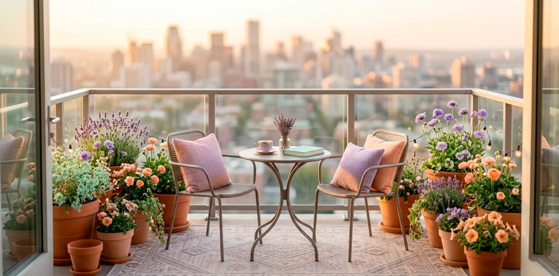
Sky Blue and Buttery Cream
Do you want to feel like you’re sitting inside a cloud? Sky blue and buttery cream create the ultimate airy escape. I find this combination particularly effective for balconies with glass railings. The blue blends into the sky, making the boundary between your home and the horizon vanish.
Use cream-colored furniture to maintain a high-end, clean look. I usually avoid pure white outdoors because it shows every single speck of dirt. Cream is much more forgiving! Add sky-blue cushions or a striped outdoor rug to pull the ‘airy’ theme together. It’s simple, classic, and incredibly relaxing after a long day at work.

Lilac and Terracotta
This might sound like a weird pair, but hear me out. The cool tones of lilac beautifully balance the warm, earthy vibes of terracotta. I think it creates a very ‘artisan’ look that feels curated rather than bought from a big-box store. Use standard orange-toned terracotta pots and fill them with lilac flowers or purple fountain grass. This naturally introduces the color palette without requiring you to paint everything. I love how the sun hits these colors during the golden hour, making the lilac look almost iridescent against the clay. It’s an easy win for anyone who loves a bit of boho charm without the clutter.

Pistachio and Soft White
Pistachio is having a major moment right now, and I am here for it. This soft, nutty green feels incredibly fresh and modern. When you pair it with soft white, you get a ‘Japandi’ exterior vibe that feels organized and peaceful.
I suggest painting a small wooden pallet or an old crate in pistachio green to use as a vertical planter. Against a white wall or white railing, the green really pops without feeling aggressive. It’s the color of growth and new beginnings.
IMO, this is the best palette for people who have a lot of actual greenery. The pistachio decor complements the natural leaves of your plants rather than competing with them. Keep your accessories minimal to let the colors speak for themselves.

Blush Pink and Copper Accents
If you want your balcony to feel like a boutique hotel, go for blush pink and copper. Copper adds a metallic edge that keeps the pink from feeling too ‘nursery.’ I love using copper lanterns or plant stands to add a bit of shine to the space.
Blush pink works wonderfully for larger textile pieces like an outdoor rug or a privacy curtain. The copper elements catch the light throughout the day, creating a dynamic look that changes as the sun moves. It’s a chic, feminine palette that still feels sophisticated enough for a cocktail hour at home.

Seafoam and Sand
Missing the beach? We can’t bring the ocean to your fourth-floor walk-up, but we can fake the colors. Seafoam green and sandy beige create a coastal vibe that instantly lowers my heart rate. I recommend using sand-colored furniture—think light woods or beige wicker.
Then, I bring in the seafoam through smaller items. A seafoam-colored tray for your drinks or some outdoor candles can do the trick. It’s subtle and very hard to mess up.
Do you have a concrete floor? A large sand-colored outdoor rug can hide the ugly gray and provide a soft foundation for your ‘beach’ escape.
This palette feels timeless. You won’t get tired of it after one season because it’s so grounded in nature. It’s a safe yet stylish bet for any balcony size.

Periwinkle and Muted Mustard
Let’s get a little bold with periwinkle and mustard. This is for the person who wants their balcony to stand out from the street below. Periwinkle is such a unique, dreamy shade of blue-purple, and mustard provides a sharp, earthy contrast. I find that these colors work best when you use periwinkle as the base and mustard as the ‘spark.’ Think periwinkle seat cushions and a mustard yellow outdoor clock or plant pot. It’s a high-contrast look that still feels soft because both colors are slightly muted. It’s quirky, fun, and shows off your personality perfectly. ✨
If you love this soft approach, you should see these 15 pastel entryway ideas for more inspiration.

Conclusion
Transforming your balcony doesn’t require a massive renovation or a professional designer. I truly believe that picking one of these chic pastel palettes is the fastest way to turn a drab space into a personal sanctuary. Whether you go for the calm of Seafoam or the punch of Lemon, your outdoor area deserves some love. Which palette are you grabbing first? Let me know in the comments and go show those pigeons who the real boss of the balcony is!