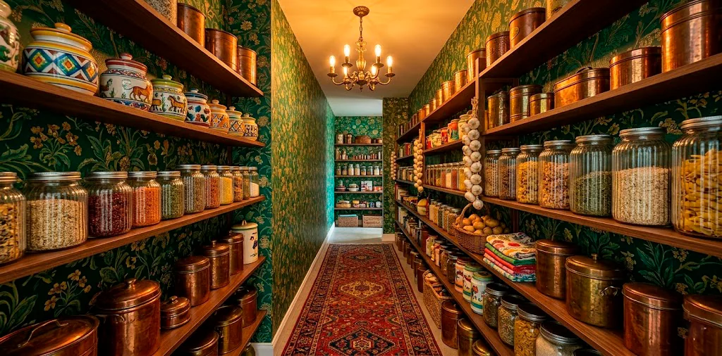
Forget those clinical, white-washed pantries that look like they belong in a hospital. We are embracing the “more is more” philosophy today! Maximalism isn’t about clutter; it is about a curated explosion of your unique personality. Why settle for boring when you can turn your cereal stash into a design statement? Let’s make your pantry the loudest room in the house.
The Foundation: Wallpaper and Backsplashes
Think wallpaper is just for the dining room? Think again. I once slapped a bold floral print behind my canned beans, and suddenly, making chili felt like a gala event. Patterns create instant depth and drama in small, enclosed spaces.
Boldly patterned peel-and-stick wallpaper acts as the perfect backdrop for your shelves. Who says stripes and florals cannot be best friends in a tight space? I love how a busy pattern hides the occasional spill while making the shelves look intentionally styled. If you want to dive deeper into this aesthetic, check out this guide on sophisticated maximalism jewel tone decor.

Clashing Containers: Glass, Ceramic, and Metal
Mixing textures is where the magic happens. Imagine the contrast of smooth, ribbed glass jars sitting next to rough, hand-carved wooden bowls. I love how matte ceramic canisters feel against glossy marble shelves. It is all about that tactile experience every time you reach for the pasta. Why would you ever want everything to feel the same? It is like a party for your hands! This variety prevents the space from looking flat or overly commercial. IMO, the more materials you use, the richer the story your pantry tells.

Labeling with Personality
Ditch those standard, tiny typewriter labels immediately.
Go big with hand-painted ceramic tags or neon acrylic labels. Does a label have to be functional? Yes. Does it have to be boring? Absolutely not.
I personally lean toward brass plates for that vintage apothecary vibe. It feels like I am storing rare potions instead of just plain white flour.
Labels serve as the jewelry for your containers. They add that final metallic or colorful pop that ties the textures together. Why use a sticker when you can use a charm? 🏷️

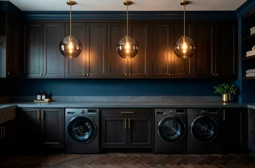
Lighting: The Jewel of the Pantry
Let’s talk about lighting because a single flickering bulb is a crime against design. A miniature brass chandelier or a colorful glass pendant light transforms the mood instantly. Who knew looking for snacks could feel so cinematic? Lighting highlights all those glorious patterns and textures you worked so hard to layer. Plus, it makes your snacks look expensive, which is a major win in my book. ✨ It creates a focal point that draws the eye upward, making the small room feel much grander than it actually is.

Woven Wonders: Baskets and Natural Fibers
Woven elements ground the wild patterns.
Rattan and seagrass baskets provide that necessary organic texture to balance out high-gloss finishes or loud wallpapers. I use them to hide the “ugly” stuff—looking at you, half-empty bags of potato chips.
Ever noticed how a bit of wicker makes everything feel more intentional? It is the unsung hero of the maximalist world. If you love this earthy vibe, you should definitely check out these 10 honey-hued rattan kitchen accents for more inspiration.

Open Shelving: Curated Chaos
Open shelving is your stage. I use lacquered floating shelves in a contrasting color to the wallpaper to make things pop. Stack your mismatched heirloom plates next to modern glass carafes. This isn’t about symmetry; it is about a visual rhythm that keeps your eyes moving.
Isn’t a little bit of “curated chaos” better than a soul-crushing row of identical plastic bins? It allows you to display your most beautiful items while keeping them within arm’s reach. I love seeing the mix of old and new together.

Flooring and Rugs: Don’t Forget the Ground
Don’t ignore the floor! A vibrant runner rug with a complex geometric pattern ties the whole room together. It adds warmth and another layer of texture underfoot. I went with a plush Moroccan rug in mine, and honestly, I spend more time standing in there now than in my actual kitchen. Is it overkill for a pantry? Maybe. Do I care? Not one bit. A rug also protects your floor from the inevitable dropped spice jar. It makes the space feel like a real room rather than a secondary utility closet.

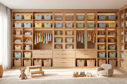
Color-Coded Chaos
Color-coding is the maximalist’s way of staying sane.
Grouping items by hue creates a rainbow effect that looks stunning against patterned backdrops.
Brightly colored metal bins are perfect for this.
Imagine a shelf of red, followed by a shelf of deep teal—it is visual candy. FYI, this makes finding the paprika a whole lot easier when you’re in a rush. It turns your inventory into an art installation. Why hide your bright packaging when you can use it to your advantage? 🌈

The Door: A Canvas for Creativity
The door is prime real estate. I painted mine a high-gloss emerald green and added a maximalist over-the-door rack for spices. It keeps the frequent flyers accessible while adding a massive pop of color to the exterior. Why leave a flat surface empty when it could be a masterpiece? It is basically free storage that looks like art. I also love adding a decorative brass knocker or a funky handle to the outside to hint at the treasures hidden within. Every inch counts!

Scent and Sound: Sensory Maximalism
Maximalism is sensory, people.
I keep a decorative reed diffuser on the top shelf to keep things smelling like a luxurious spice market.
Even a tiny Bluetooth speaker hidden behind the flour can set the mood with some jazz while you meal prep. It is about creating an experience every time you open that door. Who wouldn’t want their pantry to smell like luxury? It elevates the act of grabbing a snack into a multisensory event. Don’t just decorate for your eyes; decorate for your nose and ears too!

The Final Flourish
You don’t need a massive budget to pull off a bold, maximalist pantry. Just start with one pattern, add a funky texture, and let your personality run wild. Remember, your home should make you happy, not just look like a boring catalog page. So, are you going for a floral wallpaper or a neon label first? Let me know in the comments! 🎨