You probably see it everywhere—that sleek, skinny-legged furniture that looks like it belongs in a jazz club or a high-end architect’s office. Mid-century modern isn’t just a trend; it’s a whole vibe that celebrates clean lines and organic shapes. I personally obsessed over finding the perfect tapered leg for months! Let’s dive into how you can master these iconic silhouettes today. ✨
The Low-Slung Lounge Revolution
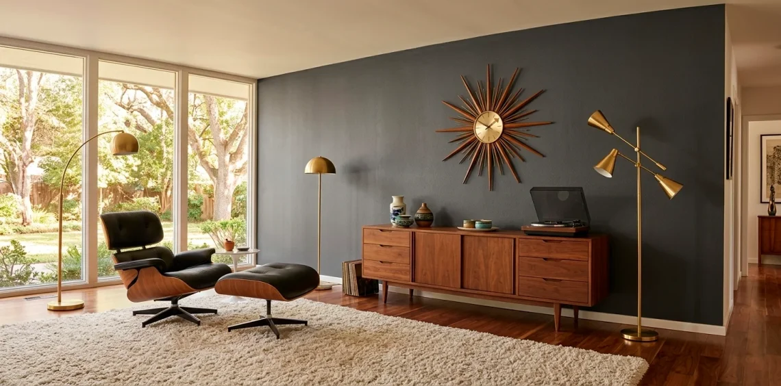
Have you noticed how modern sofas sit so close to the ground? That’s no accident! The mid-century era ditched those chunky, overstuffed Victorian couches for something much leaner and meaner. I love how a low-profile sofa makes a room feel twice as tall instantly. It creates an unbroken line across your sightline that screams sophistication without trying too hard.
When you pick your centerpiece, look for tight backs and button tufting. If the sofa looks like it could double as a sleek daybed for a stylish nap, you’ve hit the jackpot. These silhouettes emphasize horizontal planes, making your living space feel expansive and airy. Trust me, your ceiling will thank you for the extra breathing room. 😎

Legs for Days: The Tapered Silhouette
If a piece of furniture doesn’t have legs that look like toothpicks, is it even mid-century? Seriously though, these tapered ‘peg’ legs define the entire aesthetic. They lift heavy wooden cabinets off the floor, giving the illusion of weightlessness. I once bought a dresser just because the brass-capped feet looked so sharp. Ever wondered why this works so well? It’s all about the ‘visual floor space’—the more floor you see, the bigger the room feels. IMO, this is the ultimate hack for small apartments. If you want to dive deeper into this specific look, check out these 10 iconic tapered leg coffee tables for your next project.

The Organic Curve of Tulip Chairs
Designers in the 50s clearly hated right angles. They traded sharp corners for flowing, organic shapes that mimic nature. Enter the Tulip chair—the ultimate solution for ‘leg-clutter.’
Eero Saarinen basically looked at a forest of chair legs and said, ‘No thanks, I’ll take one pedestal instead.’ It’s a stroke of genius, really.
These curves add a necessary softness to the otherwise geometric world of MCM. I find that mixing these rounded silhouettes with a rectangular table creates a perfect visual balance that keeps the room from looking like a math textbook. 🎨

Lighting with Cosmic Ambition
Mid-century lighting looks like it was designed by NASA engineers on their day off. We’re talking Sputnik chandeliers and ‘flying saucer’ pendants that act as jewelry for your ceiling. These silhouettes aren’t just functional; they are full-blown art pieces.
I personally love the Sputnik because it fills a huge volume of space without feeling heavy. It’s basically a bunch of brass arms exploding from a center point—talk about a conversation starter! If you prefer something subtler, go for the George Nelson bubble lamps. They cast a soft, ethereal glow that makes everyone in the room look like they have a professional ring light following them around.

Warmth in the Wood: Teak and Walnut
Materials matter just as much as the shape.
Teak and walnut reign supreme here.
These woods offer a warm, honey-colored glow that prevents the minimalist shapes from feeling cold or sterile.
I’ve spent far too much time polishing my walnut sideboard, but that grain is basically a natural masterpiece. You want to look for matte or satin finishes rather than super shiny gloss. High gloss is for the 80s; we’re aiming for that ‘I just happen to have exquisite taste’ vibe.

The Geometric Statement of Sunbursts
Nothing says ‘I’ve mastered this aesthetic’ like a giant sunburst clock on a focal wall. It’s the ultimate silhouette of the atomic age. These clocks use radiating metal or wood spokes to create a sense of movement and energy. FYI, you don’t even need it to tell the time correctly—it’s there for the drama! I find that a sunburst mirror works just as well if you want to bounce some light around the room. It breaks up the monotony of flat walls and adds a touch of retro-futurism that somehow still feels modern today. It’s the perfect finishing touch for that empty spot above your credenza.

Small Space Silhouettes
Not all of us live in a sprawling Palm Springs villa, right? The beauty of MCM is how well it scales down. Compact armchairs with open frames keep small rooms from feeling claustrophobic.
I suggest opting for furniture with ‘exposed’ structures where you can see the wood frame surrounding the cushions. This keeps the silhouette light and architectural.
You can even apply these rules to a cozy sleeping area. Take a look at these 15 tips for a mid-century modern guest room to see how to pack style into a tiny footprint without overdoing it.

Bold Patterns and Graphic Textiles
The silhouettes don’t stop at the furniture. The patterns on your rugs and pillows should follow the same geometric logic. Think boomerangs, kidney shapes, and repeating triangles.
I usually stick to a neutral base and let one ‘loud’ rug do the heavy lifting. If you go too crazy with patterns everywhere, your house might start to feel like a funhouse—and nobody wants that. Stick to high-contrast colors like mustard yellow against charcoal or teal against burnt orange to really make those shapes pop! 🎨

The Social Silhouette: Bar Carts
Mid-century culture revolved around the cocktail hour. Naturally, the bar cart became a design staple. These silhouettes are all about mobility and shine.
I’m talking two-tiered glass shelves held together by slender brass frames.
A bar cart adds a vertical element to a room filled with low-slung furniture. Plus, it’s a great excuse to buy pretty glass decanters. Just don’t over-clutter the top shelf; keep it minimal with a few choice bottles and maybe a cheeky ice bucket. It’s functional art at its finest, and it makes you look like a pro host even if you’re just serving sparkling water. 🍸

Functional Art: The Credenza
The credenza is the unsung hero of the mid-century home.
It hides your mess while looking like a museum piece.
Look for long, lean silhouettes with sliding doors or recessed handles.
I personally love a model with a ‘floating’ look, where the main cabinet sits on a slightly recessed base. This small detail adds so much architectural depth! Use the top surface to display your best ceramics or a stack of design books. It’s the perfect balance of form and function. Which piece are you planning to hunt for first? Let me know in the comments below!

The Final Verdict
Mastering the mid-century aesthetic really comes down to choosing silhouettes that balance organic warmth with geometric precision. Whether you’re starting with a single sunburst clock or going all-in on a low-slung sofa, remember to let your space breathe. I hope this guide helps you build the retro sanctuary of your dreams! Which iconic piece is your absolute favorite? Let me know in the comments!