Ever felt like your soul belongs in a dimly lit 19th-century library, surrounded by dusty lexicons and the scent of old paper? I’ve spent years turning my living room into that very aesthetic, and honestly, nothing hits quite like a well-curated gallery wall. Ready to ditch the boring minimalist look for something with a bit more haunted intellectual energy? I’ve got you covered.
Nailing the Moody Color Palette
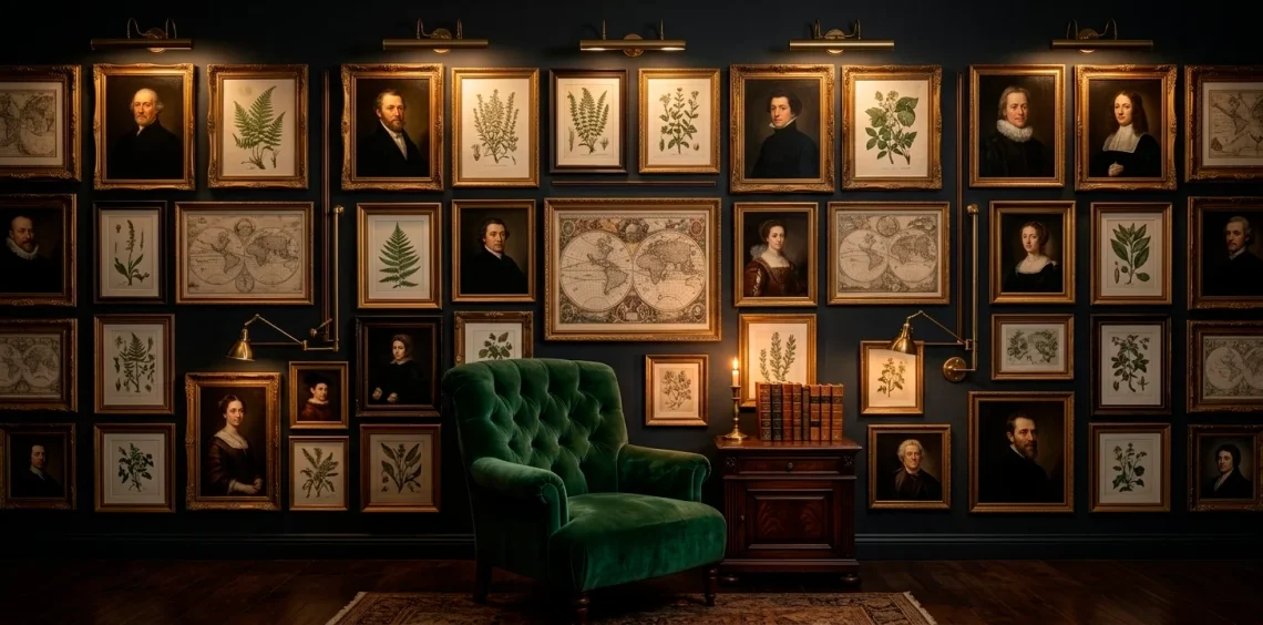
First things first: we need to talk about those wall colors. You can’t exactly channel ‘tortured poet’ vibes on a bright beige wall, right? I recommend diving into the deep end with charcoal, forest green, or a navy so dark it’s basically black. These shades act as a moody backdrop that makes your art pop in the most dramatic way possible.
Think of your wall as a canvas for your internal monologue. Is it stormy and Victorian? Or maybe a bit more mid-century scholar? Choosing the right base tone dictates the entire mood. I personally went with a matte obsidian finish, and FYI, the way the shadows dance across it at midnight is honestly chef’s kiss. 🌑

The Art of Frame Mixing
Listen, matching frames are the enemy of Dark Academia. We want history, not a big-box store catalog! Go for a chaotic but intentional mix of ornate gold, chipped wood, and maybe even some sleek black metal for contrast. I love hunting through thrift stores for those heavy, ridiculously detailed frames that look like they survived a fire in an old manor. Why settle for boring rectangles when you can find a dusty oval frame that screams ‘I have secrets’? Mix your textures and eras to create that curated-over-centuries feel we all crave. 🖼️

Choosing Your Intellectual Artifacts
Curation is where the real fun begins. You aren’t just hanging pictures; you’re telling a story. Start with the heavy hitters: oil portrait reproductions, botanical sketches, and maybe a framed piece of sheet music.
Ever thought about framing a pressed fern or an old map? These little touches add that organic, scholarly touch that separates a ‘nice’ wall from a masterpiece wall.
I once framed a set of vintage keys I found in a flea market, and they’ve become the biggest conversation starter in the room. Don’t be afraid to get weird with it!
The goal is to look like you’ve been collecting treasures while traveling through time. IMO, the more eccentric the better. Use items that feel heavy with history, even if you just bought them online last week.

Mapping Out the Strategic Chaos
You might think this aesthetic is all about random placement, but there’s a method to the madness. Before you start putting holes in your wall, lay everything out on the floor. I usually start with the largest ‘anchor’ piece and build outwards, keeping the gaps between frames uneven but balanced. Do you want a tight, structured grid or a sprawling, organic explosion of art? Personally, I prefer the sprawl. It feels more lived-in and authentic, like a scholar who simply ran out of desk space and started pinning their inspirations directly to the studs.

Lighting for High Drama
What’s a dark academic room without some moody lighting? Overhead lights are basically a crime in this house. I suggest using brass picture lights or small, adjustable spotlights to highlight your favorite pieces. It creates these gorgeous pools of light and deep shadows that make the art look almost three-dimensional.
Ever noticed how a single light source can make a room feel ten times more mysterious? Pair your gallery wall with a flickering candle or a vintage desk lamp nearby to really sell the vibe.
If you’re feeling extra, you might want to look at some 15 whimsical fairy light ideas for a softer touch, though for this look, we’re sticking to the classics.

Incorporating Three-Dimensional Elements
Why stop at flat frames? A true curator knows that depth is king. I love tucking small shelves into the gallery wall to hold things like brass candlesticks, small busts, or even a glass cloche with a preserved butterfly. It breaks up the visual plane and keeps the eye moving.
Adding these physical objects makes the wall feel like a museum exhibit rather than just a collection of prints. Does it take a little more effort to hang a shelf? Sure. Is the payoff of having a mini-Athenaeum in your hallway worth it? Absolutely. Just make sure your anchors are strong—nobody wants a plaster bust of Socrates falling on their head during dinner.

The Beauty of Decaying Botanicals
Nothing balances out the ‘heavy’ feel of dark wood and oil paintings like some greenery. I’m talking about dried eucalyptus, framed herbarium pages, or even a few sprigs of lavender tucked behind a frame. These natural elements soften the edges and add a layer of ‘decaying beauty’ that is quintessential to the aesthetic. Why would you want a perfectly fresh bouquet when you can have something that looks like it’s been forgotten in a book for fifty years? It’s all about that romanticized passage of time, my friend.

Creating an Intellectual Narrative
Think of your wall as a puzzle where the pieces don’t quite fit, but they belong together. I like to theme sections of my wall. One corner might be dedicated to Victorian anatomy, while another focuses on classical architecture.
Does this sound a bit obsessive? Maybe. But that’s the point! You’re building a sanctuary for your mind.
I recently added a framed letter I wrote to myself in fountain pen, and honestly, it fits the vibe perfectly.
Personalize it! Your gallery wall should reflect your specific brand of nerdiness, whether that’s ancient history, gothic literature, or 19th-century astronomy. The best walls are the ones that make people stop and read the tiny details.

Avoiding the Theme Park Trap
There is a fine line between ‘curated academic’ and ‘Halloween store clearance rack.’ To avoid the latter, steer clear of anything that looks too plastic or mass-produced. Real wood, metal, and glass are your best friends here. I usually avoid those ‘spooky’ signs with cheesy fonts—leave those for the trick-or-treaters.
Focus on quality materials and authentic-looking textures. If a frame feels light and flimsy, it’ll probably look that way on the wall. IMO, it’s better to have five high-quality pieces than twenty cheap ones that make your room look like a movie set instead of a home. Keep it grounded, keep it real, and don’t overdo the fake spiderwebs.

Final Styling and Finishing Touches
The wall is up, the lighting is set, but you aren’t done yet. The surrounding furniture plays a huge role in how the gallery wall is perceived. A velvet armchair or a mahogany side table positioned right below the art completes the scene. It grounds the wall and gives it a purpose.
Who wouldn’t want to curl up with a leather-bound book right next to their personal museum? For more inspiration on opulent furniture that fits this vibe, check out 10 opulent velvet furniture Victorian parlor ideas.
It’s the perfect way to tie the whole room together and make that gallery wall look like it’s been there for a century.

Your Curatorial Journey Begins
Building a Dark Academic gallery wall is a journey, not a weekend project. It’s about collecting pieces that resonate with your inner scholar and arranging them into a brooding, beautiful mess. So, are you ready to start hunting through those thrift store bins for the perfect ornate frame? Let me know in the comments which piece you’re most excited to hang! Good luck with the curating.