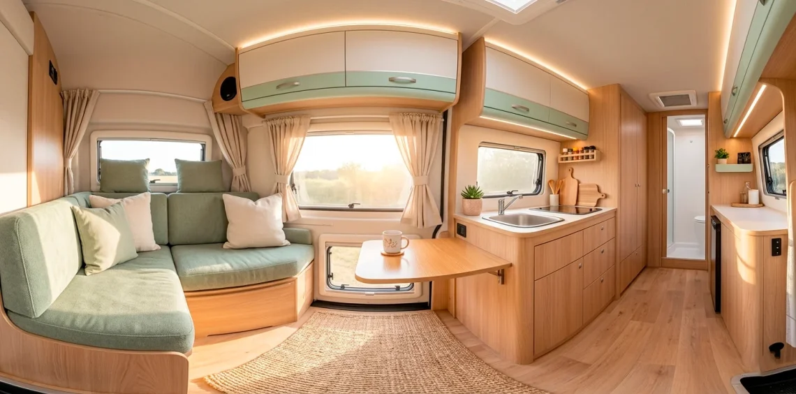
Trading four walls for four wheels shouldn’t mean living in a dark, claustrophobic tin can. If your van feels more like a metal locker than a sanctuary, you are likely missing the magic of color psychology. Soft pastels turn tiny, cramped spaces into breathable retreats that actually soothe your nervous system after a long day of driving. I’ve spent months navigating the nomad life, and trust me, your interior palette determines whether you feel at home or just like you’re loitering in a parking lot. These ten palettes will help you find that peace.
Misty Sage and Toasted Oat
Misty sage acts as the ultimate neutral for people who are tired of plain white but fear bold commitments. It brings the outside in without the literal dirt, which is a massive win when you’re living on the road. When I first saw this combo in a converted Sprinter, the calmness hit me immediately. The green tones ground the space, while the toasted oat accents keep the vibe from feeling clinical or cold. Ever felt like your walls were closing in during a rainstorm? This palette prevents that claustrophobia by mimicking the natural horizon.
Key design elements for this look:
- Matte sage green cabinetry panels with gold hardware
- Light oak or oat-colored wood vinyl flooring
- Textured linen curtains in a soft cream or flaxen shade
- Ceramic storage jars in muted earthy green tones
Mixing these shades creates a sophisticated balance that hides a surprising amount of road dust. You can even experiment with darker accents if you want more depth, similar to these sprinter van interior ideas.

Dusty Rose and Warm Sandstone
If you want your van to feel like a perpetual sunset, dusty rose is your best friend. This isn’t your grandma’s floral wallpaper pink; it’s a sophisticated, muted tone that adds instant warmth to cold metal interiors. I personally love pairing this with sandstone because it creates a desert-chic vibe that works everywhere from the Oregon coast to the Utah salt flats. It makes the space feel cozy and intentional rather than just functional. Does your current interior feel a bit sterile? Adding these blush tones softens the hard edges of your build and makes the small square footage feel much more inviting. IMO, it’s the best way to bring a touch of luxury to the nomad lifestyle ✨.

Pale Aqua and Weathered Driftwood
Who doesn’t want to feel like they’re parked at the beach, even when they’re stuck in a mountain pass? Pale aqua brings a refreshing, airy quality that practically doubles the perceived size of your van. It’s light, it’s crisp, and it looks incredible against the gray-brown tones of weathered wood. FYI, this palette is a lifesaver for smaller builds like Ford Transits where light is at a premium.
Beach vibe check:
- Sky-blue or pale aqua backsplash tiles
- Reclaimed driftwood shelving or tabletops
- White cotton textiles for a breezy feel
- Silver or chrome fixtures for a modern touch
I find that this combination keeps the energy high and the mood light. It’s hard to feel grumpy about a flat tire when your kitchen looks like a seaside cottage.
Is there anything more relaxing than a blue-and-wood combo? Probably not. It creates a rhythm that feels clean without being boring.

Buttercream and Soft Pewter
White is great, but buttercream is better if you actually plan on living in your van. Pure white shows every coffee spill and dog paw print, whereas a creamy buttercream hides the chaos of daily travel. Pairing it with a soft pewter gray gives the space a grounded, modern edge that prevents it from looking too ‘shabby chic.’
I’ve noticed that this combo works exceptionally well with industrial accents. Think black metal frames or hardware against those soft, buttery walls. It’s a sophisticated look that says ‘I live in a van, but I still have my life together.’ You might find similar vibe-shifting tips in this guide to warm studio apartment essentials. Does your van need a more grown-up look? This is the one.

Lavender Mist and Flaxen Linen
Lavender might sound bold for a vehicle, but a desaturated lavender mist is surprisingly neutral. It provides a cool, calming undertone that shifts beautifully as the light changes throughout the day. When you pair it with flaxen linen, you get a texture-heavy look that feels organic and high-end.
Why does this work?
- The purple tones counteract the yellow light of some interior LEDs.
- Flaxen linen adds a ‘raw’ element that keeps the lavender from feeling too sweet.
- It creates a unique identity that stands out from the sea of white and wood builds.
I suggest using lavender for smaller accents or a single feature wall. Too much might make you feel like you’re living inside a grape, and nobody wants that. Keep it subtle, keep it classy, and let the textures do the heavy lifting.

Peach Fuzz and Creamy Vanilla
Peach fuzz was a color of the year for a reason—it’s the ultimate ‘good mood’ hue. In a van, where gray skies and cramped quarters can sometimes dampen your spirit, peach brings a much-needed dose of vitamin D (visually, at least). Mixing it with creamy vanilla prevents the space from looking like a nursery. This palette glows beautifully under warm evening lights, making your van feel like a lit candle on wheels. Have you ever noticed how some colors just make you want to smile? This is definitely one of them. It’s playful without being obnoxious, which is a rare balance to strike in a mobile home.

Sky Blue and Linen White
This is the classic ‘coastal grandmother’ look adapted for life on the road. Sky blue and linen white are timeless because they mimic the two things we see most through our van windows: the sky and the clouds. It’s a literal breath of fresh air.
Design tips for a sky-high vibe:
- Paint your ceiling a very pale blue to create height
- Use linen white for all large cabinetry to maximize light bounce
- Incorporate navy blue striped rugs for a nautical touch
- Choose matte finishes to keep the look modern and soft
I’ve seen people go overboard with the nautical theme—avoid the anchor pillows unless you really want to look like a gift shop. Keep the colors soft and the patterns minimal. The goal is serenity, not a theme park. Doesn’t the idea of a blue ceiling just make the roof feel miles higher?

Mint Leaf and Pale Terracotta
This is a slightly more ‘boho’ take on the pastel trend. Mint leaf green is refreshing and cool, while pale terracotta adds a necessary earthy heat. This contrast keeps the interior from feeling one-note. It’s like a desert oasis inside your van. I personally love this for people who have a lot of indoor plants; the mint complements the greenery, while the terracotta mirrors the clay pots. It’s a very organic, grounded palette that feels connected to the earth. Do you find yourself gravitating toward nature-inspired colors? This pair will make your van feel like it’s growing right out of the landscape.

Lilac and Dove Gray
Lilac and dove gray is for the nomad who wants a sophisticated, almost ethereal interior. Gray provides a solid, neutral foundation that stops the lilac from feeling too whimsical or ‘childish.’ It’s a very calm, quiet palette that works perfectly for a workspace-heavy van build. If you spend your days staring at a laptop, having a cool, lilac-toned environment can actually help reduce eye strain compared to harsh whites. I’ve seen this look best with brushed nickel hardware—it keeps that ‘cool’ tone consistent throughout the build. It’s a modern, polished look that feels incredibly peaceful during the twilight hours.

Lemon Chiffon and Slate
Let’s talk about Lemon Chiffon. It’s bright, it’s sunny, and it’s basically a cup of coffee for your eyes. However, a van full of yellow can be… intense. That’s why you balance it with a heavy slate gray. The slate acts as an anchor, bringing a bit of ‘weight’ to the airy yellow.
Visual balance rules:
- Use slate for the floors or lower cabinets to ‘ground’ the space
- Use lemon chiffon for upper accents, pillows, or curtains
- Incorporate white as a transition color to prevent a ‘bumblebee’ effect
It’s a bold choice, but when done right, it makes your van feel like the sun is always out, even in the middle of a UK winter. Who wouldn’t want a little extra sunshine in their life?

Conclusion
Choosing the right palette turns your van from a mere vehicle into a soul-soothing retreat. Whether you vibe with misty greens or sunset pinks, your interior should reflect your personal peace. Don’t fear the pastels—they hide dust surprisingly well and make small spaces feel massive compared to dark, heavy woods. Which of these dreamy palettes are you slapping on your cabinets first? Let me know in the comments!