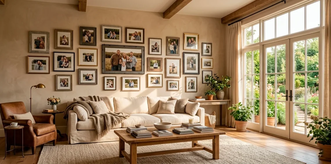
Stop leaving those precious memories to rot in your phone’s cloud storage! We all have thousands of photos that deserve better than a digital grave. Why not turn your blank walls into a living storybook? I’ve spent years rearranging my own hallway like a mad scientist to find the perfect flow. These 15 layouts will help you reclaim your space and keep your favorite faces front and center every single day.
The Classic Uniform Grid
Do you crave order in a world of chaos? The classic uniform grid offers a clean, architectural look that screams sophistication without trying too hard. I find that using identical frames creates a powerful sense of balance. This layout works wonders in entryways where you want to make a strong first impression.
You should choose a single color for your frames to maintain that sleek, modern vibe. Whether you go for matte black or natural oak, consistency is your best friend here. Have you ever noticed how a simple 3×3 grid instantly makes a room feel more organized?

The Eclectic Mismatched Gallery
If perfection makes you itch, the eclectic mismatched gallery is your spirit animal. I love mixing different textures, sizes, and colors because it tells a story that feels organic rather than manufactured. You can pair a thrifted ornate gold frame with a modern thin-profile wood frame for an instant ‘collected over time’ feel. Just keep a common element, like a specific color palette in the photos, to prevent it from looking like a garage sale exploded on your wall. Trust me, your guests will spend way more time hovering over this wall than any other!

The Minimalist Picture Ledge
I hate commitment, especially when it involves drilling holes in my walls every time I want to swap a photo. The minimalist picture ledge solves this beautifully. You just mount a few slim shelves and lean your frames against the wall.
This layout allows you to layer photos of different heights, creating depth that a flat wall just can’t match. You can easily switch out holiday photos for summer memories in about thirty seconds.
Why settle for a static display when you can have a rotating exhibition? It’s basically the Pinterest-perfect solution for the indecisive decorator. IMO, it’s the GOAT of flexible home decor.

The Chronological Hallway
Transform your boring hallway into a literal walk down memory lane. I recommend arranging photos in chronological order along the length of the wall to show your family’s growth. It turns a transitional space into a meaningful experience for everyone who passes through.
You can use small brass plaques to mark specific years or milestones. Does it get any more heartwarming than seeing your kids grow an inch every few frames? It’s a tear-jerker for sure, but in the best way possible.

The Monochromatic Statement
If you want your photos to look like high art, go black and white. Converting all your family photos to a monochrome palette hides a multitude of sins—like that neon shirt your cousin wore in 2005.
This approach unifies different settings and lighting conditions into one cohesive story. I think it adds an expensive, timeless feel to any room.
- Use thick white mats for a museum look.
- Stick to black or silver frames.
- Ensure high contrast in your prints.
It’s a foolproof way to make messy candid shots look like a professional gallery installation. Seriously, even a blurry photo of the dog looks deep in black and white.

The Corner Wrap Layout
Why stop at the edge of the wall? The corner wrap is a genius way to utilize awkward spaces. I love how it leads the eye around a room, making the transition between spaces feel seamless. It’s a bold architectural move that turns a boring 90-degree angle into a focal point. You can mix frames of different sizes but keep the ‘center line’ consistent as you move across the corner. It’s a bit like a hug for your room, right?

The Oversized Triptych
Sometimes, one photo just isn’t enough, but a wall full of them is too much. Enter the oversized triptych. Take one high-resolution family shot and split it across three large canvases or frames.
This creates a dramatic impact that fills a large wall without looking cluttered. I recommend using this over a sofa or a bed.
Ever tried splitting a beach photo? The horizon line helps keep everything grounded while looking incredibly chic. It’s an easy way to achieve that ‘custom art’ look without the custom art price tag.

Staircase Cascade
The staircase is the natural habitat of the family photo. However, most people just slap them on the wall haphazardly. The staircase cascade follows the diagonal line of the steps, creating a sense of movement.
I suggest keeping the bottom of the frames parallel to the stairs for a cohesive look. It turns a boring climb into a trip through your best memories. Why wouldn’t you want a little inspiration while you’re lugging laundry upstairs?

The Map and Memory Hub
Are you a family of explorers? This layout combines a large wall map with photos of your travels pinned to their specific locations. I think this is one of the most interactive ways to display photos.
- Use a cork or wood map as the base.
- Connect photos to locations with string or pins.
- Include polaroids for a retro, tactile feel.
It’s a great conversation starter. ‘Oh, is that when we almost got lost in Tokyo?’ It makes the memories feel alive and tied to the world. FYI, kids absolutely love helping with this one!

Integrated Art and Texture
Don’t limit yourself to just photos! I love mixing family portraits with other elements like woven baskets, mirrors, or even abstract paintings. This adds incredible texture and prevents the wall from feeling ‘flat’. By layering different mediums, you create a rich, eclectic vibe that feels high-end and curated. Ever thought about how a round mirror can break up the hard angles of square frames? It’s a game-changer. For more ideas on mixing textures, check out these bold wallpaper patterns for eclectic living rooms.

The Casual Clip and Wire
Sometimes frames feel too formal. For a more relaxed, youthful vibe, I recommend using a wire grid or a simple string with wooden clips. This is perfect for home offices or playrooms where the energy is high.
You can literally change the photos every week without any tools. It’s the ultimate low-pressure way to keep your latest snapshots visible.
Does your fridge look like a cluttered mess of magnets? Move those photos to a dedicated wire wall and watch your kitchen instantly feel five times cleaner. It’s a win-win.

The Symmetrical Diptych
If you have a narrow wall space, like between two windows, the symmetrical diptych is your best bet. Just two large, identical frames stacked vertically or placed side-by-side.
I find that this creates a sense of intentionality and poise. It’s less about a ‘gallery’ and more about a ‘statement’. Use your two absolute favorite shots—maybe a wedding photo and a recent family portrait.
It’s simple, it’s clean, and it doesn’t require a PhD in interior design to get right. Sometimes, less really is more, wouldn’t you agree?

Floor-to-Ceiling Impact
Want to go big? The floor-to-ceiling layout is for the brave souls who want their family to be the literal foundation of the room.
- Start from the baseboard and go all the way to the crown molding.
- Use a variety of frame sizes to fill every gap.
- Keep the color palette of the frames consistent to avoid visual overwhelm.
I’ve seen this in large dining rooms, and it is absolutely breathtaking. It feels like a massive, customized wallpaper made of love. Just be prepared for everyone to stop and stare the second they walk in.

The Modern Hexagon Tile
For something truly unique, try hexagonal photo tiles. These are often lightweight and stick directly to the wall without nails. I love the honeycomb pattern they create because it feels so modern and fresh. You can keep adding to the cluster as your family grows, making it an ‘evolving’ piece of art. No more stressing about perfect alignment—the shapes fit together like a puzzle. It’s basically the cool, tech-savvy cousin of the traditional photo frame.

Vintage Thrifted Treasures
Last but not least, the vintage frame mix is perfect for those who love a bit of history. I spend my weekends hunting through thrift stores for the most unique, tarnished, and ornate frames I can find.
Mixing these with old family heritage photos creates a deeply soulful display. It honors where you came from while looking incredibly stylish.
You can even leave some frames empty to add to the ‘abandoned estate’ aesthetic. If you’re into that thrifted look, you’ll love exploring these 8 vintage treasures for a thrifted gallery. It’s the perfect way to give new life to old objects.

Conclusion
You don’t need a professional interior designer to make your home feel personal and warm. Whether you love the strict order of a grid or the wild energy of a thrifted gallery, your photos are the heart of your home. Which of these layouts are you going to try first? I’m currently leaning toward that corner wrap myself! Let me know in the comments if you’ve found a layout that works even better. Now, go get those photos off your phone and onto your walls where they belong! 😉