Stepping into a terracotta bathroom feels like a warm embrace from the earth itself, but let’s be honest, too much orange can make you feel like you’re living inside a giant flowerpot. You need the right dance partners to make that clay pop without overwhelming your senses. I’ve rounded up ten shades that turn a basic bathroom into a high-end spa retreat. Ready to find your perfect match?
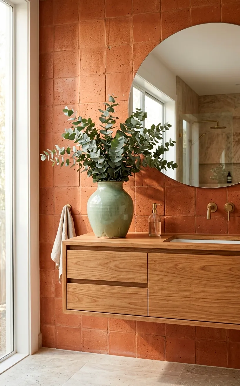
Sage Green for a Natural Balance
Sage green literally saves your bathroom from looking like a dusty desert. I once painted my small powder room a deep clay and felt trapped in a brick until I added sage green accents. This cool, muted tone cuts through the warmth like a fresh breeze. Ever wonder why nature does this so well?
Think of a succulent sitting in a clay pot. It just works. I recommend swapping out your old white towels for some plush sage linens. Trust me, your eyes will thank you for the visual break. For more inspiration, check out these sage green color palettes that bring peace to any space.
Creamy Oat for Softness
If you want that ‘expensive hotel’ vibe without the five-star price tag, creamy oat is your best friend. This isn’t just boring beige; it’s a rich, buttery neutral that softens the hard edges of terracotta tiles. I find that using oat-colored bath mats or a textured shower curtain prevents the room from feeling too aggressive. Why settle for stark white when you can have this cozy warmth? IMO, it makes the whole room feel ten times larger and way more inviting ✨.

Mustard Yellow for Sunny Energy
Hear me out before you run away! Mustard yellow provides a sophisticated pop of energy that terracotta desperately craves. I love using this color in smaller doses, like a single mustard-toned candle or a patterned hand towel. It’s like adding a squeeze of lemon to a heavy meal—it just brightens everything up.
Don’t go overboard, though. You aren’t building a giant omelet. Keep the mustard to your decorative accessories to maintain that earthy, grounded feel.
Does your morning routine need a little more sunshine? A few hits of mustard yellow will wake you up faster than a double espresso. It creates a Mediterranean heat that feels intentional and curated rather than accidental.

Charcoal Gray for Modern Contrast
Terracotta can sometimes feel a bit too ‘rustic farmhouse’ if you aren’t careful. If you want to pull it into the 21st century, introduce charcoal gray. The deep, moody contrast makes the orange tones in the clay look intentional and sharp rather than dated. I suggest using charcoal for your hardware or mirror frames.
Doesn’t that dark edge look sleek? It grounds the warmth of the tile and adds a layer of sophistication that lighter colors just can’t touch. FYI, matte black or charcoal finishes are much easier to keep clean than shiny chrome in a humid bathroom environment.

Dusty Rose for Romantic Depth
Pairing pink with terracotta sounds like a risky move, but dusty rose is actually just a lighter, softer cousin of the clay family. It creates a monochromatic look that feels incredibly high-end and romantic. I’ve seen designers use this combo to create a desert sunset vibe that is absolutely to die for.
You might think it’s too feminine, but it actually feels quite earthy when paired with raw wood. Think about adding:
- A dusty rose linen bathrobe
- Small clay bud vases
- A soft pink vintage-style rug
This palette works because the colors share the same warm undertones. It’s like they were made for each other.
Would you ever consider a pink-on-orange look? When the tones are this muted, it’s less ‘Barbie’ and more ‘Arizona luxury resort.’ It’s a total mood.

Olive Green for a Moody Retreat
If sage is the light breeze, olive green is the deep forest. This pairing creates a moody, sophisticated atmosphere that feels incredibly grounded. I personally love how olive green brings out the brown undertones in terracotta tiles, making the whole room feel much more expensive.
Try adding an olive green vanity or even just some deep green botanical prints. This combo reminds me of the Mediterranean countryside in the best way possible. It’s mature, elegant, and timeless. Check out these secrets to Mediterranean styles to see how these earthy palettes dominate world-class architecture.

Sandstone for Beachy Warmth
For those who want to keep things light but still earthy, sandstone is the answer. It mimics the look of natural stone and provides a subtle, grainy texture that complements the smoothness of terracotta. I think this is the safest bet if you’re worried about the room feeling too dark. It keeps that sunshine-baked feeling alive all year round! Sandstone accessories, like soap dishes or tooth holders, add a tactile element that makes the space feel curated and thoughtful.

Burnt Umber for Rich Layers
Do you want your bathroom to feel like a cozy cavern? Burnt umber is the way to go. This deep, reddish-brown tone leans into the darkness of terracotta without clashing. I find that using umber-colored wood stains on a vanity or shelving creates a beautiful, layered look that feels very intentional.
It’s all about those layers, baby!
When you mix different shades of the same color family, you get a depth that a single-tone room just can’t offer. Burnt umber acts as the ‘bass note’ in your design orchestra, providing a solid foundation for everything else to sit on. It’s bold, it’s rich, and it’s undeniably cozy.
Warm Espresso for High Contrast
If you really want to make a statement, look at warm espresso. This is nearly black but with a hidden brown warmth that keeps it from feeling cold. I love using espresso for mirror frames or even window trim in a terracotta bathroom. It provides a frame for the warmth of the tiles, making the orange pop in the most stylish way possible.
Don’t be afraid of dark colors!
People often worry that dark tones make a room feel small, but in a bathroom, it often creates a sense of luxury and privacy. Think of it like a high-end coffee shop—rich, dark, and perfectly balanced.
Items to consider:
- Dark espresso picture frames
- Woven dark wood baskets
- A deep brown storage cabinet
- Matte dark hardware
Using these elements will sharpen the look of your space immediately. IMO, this is the most sophisticated pairing on this list.

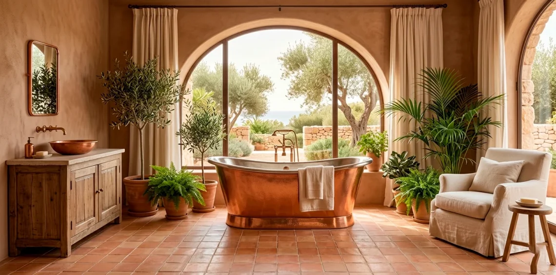
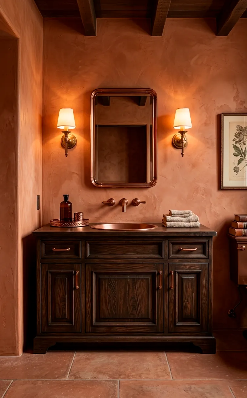
Copper for Metallic Glow
Finally, let’s talk about copper. While not a ‘tone’ in the traditional paint sense, it is the ultimate earthy metallic to pair with terracotta. Since both materials share that warm, reddish base, they blend together seamlessly. I’ve seen copper pipes left exposed against terracotta walls, and it looks like a piece of art.
Copper adds that little bit of sparkle!
It keeps the room from looking too flat or matte. Whether it’s a copper soap dispenser or a stunning copper light fixture, this metal brings a touch of magic to the earthiness.
Ever noticed how copper changes over time? The slight patina that develops only adds to the organic, lived-in feel of a terracotta space. It’s a match made in design heaven. Trust me, once you add copper, you’ll never go back to boring chrome again.

The Final Flourish
Terracotta is a bold choice, but with the right earthy tones, it becomes a timeless masterpiece. Whether you go for the freshness of sage green or the sleek contrast of charcoal, your bathroom will finally feel like the sanctuary you deserve. So, which of these tones are you grabbing first? Let me know in the comments and go create that dream spa!