Skip to content
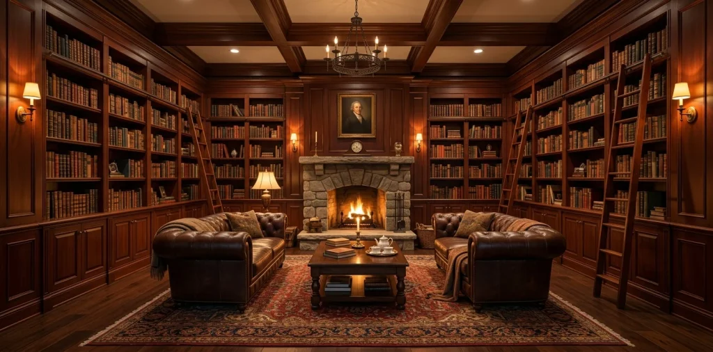
Ever walk into a room and instantly feel a wave of calm wash over you? That is the magic of symmetry working its psychological wonders. Arranging a library does not mean just cramming paperbacks onto a dusty shelf until it groans under the weight. We are creating a visually stunning sanctuary here ☕. Grab your coffee, because your reading space is about to get a massive glow-up.
The Anchor Rule
Every symmetrical masterpiece needs a strong center point. Think of this as the gravitational pull of your entire room. Without it, your carefully curated shelves just float around looking lost.
I learned this the hard way after building a wall of shelves that looked like a chaotic book avalanche. You need a focal point—a grand fireplace, a striking piece of art, or even a gorgeous window. Frame this anchor equally on both sides. This creates an invisible line slicing the room in half, telling your brain everything is perfectly under control.

Mastering the Weight Distribution
Balance does not mean creating an exact, boring mirror image.
Visual weight is your best friend here. A massive leather-bound encyclopedia on the left demands something equally heavy-looking on the right. If you place a bulky bronze statue on one side, you better offset it with a stack of thick coffee table books opposite it.
A useful little gift for your home
🎁 Free Plant Finder Tool
Filter 250+ houseplants by 6 smart criteria to find your perfect green companion.
We’ll email you the link. Plus, you’ll join our newsletter!
Otherwise, your room visually tips over. Nobody wants a lopsided library, right?
Spacing out the heavy elements anchors the bottom shelves and keeps the whole structure grounded. Place your delicate decor and smaller paperbacks closer to the top so the setup breathes.

Color Blocking for the Win
Grouping books by color sounds like a trend only influencers care about, but it actually forces symmetry like a charm! Throwing a random mix of neon spines everywhere creates visual static. By clustering your deep blues on the lower left and matching them with rich greens on the lower right, you establish a harmonious rhythm. Color blocking transforms clutter into intentional design (and IMO, it looks fabulous). Plus, finding a specific book becomes a fun little memory game. I highly recommend pulling out those bright red spines and using them as accent pops flanking your central art piece.

The Rule of Three in Accents
Odd numbers look natural, which perfectly offsets the strictness of a mirrored layout. Introduce small clusters of decor to break up the endless rows of books.
Design elements:
- A brass magnifying glass paired with a vintage clock.
- Three staggered brass candle holders reflecting the light.
- A trio of small potted succulents for a pop of life.
Place one trio on the middle-left shelf and a completely different trio on the middle-right. This keeps the symmetrical layout from feeling too rigid or museum-like. You want a cozy home, not a sterile library.

Furniture Placement Magic
Shelves only do half the work. How you arrange your seating dictates how inviting the space actually feels. Position two identical accent chairs facing each other directly in front of your focal point.
This frames the room beautifully. Add a small, round side table between them to hold your inevitably cold cup of tea. If you have the space, a plush rectangular rug running straight down the middle ties everything together perfectly. Suddenly, your room screams sophisticated symmetry without trying too hard. If you are looking for more inspiration on taking these ideas to the next level, check out this guide on designing symmetrical built-ins formal library.

Lighting the Symmetrical Way
Shadows ruin symmetry faster than a toddler left alone with a marker.
You must illuminate both sides of your room equally. Installing matching picture lights above the top shelves instantly elevates the entire vibe.
I installed twin brass sconces flanking my fireplace, and it completely changed the mood from dingy to dramatic. Warm bulbs bounce light off the book spines, creating a ridiculously cozy atmosphere.
Do not forget a central chandelier or pendant light! Hanging a statement fixture directly in the middle of the room reinforces that central anchor we talked about earlier. It draws the eye right up to the ceiling.

Embracing the Almost Match
Matching everything perfectly breeds paranoia. If you constantly tweak things by a millimeter, you will drive yourself crazy. Embrace the almost match! Balance a tall, slender vase on the left with a stack of horizontally laid books of the exact same height on the right. They take up the same visual real estate but offer totally different textures. This trick softens the room and adds serious character. Your library should reflect your personality, not a sterile rendering from an architectural magazine.

Vertical vs. Horizontal Stacking
Breaking up the monotony of endless vertical spines gives your eyes a much-needed resting place. Try stacking three large coffee table books horizontally, then capping them with a small decorative object.
Replicate this exact horizontal stack on the opposing shelf, perhaps exactly one level lower or higher. This creates a neat little mirrored grid pattern within your larger symmetrical layout. It acts like a visual speed bump, forcing guests to pause and actually admire your collection instead of just glancing past it. Plus, flat stacks make great makeshift bookends for the floppy paperbacks!

Letting the Shelves Breathe
Negative space holds just as much power as the books themselves. Packing every single inch of shelving screams hoarder rather than high-end designer.
Leave at least twenty percent of your shelf space completely empty. This allows the structural symmetry of the bookcases themselves to shine through.
I usually leave the top outer corners relatively bare. It draws attention back toward the center focal point and keeps the room from feeling top-heavy. Give your books some room to breathe, and the whole space immediately feels lighter and far more intentional.

Final Touches and Texture
Now that you have the layout dialed in, inject some much-needed texture to keep things interesting. Symmetry often looks flat if everything features the same smooth, glossy finish. Woven baskets on the bottom shelves hide messy cables while adding a fantastic rustic element. Drape a chunky knit throw blanket over one of your identical accent chairs and balance it with a textured linen pillow on the other. These subtle, tactile differences make a rigidly symmetrical room feel effortlessly lived-in. For a completely different cozy vibe to complement your main space, you might also want to read this guide to cozy attic reading nooks.

A useful little gift for your home
🎁 Free Plant Finder Tool
Filter 250+ houseplants by 6 smart criteria to find your perfect green companion.
We’ll email you the link. Plus, you’ll join our newsletter!
Conclusion
Achieving a balanced symmetrical home library design transforms a chaotic book storage area into an absolute sanctuary. By mastering visual weight, anchoring your layout, and sneaking in some clever asymmetrical textures, you create a space that feels both highly curated and intensely personal. Grab those books and start rearranging! Which shelf styling trick are you trying first? Let me know in the comments 📚.