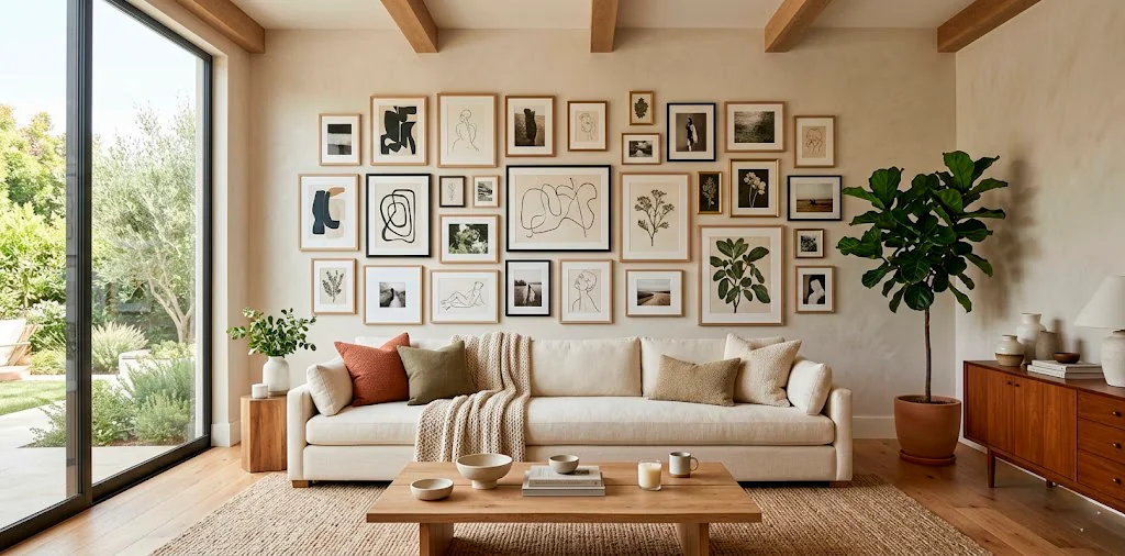
Ever stare at a pile of mismatched photos and wonder how on earth they’ll look good on the same wall? Trust me, I get it. Creating a cohesive gallery wall isn’t just about hammering nails into drywall; it completely hinges on how you edit those pictures first. Let’s grab a coffee and fix that chaotic camera roll of yours once and for all.
The Pre-Edit Master Plan
Before you touch a single slider, we need a solid game plan. You can’t just slap an over-saturated beach sunset next to a moody indoor portrait and expect magic. Decide on a distinct vibe upfront. Are we going warm and vintage, or sleek and high-contrast?
Take five minutes to dump all your potential candidates into a single album on your phone or desktop. Seeing them side-by-side immediately exposes the outliers. Seriously, this incredibly simple step saves you from ripping your hair out later.

Establish Your Anchor Color
Every stunning gallery wall possesses a secret weapon.
It relies heavily on an anchor color to tie the chaos together. I usually pick a dominant tone that already exists naturally in my living room furniture or rugs.
Look closely at your favorite shots. Do they share a subtle earthy green or a vibrant pop of mustard yellow? Amplify that specific hue across the board. You don’t need every photo to match perfectly, but weaving a common thread creates instant visual harmony.
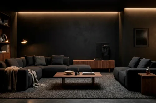
Ever wondered why professional displays look so effortless? It’s exactly this trick. If you want the perfect backdrop for this, check out these tips for a living room with warm wood finishes and organic modern style.

Consistency is King: Choosing a Preset
Applying a single preset to your entire batch acts as the ultimate shortcut to visual harmony. I know, I know—presets get a bad rap sometimes, but they serve as total lifesavers for bulk editing. Find a preset that subtly enhances rather than completely overhauls your original images. Apply it to every single photo, then tweak the exposure individually. It lays down a uniform baseline of contrast and color grading. Boom, half the heavy lifting is instantly done for you.

Taming the White Balance
Nothing ruins a cohesive display faster than wildly mismatched white balances. A cool, blue-tinted winter photo clashes horribly against a warm, orange-toned indoor snap.
Fixing this discrepancy requires a fairly sharp eye.
Slide that temperature gauge until the whites in every image look relatively identical. I strongly prefer pushing things slightly to the warmer side because it makes the whole wall feel infinitely more inviting. Getting your white balance uniform stands as literally the most critical step you can take. IMO, it easily separates the amateurs from the pros.

The Magic of HSL Sliders
Let’s talk about the HSL (Hue, Saturation, Luminance) panel, which basically acts like witchcraft in the absolute best way possible. If one rogue photo features a glaring neon pink shirt, you definitely don’t have to scrap the whole image. Just pull down the saturation on that specific color channel.
Mute the distracting background colors so your main subjects actually pop. I frequently desaturate my greens slightly, turning harsh neon grass into a sophisticated, moody olive. It totally elevates the overall aesthetic of the wall! ✨

Black and White Interventions
Sometimes a stubborn photo simply refuses to cooperate with your carefully chosen color palette.
Don’t delete it. Convert it.
Throwing a few black and white images into the mix acts as a brilliant visual palate cleanser. It seamlessly breaks up heavy color blocks and adds a gorgeous layer of timeless elegance to the overall grid.
Just ensure your monochrome shots share the exact same level of contrast. Deep, rich blacks and crisp whites always look more premium than muddy, flat grays. They look absolutely incredible if you decide to restore thrifted frames for a high-end look.

Cropping for Dynamic Composition
Cropping isn’t just about removing that random trash can in the background; it alters the entire energy of the shot. Mix up your compositions intentionally. Pair a super tight, intimate close-up with a wide, sweeping landscape. Varying your crop scales keeps the viewer’s eye moving fluidly across the wall. If every single photo features a full-body portrait taken from ten feet away, your gallery feels incredibly stiff and boring.

Adding Grain for Soulful Texture
I hold a slightly controversial opinion: modern digital photos look way too impossibly sharp these days.
Injecting a tiny bit of uniform film grain into every picture masks the fact that they originated from different cameras or phones. It acts like a delicate, cohesive blanket draped over your entire collection.
Don’t go overboard and make it look like a static TV screen, obviously. A subtle grain setting of around 15 or 20 adds a beautiful, tactile quality that prints magnificently on matte paper. It brings a genuine soul back to sterile digital files.

Matching Exposure and Brightness
Stand back and squint at your digital album. Do any photos look like a blazing spotlight hits them, while others hide entirely in the shadows? Uneven exposure completely destroys the illusion of a curated, professional collection.
Tweak the exposure slider until the overall brightness matches across the board. You want the entire grid to share a similar luminous weight. It sounds fussy, but this exact attention to detail makes your living room look like a chic downtown art gallery.

Test Printing Like a Pro
Never, ever trust your phone screen blindly. Screens emit bright backlight; paper does not. Before you drop major money on massive fine art prints, send a small batch of cheap 4x6s to your local printer. Lay them out on your floor in natural daylight. This physical test run reveals hidden color casts and lets you finalize your grid layout without the crippling anxiety of making a permanent, expensive mistake. FYI, dark areas always print significantly darker than they look on your glowing screen.

The Final Layout Strategy
Now for the incredibly fun part.
You’ve edited everything perfectly, so the actual layout should feel like a total breeze. Start with your largest, most visually heavy photo right in the center. Build outward, balancing out the dark and light images so one side doesn’t feel visually lopsided. Frame essentials:
- Sleek matte black frames for contrast
- Warm oak wood borders for coziness
- Extra-thick white gallery mats for a high-end look
Mix up the orientations, too! Staggering horizontal and vertical crops creates a brilliantly dynamic rhythm. Frame choice presents another beast entirely, but your flawlessly edited photos shine brightly regardless.

Wrap Up and Hang It Up
Editing photos for a cohesive gallery wall takes a little patience upfront, but the final result completely transforms your space. By unifying your colors, dialing in the contrast, and relying heavily on the magic of presets, you turn random snapshots into actual, intentional art. Which editing trick are you trying first? Let me know in the comments below!