Skip to content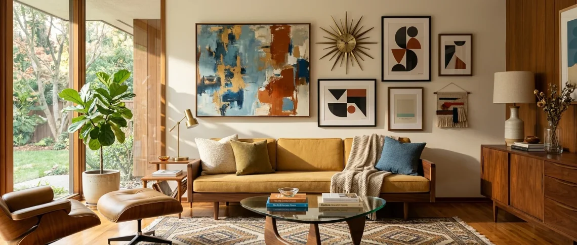
Staring at a blank wall and wondering how to bring that retro Don Draper energy into your space without making it look like a vintage thrift store exploded? I completely feel you. Mid-century modern art arrangements instantly elevate a room, but nailing that effortlessly chic vibe takes a bit of strategy. Ready to transform those sad, empty walls? Let’s fix them right now!
The Asymmetrical Sunburst Setup
Ever tried balancing a massive sunburst clock with tiny framed prints and failed miserably? It happens to the best of us. The trick to the asymmetrical sunburst setup is anchoring the heavy metal clock off-center and flanking it with three vertical abstract canvases. You get that iconic 1960s geometry without feeling aggressively symmetrical. Always hang the heaviest piece first before placing your supporting art. Honestly, this arrangement instantly saved my dining room from total boredom. Want more tips on finding vintage gems to hang here? Check out this guide to sourcing estate sale art.

Geometric Color Block Grids
Love a good grid? Me too! Nothing screams mid-century modern quite like a perfectly spaced grid of bold geometric color block prints.
Try arranging six square frames featuring rich mustard, teal, and burnt orange abstract shapes. Keep exactly two inches between every frame. This strict spacing creates a massive visual impact that anchors a large living room beautifully.
A useful little gift for your home
🎁 Free Plant Finder Tool
Filter 250+ houseplants by style, size, and care level to find your perfect green companion in seconds.
We’ll email you the link. Plus, you’ll join our newsletter for fresh home inspiration.
Why does this work so well? The rigid structure tames the wild, playful colors typical of the MCM era. Plus, it makes you look incredibly organized! 😉

The Low-Slung Credenza Lean
Hanging art requires commitment, and sometimes I just refuse to pick up a hammer. That is exactly where the low-slung credenza lean comes in to save the day!
Grab three pieces of varying heights—think one massive textured abstract canvas, a medium portrait, and a small typographic print. Layer them directly on your walnut sideboard. Overlap the frames slightly to create a casual, layered aesthetic. This technique adds incredible depth to a flat wall. Throw a sleek ceramic table lamp into the mix, and you suddenly have a magazine-ready focal point.

The Floating Shelf Gallery
Want ultimate flexibility? Install two long, sleek teak floating shelves on your blank wall.
This setup lets you swap out your Bauhaus exhibition posters whenever the mood strikes. I honestly love changing my art around when I get bored of the same old view.
Design essentials for this shelf look:
- Sleek teak floating ledges
- Minimalist black aluminum frames
- Small trailing pothos plant in a ceramic pot
Just lean the art against the wall and mix in a few brass accents. You avoid putting fifty nail holes in your drywall, which your landlord will definitely appreciate!

Mixed Media Organic Clusters
Who says you only have to frame flat paper? Real mid-century modern design embraces texture and organic shapes. Create a cluster above your sofa using a mix of traditional framed landscape paintings, a woven macrame wall hanging, and a sculpted brass wall piece. The contrast between soft textiles and hard metals absolutely nails the quintessential 1970s transition era. Just keep the outer perimeter of your arrangement somewhat circular to tie everything together. Trust me, your guests will constantly ask where you bought your decor!

The Singular Oversized Statement
Sometimes, you just need one massive showstopper. A gigantic piece of art commands attention and eliminates the headache of perfectly spacing a complex gallery wall.
Find an oversized canvas featuring bold sweeping brushstrokes or a minimalist atomic era motif. Hang it alone on a prominent wall. Scale is everything here. The art should span at least two-thirds the width of the furniture below it.
Less really is more with this strategic arrangement. A single huge canvas above a low-profile sofa screams confident, high-end interior design.

The Corner Wrap-Around
Got an awkward empty corner? Stop ignoring it! Wrapping an art arrangement around a corner turns a weird architectural quirk into a brilliant design feature.
Hang a series of complementary minimalist line-art portraits across both intersecting walls. Start on one wall and literally bleed the arrangement right around the edge to the adjacent wall. This draws the eye inward and creates a cozy, immersive nook. Grab a retro leather lounge chair, toss it in that corner, and enjoy your new favorite reading spot! If you love breaking the rules with decor, you might also want to try adding some checkerboard home decor accents to that newly styled space.

Vertical Stacked Paneling
Narrow walls between doors or windows often confuse people. Should you just leave them completely blank? Absolutely not!
A vertical stack of identical frames solves this irritating design dilemma instantly.
Choose three tall, slender frames showcasing continuous botanical prints or abstract mid-century squiggles. Stack them directly on top of each other with exactly one inch of spacing between each frame.
This simple arrangement forces the eye upward, making your ceilings feel incredibly high. It perfectly fills those frustrating gaps in your floor plan.

The Staircase Stagger
Decorating a staircase terrifies most people, but it offers a brilliant canvas for mid-century modern art! The secret involves tracing the exact angle of your stairs. Start by hanging a central focal point at eye level in the middle of the ascent. Then, stagger smaller vintage travel posters and atomic-era advertisements diagonally upwards and downwards. Keep the centerline of the art parallel to the stair stringer. This dynamic layout injects vibrant energy into a normally boring transition space. You climb the stairs and literally walk through a stylized retro history lesson!

Triptych Split Scenes
Why buy three completely different pieces when you can split one epic scene into three? A stunning triptych brings incredible modern flair to any large, intimidating wall space.
Pick a panoramic mid-century landscape or a sweeping abstract expressionist painting divided across three separate canvases. Hang them side-by-side with a two-inch gap between each panel. The negative space acts as a visual break, adding a highly structured, architectural feel to the artwork. IMO, it looks unbelievably expensive and totally custom.

The Mantel Layering Trick
Fireplaces naturally command the living room. We just need to accessorize them properly to maximize that mid-century magic!
Ditch the single boring painting centered above the firebox. Instead, lean a large, bold vintage portrait directly on the mantelpiece. Then, overlap a smaller geometric print slightly in front of it.
Flank this layered duo with a tall brass candlestick and a low, sweeping monstera plant. This intentional asymmetry perfectly captures the relaxed yet sophisticated essence of 1950s interior design.

Record Sleeve Wall Displays
Let us celebrate the glorious vinyl era! Album covers feature some of the most striking graphic design of the mid-20th century.
Install a grid of shallow wall ledges specifically designed for vinyl records. Display your favorite jazz, funk, or classic rock albums proudly. The best part? You can change the “art” instantly just by playing a different record! This arrangement screams authenticity and serves a functional purpose for music lovers. It adds an unbeatable nostalgic warmth to your listening lounge.

Mirror and Art Hybrids
Dark rooms desperately need reflective surfaces. Why not mix a fabulous mid-century mirror right into your art arrangement? Grab a retro asymmetrical pond mirror and surround it with a few colorful abstract lithographs. The mirror bounces light around the space while the art provides necessary pops of color. Keep the frames ultra-thin to maintain that streamlined modern aesthetic. This clever combination visually doubles the size of a cramped hallway and gives you a spot to check your hair before heading out. Talk about a total win-win situation!

The Monochromatic Minimalist Vibe
Sometimes loud colors completely overwhelm a calm space. If you crave absolute serenity, you need a monochromatic minimalist approach.
Group a curated collection of high-contrast black and white photography, charcoal sketches, and simple continuous line art. Use identical matte black frames for every single piece to create strict visual uniformity.
This high-contrast arrangement looks phenomenally chic against a warm walnut paneled wall. It strips away the visual clutter and forces you to appreciate the raw composition of the art itself.

The Unconventional Object Display
Who dictates that art must exist on flat paper or canvas? I certainly do not! Mid-century design heavily embraced quirky sculptural elements.
Try mounting physical objects alongside your framed prints. Hang a vintage brass starburst, a pair of carved wooden swallows, or even a classic Nelson bubble lamp sconce right in the middle of your gallery wall. These 3D elements cast fascinating shadows as the sun sets, bringing the entire arrangement to life. It breaks up the flat monotony and adds a surprisingly playful character to your home.

A useful little gift for your home
🎁 Free Plant Finder Tool
Filter 250+ houseplants by style, size, and care level to find your perfect green companion in seconds.
We’ll email you the link. Plus, you’ll join our newsletter for fresh home inspiration.
Conclusion
Decorating your walls shouldn’t feel like stressful geometry homework. These unique mid-century modern art arrangements offer endless ways to inject that iconic retro personality into your home. Grab a hammer, start playing with different layouts, and watch your space completely transform. Which one are you trying first? Let me know in the comments below!