Your art collection definitely grows faster than your floor space, doesn’t it? I know the struggle of finding “one more spot” for that impulse-buy print. You need a system that evolves with your taste rather than a static mess. I’ve mapped out 15 modular layouts that allow for infinite expansion. Ready to finally fix that blank wall?
The Reliable Anchor Grid
I always suggest starting with a tight 3×3 or 2×2 grid in the very center of your wall. This anchor creates a visual home base that keeps the entire room from feeling chaotic. Who wants to re-drill twenty holes every time they buy a new postcard? Not me, and certainly not you if you value your weekend. FYI, using identical frames for this core section makes the expansion feel intentional rather than accidental. 🎨
You simply add new rows or columns to the edges as your collection grows. I love how this method maintains a sense of order even when you reach thirty pieces. You might find some extra inspiration in this gallery wall home library design article.

The Horizontal Horizon Line
This layout works wonders if you have a long hallway or a massive sofa. You pick a central horizontal axis and hang everything along that invisible line.
I find that keeping the bottom edges of the top row and the top edges of the bottom row aligned creates a sleek ‘gutter’ effect. It looks professional without requiring a degree in interior design.
Adding more art is a total breeze with this one. You just extend the line further down the wall. Does it ever end? Only when you run out of drywall!
Layout essentials:
- Matching frame heights for the center row
- Consistent spacing between the top and bottom frames
- A long spirit level to keep that horizon straight

The Expanding Spiral
Ever feel like your wall is a living organism? The spiral method starts with one oversized ‘hero’ piece in the middle, and you rotate smaller frames around it in a clockwise fashion. I think this is the most organic way to grow a collection because it doesn’t demand perfect symmetry. You just find the next available ‘orbit’ and tuck your new find into the curve. It handles different frame sizes and textures like a champ, unless you enjoy the ‘abandoned warehouse’ aesthetic of random nails. This layout embraces the beautiful mess of a true enthusiast’s home.

Sleek Picture Ledges
Ledges are the ultimate ‘cheat code’ for modularity. I installed three long white ledges in my office last year and haven’t touched a hammer since.
You simply lean your frames against the wall. This allows you to overlap pieces, swap them out for the seasons, or add tiny trinkets without committing to a single nail hole.
Pro-tip: Mix your heights! Taller frames in the back and smaller ones in the front create a depth that flat walls just can’t touch.
Ledge styling tips:
- Overlap frame corners for a casual look
- Mix in small potted plants or candles
- Keep the ledges the same color as the wall for a floating effect

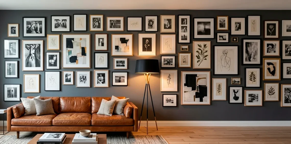
The Freeform Cluster
IMO, the cluster is for the brave souls who hate rules. You start with a small group of three items and just keep adding to the edges in whatever direction feels right at the moment.
I like to maintain a consistent gap—maybe two inches—between every piece to keep it looking like a deliberate collection rather than a storage accident. It feels very ‘cool loft’ and very little ‘I don’t know what I’m doing.’

The Triptych Foundation
Why settle for one focal point when you can have three? I love starting with three large, identical frames that span the width of your main furniture piece.
This creates a massive amount of visual ‘weight.’ Once you have that foundation, you treat the space above and below the triptych as your expansion zones.
It provides a structured ‘spine’ that supports as many smaller, weirder pieces as you want to throw at it later.
Foundational steps:
- Measure the sofa width first
- Hang the center of the triptych at eye level
- Space the three main frames exactly 3 inches apart
- Add smaller frames in the gaps over time

Staircase Ascent
Stairways are usually the most wasted real estate in a house, which is honestly a tragedy. You follow the angle of the stairs, maintaining a parallel line with the steps. I suggest keeping the ‘bottom’ of your gallery about 15 inches above the tread so you don’t accidentally kick a frame while carrying laundry. It’s a layout that naturally grows as you climb, letting you tell a story from the ground floor all the way to the bedrooms. Just don’t get so distracted by the art that you trip!

The Wrap-Around Corner
Corners are tricky, right? Most people leave them empty or shove a dusty fake tree there.
I prefer wrapping the art around the 90-degree bend. It leads the eye from one room to the next and makes the architecture feel integrated with your style.
You treat the corner as a hinge. By placing two frames very close to the actual corner seam, you create a seamless transition that you can expand down both walls indefinitely.
Corner layout perks:
- Maximizes small apartment spaces
- Creates a ‘reading nook’ vibe instantly
- Connects two different living zones visually

Balanced Vertical Columns
If your ceilings are high, use them! I see people crowding art at eye level while leaving five feet of empty space above.
You can create vertical columns of art that draw the eye upward. This modular style allows you to add a new ‘story’ to your tower whenever you find a new piece.
It’s especially effective in narrow slices of wall between windows or doors. Just make sure you have a sturdy ladder before you decide to reach for the ceiling.

Floor-to-Ceiling Statement
This is the ‘maximalist’ dream. You don’t just hang art; you coat the wall in it.
I love this for a dedicated ‘wow’ wall. You start in one corner and just keep building until every square inch of drywall is gone.
It’s incredibly forgiving because the sheer volume of art masks any minor alignment issues. If a frame is slightly crooked, who’s going to notice among the other fifty pieces?
How to execute the maximalist look:
- Mix textures (canvas, paper, wood)
- Include some ’empty’ frames for breathing room
- Vary the frame thicknesses significantly
- Start from the bottom and work your way up

Masonry Style Stagger
Think of this like laying bricks. You offset the frames so that the vertical seams never line up perfectly. I find this much easier to manage than a strict grid because ‘perfect’ is hard to maintain as a collection grows. By staggering the frames, you give yourself permission to use different widths and heights without the wall looking broken. It has a rhythmic, architectural feel that works beautifully in modern homes with clean lines.

Mixed Media Fusion
Why stop at paper and canvas? I love throwing a vintage clock, a brass mirror, or even a decorative plate into the mix.
These ‘non-art’ items act as visual breaks and add a 3D element to your flat wall. It makes the collection feel like it was gathered over decades of world travel.
As you find new treasures, you just slot them into the gaps. Check out this art of blending vintage modern decor guide for more combo tips.
Fusion elements to add:
- Small wall-mounted planters
- Oversized vintage keys or gears
- Woven baskets for texture

The Centered Cross
This layout uses a vertical and horizontal axis that intersect in the middle of the wall. You build outward into the four resulting quadrants.
I like this because it feels very balanced but allows for totally different ‘vibes’ in each corner if you’re feeling eccentric. You can have your family photos in the top left and your abstract prints in the bottom right, and the cross-axis keeps them connected. It’s the perfect compromise for people who can’t decide on a single theme.

Double-Row Symmetry
If you want something that looks like an upscale boutique, go for the double-row stack.
You keep two rows of frames perfectly aligned in height, but the widths can vary. I find this incredibly satisfying to look at because the consistent top and bottom lines frame the ‘chaos’ in the middle.
It’s a modular dream because you can just keep adding pairs of frames to the end of the rows as you acquire them.
Expansion rules:
- Always add in pairs (top and bottom)
- Keep the vertical gap between rows identical
- Use the same matting color for all pieces to tie them together
- Align the outer edges of the pairs

Rotating Spotlight Slot
Every collection has that one ‘current favorite’ piece, right? I suggest leaving one oversized frame in the center that features an easy-access back. You can swap the art in this ‘spotlight’ every month without moving a single nail. The surrounding frames stay fixed, acting as a permanent border for your rotating exhibition. It keeps the wall feeling fresh without requiring a full afternoon of manual labor. ✨

Final Thoughts on Growing Your Wall
Building a gallery wall shouldn’t feel like a permanent life choice. These modular ideas give you the freedom to swap, add, and shuffle your art as your collection grows. Which layout are you tackling first? Let me know in the comments! I personally love the spiral method for its sheer unpredictability. Happy hanging, fellow art hoarder!