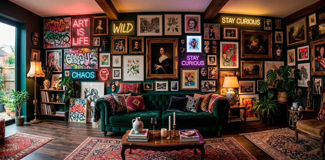
Ever look at your blank walls and think they need a little chaos? I definitely do. 🎨 Safe, matching gallery walls bore me to tears nowadays. You honestly need to mix things up if you want a space with actual personality. We completely ignore the traditional design rules here and smash contrasting styles together until they look dangerously good.
Renaissance Oil Portraits and Blazing Neon
You probably think a brooding 16th-century nobleman has absolutely no business sitting next to a glowing pink neon sign. I thought the exact same thing until I actually tried it! 💡 The intense, classic darkness of the oil paints provides the ultimate backdrop for that harsh, modern electric glow.
Try pairing these:
- A vintage-style moody portrait.
- A custom neon word sign.
- Dark matte wall paint.
This combo forces your brain to process two wildly different eras at once. It just screams rebellious luxury, IMO.

Delicate Botanicals and Gritty Graffiti
Soft, watercolor fern leaves delicately floating beside a harsh, spray-painted street tag? Absolutely yes. 🌿 You take the most serene, grandma-approved nature prints and literally slap them right up against loud, aggressive urban street art. The visual friction here makes both pieces pop ten times harder. The raw energy of the graffiti completely strips away the stuffiness of the botanicals, while the flowers soften the aggressive edges of the spray paint. You get this perfect, chaotic harmony that keeps your guests completely glued to the wall.

Abstract Expressionism and Vintage Comics
Hear me out on this one. You hang a massive, confusing splash of chaotic colors right next to a hyper-structured vintage Batman or Wonder Woman comic panel.
Ever wondered why this actually works?
The rigid black outlines and primary colors of the pop art instantly ground the formless madness of the abstract piece. They speak totally different visual languages but somehow understand each other perfectly.
You basically anchor a wild emotional expression with a familiar, nostalgic story. It adds a totally unexpected layer of playful irony to your living room.

Gilded Rococo Frames and Minimalist Line Art
I absolutely love this pretentious clash! 🖼️ You take the most over-the-top, deeply carved, gold-leafed museum frame you can possibly find. Then, you stuff a single, continuous-line drawing of a face inside it. The contrast between the insanely wealthy, maximalist border and the bare-bones, modern interior feels like a hilarious inside joke. You basically mock the seriousness of traditional art institutions while still keeping things incredibly chic. It proves that you totally understand the rules and actively choose to break them!

Traditional Ukiyo-e and Cyberpunk Digital Prints
Want to time travel on your living room wall? You place a serene 18th-century Japanese woodblock print right next to a glaring, neon-drenched cyberpunk cityscape.
This pairing literally shows the past and the future colliding. 🏙️ The muted indigo and terracotta inks of the Ukiyo-e ground the hyper-saturated digital magentas and cyan blues of the sci-fi art.
You create a bizarre narrative about technological evolution just by hanging two frames side by side. It gives off major sci-fi movie vibes, and honestly, I am completely here for it.

Pastel Watercolors and Gothic Dark Art
Nothing creates visual tension quite like placing a fluffy, pastel-toned landscape right next to a brooding, macabre Gothic sketch. 🦇 You force extreme sweetness to share a border with total darkness, creating an undeniably magnetic pull.
The lightness of the watercolor makes the Gothic art look even more intense and mysterious, while the dark piece prevents the pastel from looking like a nursery room reject. It brings serious Edgar Allan Poe vibes to a Sunday picnic. If you love this dramatic mood, you should definitely check out these moody deep burgundy gothic accents.

Victorian Silhouettes and 1970s Psychedelic Posters
Picture a prim, proper, black-and-white cameo profile completely surrounded by melting fonts and eye-bleeding acid-trip colors. 🍄 This mashup feels incredibly weird, yet it instantly transforms your hallway into an eclectic wonderland. The strict, unyielding lines of the Victorian silhouette act like a visual anchor amidst the swirling, chaotic mess of the 70s rock poster. You basically trap a very serious 19th-century ghost inside a loud disco, and the resulting aesthetic is pure, unfiltered fun.

Folk Art Tapestries and Metallic Geometrics
You really need to mix your textures if you want true maximalism. 🧶
Hang a heavily embroidered, colorful folk art textile right next to a sharp, reflective brass geometric wall sculpture.
The incredibly soft, handmade warmth of the woven yarn clashes beautifully with the cold, precise, machine-made metal. Your eyes bounce wildly between the cozy imperfections of the tapestry and the sharp, mathematical perfection of the geometric piece.
It feels grounding and futuristic all at once, satisfying every single texture craving you possess.

High-Fashion Photography and Kitsch Diner Signs
I strongly believe every sophisticated room needs a little bit of trashy charm. 🍔 You take a sleek, black-and-white Vogue-style editorial shot and hang a cheap, slightly rusted “Hot Dogs 5¢” tin sign right next to it.
The severe glamour of the high-fashion model suddenly looks incredibly funny when paired with fast food marketing. This pairing completely shatters any pretentious vibes in your space. You tell your guests that you have exquisite taste but absolutely refuse to take yourself too seriously.

Chinoiserie Panels and 1980s Memphis Design
This pairing sounds like an absolute disaster on paper, but it looks magical in person. You take a delicate, hand-painted silk Chinoiserie panel featuring birds and cherry blossoms.
Then, you slam a loud, squiggly, primary-colored 1980s Memphis pattern right beside it. 🌸
The elegant, organic curves of the traditional Chinese art strangely complement the wacky, geometric zig-zags of the 80s movement. You get a wildly vibrant, pattern-heavy explosion that somehow balances itself out through pure, unadulterated boldness.

Ansel Adams-Style Landscapes and Pop-Surrealism
Imagine a majestic, sweeping black-and-white photograph of Yosemite Valley sharing wall space with a bright pink, giant-eyed cartoon alien riding a tricycle. 👽 You completely disrupt the quiet majesty of nature with loud, weird, lowbrow art. The serious monochrome landscape provides the perfect quiet stage for the hyper-saturated surrealism to absolutely scream. It honestly feels like someone vandalized a museum in the best way possible. This pairing guarantees a double-take from anyone who walks into your house.

Classical Marble Busts and Op Art Canvases
We usually expect a stoic Roman emperor bust to sit in a boring, wood-paneled library. Instead, you mount that classical marble head directly in front of a dizzying, black-and-white optical illusion canvas. 🏛️
The solid, realistic, 3D curves of the ancient sculpture violently disrupt the flat, vibrating, mind-bending lines of the 1960s Op Art. You basically force antiquity to survive a visual funhouse. It creates an incredible depth of field that makes your wall feel alive and moving.

Nostalgic Travel Posters and Macabre Anatomy
You hang a sunny, optimistic mid-century travel poster of the French Riviera. Then, right beside it, you mount an intricately detailed, slightly creepy vintage medical diagram of a human skull. 💀
Why does this work? It plays heavily on the cycle of life!
You contrast the breezy joy of a summer vacation with the ultimate, gritty reality of human biology. It introduces a subtle, intellectual darkness to a typically cheerful display. If you love weaving scholarly, slightly dark themes into your home, you will obsess over these dark academia book-filled attic office ideas.

Islamic Geometric Art and Messy Splatter Paint
This pairing is a complete battle between total control and absolute freedom. You place a highly intricate, perfectly symmetrical Islamic tile print directly beside a chaotic Jackson Pollock-style splatter canvas. 🎨 The rigid, mathematical perfection of the geometric piece highlights just how delightfully unhinged the paint splatters really are. Meanwhile, the messy canvas keeps the geometric art from feeling too sterile or rigid. They literally balance each other’s extremes, creating a totally fascinating, cohesive maximalist vibe.

Fine Art Portraiture and Satirical Typography
You take a gorgeous, incredibly detailed replica of a moody Renaissance queen. Underneath it, you hang a bold, modern typography poster that just says “Please Leave By 9 PM” in giant pink letters. 👑
The historical elegance beautifully sets up the punchline of the modern, sarcastic text. You use fine art as the straight man in your interior design comedy routine! It brilliantly injects your actual personality into the room while still displaying incredibly gorgeous, high-quality artwork.

Conclusion
Maximalism thrives entirely on your courage to make weird choices! 💥 You absolutely have to stop worrying about whether things “match” and start focusing on whether they make you feel something. These crazy pairings bring actual life and humor into your home. Which of these unhinged art combos are you grabbing first? Let me know in the comments!