Look, choosing colors for a living room usually feels like a terrifying guessing game. But playing it safe with fifty shades of beige? That just guarantees a boring space. I prefer rooms that grab you by the collar the second you walk in. Let’s explore fifteen high-contrast color schemes that will turn your eclectic living room into an absolute masterpiece.
Mustard Yellow & Navy Blue
Let me tell you about my absolute favorite safety net for eclectic design: mustard yellow and navy blue. You get the deep, moody grounding of the navy right alongside the punchy, acidic brightness of the mustard. It just works effortlessly.
Try painting your walls a rich, velvety dark blue and tossing a couple of bright yellow velvet armchairs right in the center. Want to kick it up a notch? Add brass hardware and a vintage Persian rug 🛋️. Ever wonder why this pairing feels so timeless? The extreme contrast forces your brain to pay attention to the room’s architecture.

Emerald Green & Matte Black
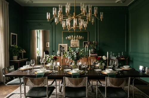
Emerald green and matte black creates a living space that feels like a chic villain’s lair, and I mean that as a massive compliment. Black absorbs light, while jewel-toned green reflects it in the most dramatic way possible. You paint the trim and ceiling a dead-flat black, letting a massive emerald velvet sofa steal the spotlight. Add some bizarre, sculptural lighting, and suddenly your living room looks like a million bucks. People often ask me if black walls make a room feel tiny. The truth? They actually blur the corners and make the room feel endless.

Hot Pink & Forest Green
Need something entirely unhinged but surprisingly elegant? Enter hot pink and forest green.
I initially hated this idea until I saw it executed perfectly in a restored 1920s bungalow.
The organic depth of forest green completely neutralizes the chaotic energy of neon pink. You throw a bright pink abstract canvas onto a dark green wall, and magic happens. It screams confidence.
If you want to replicate this, balance the madness with natural wood floors. Need more quirky inspiration? Check out these 10 vintage-inspired pieces to elevate your decor.

Cobalt Blue & Burnt Orange
Cobalt blue and burnt orange sit directly opposite each other on the color wheel, making them the ultimate high-contrast power couple. Cobalt brings an electric, modern edge, while burnt orange warms everything right back up. I once styled a room using a massive cobalt area rug and a burnt orange leather sectional, and the resulting vibe felt incredibly energetic 🔥.
Does this pairing feel too loud for you? Tone it down by utilizing both colors as secondary accents against a crisp white backdrop. A white room holding two intensely competing colors looks wonderfully deliberate.

Charcoal Gray & Neon Yellow
We all know gray had a chokehold on interior design for a decade. But charcoal gray paired with neon yellow completely flips that boring script.
The dark, stormy charcoal acts as a moody canvas, letting those shocking bursts of highlighter yellow truly sing. You can pull this off easily with an oversized charcoal sectional and exactly two neon yellow throw pillows.
Add some concrete planters and a distressed vintage rug. This combination gives your living room an edgy, industrial loft vibe without trying too hard. It definitely keeps your guests fully awake!

Mint Green & Crimson Red
Do you think red and green only belong in December? Think again. Mint green and crimson red offer a surprisingly fresh, retro aesthetic that completely avoids any holiday cliches. The icy, pastel nature of mint totally cools down the fiery aggression of crimson. I recommend painting the walls a pale, almost-white mint and bringing in a bold red credenza or an oversized crimson armchair. This palette thrives on quirky, mid-century modern furniture silhouettes. Throw in a black and white checkerboard rug to ground the space and give it that authentic eclectic edge.

Plum Purple & Chartreuse
Plum purple and chartreuse creates an atmosphere that feels unapologetically regal and slightly eccentric. Chartreuse provides that weird, yellow-green acidity that slices right through the heavy, royal vibe of the deep plum.
Try styling a deep purple velvet sofa against a chartreuse accent wall. I tried this in a tiny apartment once, and it immediately gave the space a quirky, boutique hotel atmosphere. You absolutely need adequate lighting to pull this off, so load up on brass floor lamps and oversized mirrors to bounce those intense colors around.

Terracotta & Teal
Earthy terracotta and vibrant teal bring a massive dose of Southwestern flair right into your living room.
I completely adore this pairing because it feels grounded yet surprisingly vibrant.
Terracotta provides a baked, clay-like warmth that perfectly contrasts the cool, watery depth of teal. You can use raw terracotta tiles on the floor and paint the surrounding walls a rich teal.
Want to enhance the look? Bring in plenty of lush green houseplants. They bridge the gap between these two contrasting tones effortlessly.

Blush Pink & Hunter Green
Blush pink and hunter green strike the perfect balance between soft feminine energy and masculine moodiness. Hunter green walls anchor the room with an undeniable library-esque sophistication, while blush pink upholstery softens the entire visual impact. FYI, this scheme looks exceptionally stunning when you incorporate natural textures like rattan or cane webbing. I highly suggest adding a blush pink linen sofa and draping a chunky knit throw over the back. This combination feels incredibly high-end, proving that eclectic design doesn’t always have to look chaotic.

Chocolate Brown & Ice Blue
Chocolate brown is making a massive comeback, and pairing it with ice blue gives it a stunning, modern twist. The icy, almost translucent quality of the blue perfectly cuts through the heavy richness of the brown.
A chocolate brown leather sofa looks unbelievably sharp against pale blue walls. I love using this scheme to create a space that feels both nostalgic and forward-thinking.
Incorporate plenty of chrome accents and glass coffee tables to keep the brown from feeling too heavy. This creates a brilliant, light-reflecting modern aesthetic.

Ruby Red & Turquoise
If you want a living room that channels a bohemian bazaar, ruby red and turquoise will get you there immediately. The fiery heat of ruby red aggressively clashes with the cool brightness of turquoise, creating a wildly stimulating environment.
You can achieve this look by layering intricately patterned Turkish rugs over dark wood floors and adding brightly painted turquoise furniture. This palette demands lots of texture, so bring in the velvet, the tassels, and the macrame. If you want more tips on blending aesthetics, read up on these 15 organic modern living room elements.

Slate Blue & Coral
Slate blue and coral offer a beautifully muted alternative to standard high-contrast pairings.
The dusty, grayish undertones of slate blue make it act almost like a neutral.
Coral injects a playful, sunny warmth without the harshness of a true orange or red. I used this combo in my own sunroom, and it instantly brightened my mood every single morning.
Use coral heavily in your artwork and textiles, keeping the larger furniture pieces anchored in that calming slate blue. It feels fresh, inviting, and wonderfully laid-back.

Olive Green & Fuchsia
Olive green and fuchsia deliver a sophisticated, earthy vibe with a totally unexpected neon punch. The muddy, natural tones of olive green provide the perfect backdrop for the synthetic brightness of fuchsia. Think about placing a brilliant pink acrylic coffee table right in front of an olive green linen sofa. This setup tells your guests that you appreciate nature but also know how to throw a killer party. Add some metallic gold accents to bridge the gap between the organic green and the electric pink. It is weird, wonderful, and entirely unforgettable.

Jet Black & Crisp White
You cannot discuss high contrast without honoring the absolute king: jet black and crisp white. But for an eclectic living room, you must push this classic combination further. The secret lies in mixing bizarre, conflicting patterns and adding a massive dose of warm brass.
I strongly recommend painting bold, thick black and white stripes on the ceiling. Pair that with an overstuffed floral sofa and a gallery wall filled with weird, vintage oil paintings. The monochrome base allows you to get absolutely reckless with your art and accessories.

Amethyst & Tangerine
Let us wrap this up with a scheme that screams retro glamour: amethyst and tangerine. This pairing feels like a 1970s fever dream in the absolute best way possible.
The vibrant, citrusy burst of tangerine cuts directly through the luxurious, muted purple tones of amethyst. Try styling an amethyst tufted rug under a sleek, tangerine-colored mid-century modern chair.
IMO, this is the ultimate palette for anyone who wants their living room to feel like a high-end creative studio. It demands attention and completely refuses to apologize for its boldness.

Conclusion
Designing an eclectic living room requires a bit of bravery, but the payoff is absolutely worth it. High-contrast colors breathe life into a space and showcase your unique personality. I hope these wild palettes inspire you to finally ditch the greige and pick up a paintbrush. Which bold combination are you grabbing first? Let me know in the comments!