Blank walls are basically the adult version of a terrifying blank canvas. I remember staring at my living room for months, paralyzed by the fear of hammering that first nail. Honestly, creating a stunning focal point shouldn’t require an interior design degree. We just need a solid game plan. Let’s figure out how to arrange your favorite pieces so your space looks effortlessly chic and intentional.
The Classic Symmetrical Grid
Ever crave that high-end art gallery vibe without leaving your house? The symmetrical grid layout is your absolute best friend.
This setup relies entirely on identical frames and exact spacing, bringing a serious dose of order to any room. I love using this layout above a sleek sofa or a minimalist console table. It instantly tricks the eye into thinking you have your life completely together. Precision is key here, so grab a tape measure and maybe a laser level if you feel fancy.
Grid layout essentials:
- Matching square frames
- Black and white photography
- Precision laser level

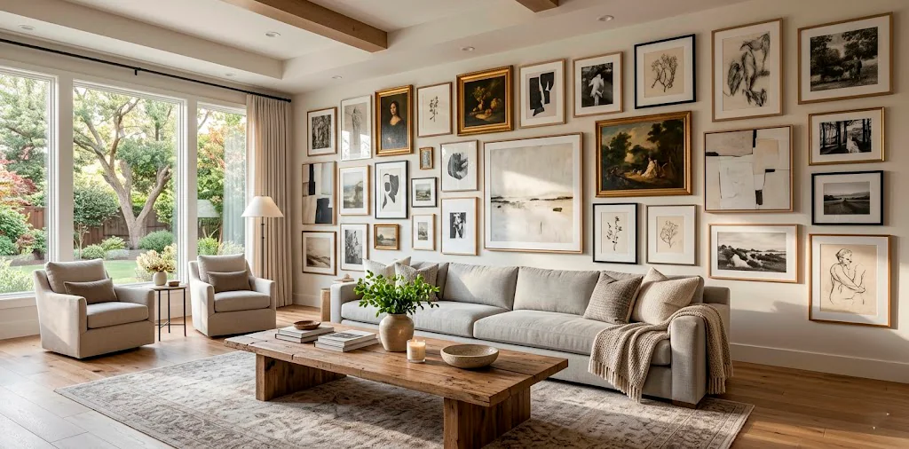
The Controlled Chaos Eclectic Mix
Minimalists, you might want to look away right now.
The eclectic mix throws the traditional rulebook straight out the window. You basically gather all your favorite mismatched pieces and build an organic, unstructured cluster.
I usually start with one large anchor piece slightly off-center, then build outward using different frame styles, textures, and even small mirrors. The trick is maintaining equal spacing between the wildly different items.
Does it look chaotic while you build it? Absolutely. But the final result screams effortless cool.

The Staircase Ascend
Decorating a staircase feels like an extreme sport, right? The angled layout solves this tricky transition zone beautifully. You simply follow the exact angle of your stairs, creating a rising diagonal baseline for your bottom frames. I always suggest keeping the center of your artwork right at eye level as you walk up the steps. Mix family photos with landscape prints to keep the journey upstairs interesting. Just ensure you secure those frames properly—nobody wants a rogue frame tumbling down the steps in the middle of the night!

The Minimalist Floating Ledge
Commitmentphobes, this one has your name written all over it! 😎
Picture ledges offer the absolute easiest way to display art because you never have to commit to a permanent nail hole for every single piece. You just install two or three sleek floating shelves and casually lean your framed prints against the wall.
I swap my art out seasonally using this exact method. Layering is the secret sauce here. Place larger frames in the back and slightly overlap smaller, contrasting frames in the front for a casual, lived-in depth.

The Wraparound Corner Hook
Why let a perfectly good corner go to waste? The wraparound layout literally folds your gallery across two adjoining walls.
This unexpected design totally transforms a dead space into an immersive art experience. I love anchoring the corner with two prominent pieces on either side of the seam, then letting the rest of the collection trail off organically. It draws the eye right through the room and makes your space feel noticeably wider. Ever tried this trick in a tiny apartment? It practically works magic.

The Floor-to-Ceiling Statement
Sometimes you just need to go big or go home. The floor-to-ceiling layout transforms an entire wall into custom wallpaper made entirely of framed art. I typically reserve this dramatic approach for narrow hallways or small powder rooms where you want maximum impact without sacrificing floor space. You absolutely must plan this on the floor first. Cover the entire vertical span, mixing large statement canvases with tiny, intricate sketches. It surrounds you completely and commands immediate attention from anyone walking into the space.

The Organic Cloud Flow
Think soft, sweeping, and totally natural.
The organic cloud layout avoids hard edges entirely, forming a soft, rounded shape on your wall.
Instead of aligning the outer edges to an invisible square, you let the arrangement ebb and flow. I usually put the heaviest, darkest pieces right in the center to anchor the “cloud,” and scatter lighter, smaller frames toward the wispy edges.
This arrangement feels incredibly calming and works wonders above a curved velvet sofa or an oval dining table.

The Bold Modern Triptych
Craving maximum impact with minimal effort? The triptych layout is your savior.
You split one large image across three identical vertical frames, or hang three cohesive oversized pieces side-by-side. I always leave about two inches of breathing room between the panels. This setup screams modern luxury and fills a massive blank wall effortlessly. Plus, hanging three frames requires significantly less math than plotting out a twenty-piece grid. It offers clean lines, striking visuals, and zero visual clutter.

The Symmetrical Axis
Imagine drawing an invisible line straight down the middle of your wall.
The symmetrical axis layout balances different frame sizes on either side of that exact center line. It offers the satisfying balance of a formal grid, but gives you the freedom to mix vertical and horizontal frames.
IMO, I find this layout incredibly pleasing to the eye. You get a curated, dynamic look that still feels incredibly intentional and polished.

The 3D Mixed Media
Who says a gallery wall can only hold flat paper? The mixed media layout breaks all dimensional rules by incorporating 3D objects right alongside your framed prints. I love weaving in woven wall baskets, brass sconces, sculptural ceramic pieces, or even trailing indoor plants. This tactile approach adds incredible depth to a flat room. You treat your 3D objects exactly like framed art, spacing them out to ensure visual balance. It immediately turns a standard wall into a curated museum of your favorite treasures.

The Thrifted Vintage Collection
This layout is basically a love letter to weekend flea markets.
The thrifted collection thrives on absolute inconsistency. You combine ornate gold frames, chipped wooden borders, and tarnished silver edges into one cohesive display.
I usually stick to a loose theme—like moody landscapes or vintage portraits—to stop the wall from looking like a chaotic yard sale. The charm lies in the history of the pieces.
It feels collected over decades rather than purchased in a single afternoon. Want to nail this aesthetic? Check out our vintage irish landscape gallery wall ideas for some epic inspiration.

The Minimalist Single Horizon Line
Sometimes, less truly is more. The minimalist line features a single, perfectly straight horizontal row of equally spaced frames.
I rely on this layout for long, empty hallways or directly above an extended dining room table. It draws the eye horizontally, making your room feel significantly wider.
Line layout rules:
- Identical frame sizes
- Consistent 2-inch spacing
- Unified color palette
It provides a sharp, sophisticated edge without overwhelming the senses.

The Television Camouflage Anchor
Let’s be honest: giant black TV screens are massive design buzzkills. The TV anchor layout specifically surrounds your television with a vibrant gallery wall, effectively disguising the tech as just another piece of art. I always align the frames around the screen’s borders to integrate it seamlessly into the cluster. If you have a frame TV that displays digital art, this layout practically renders the television invisible. Don’t leave the screen floating alone; surround it with life and color to instantly cozy up your entertainment zone.

The Monochromatic Color Block
Ready for a serious mood booster?
The color block layout unifies wildly different art styles through a single, bold color palette. You might mix typography, abstract blobs, and photography, but every single piece features deep emerald greens or vibrant terracottas.
I love painting the wall behind the frames the exact same color for a high-impact, drenched look. This hyper-focused approach brings visual peace to an otherwise busy arrangement.

The Asymmetrical Hallway Runner
Hallways are notoriously difficult to decorate, but they offer prime real estate for a sprawling art collection. The asymmetrical runner layout stretches horizontally down a corridor, staggering frames at varying heights.
I advise staggering the pieces so the eye naturally bounces up and down as you walk down the hall. It prevents the space from feeling like a sterile corporate tunnel. Need help getting your photos to look cohesive before framing them? Check out our guide on how to edit photos cohesive gallery wall.

Conclusion
Nailing the perfect gallery wall layout completely transforms the atmosphere of your home, turning empty vertical space into a deeply personal showcase. Whether you lean toward the strict precision of a classic grid or the vibrant chaos of a mixed media display, there is absolutely a setup here with your name on it. Don’t let fear paralyze your design dreams—grab your hammer, embrace a little trial and error, and start hanging. 😉 So, which of these 15 gallery wall layouts are you trying out first? Let me know in the comments!