Ever tried fitting a bed, a mountain of toys, and actual breathing room into a tiny kids’ bedroom? It feels impossible. But paint is your secret weapon, transforming cramped boxes into spacious wonderlands. I once painted a microscopic nursery dark blue—huge mistake! Let’s explore ten bright and airy color palettes that instantly double your square footage visually.
Soft Mint Green and Crisp White
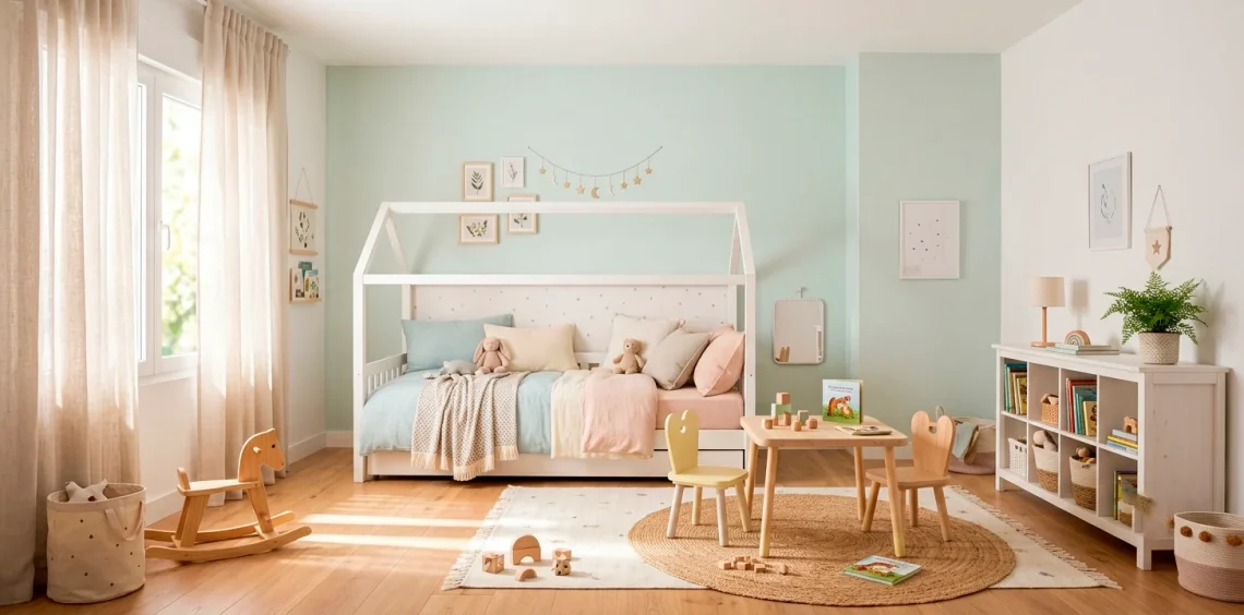
Let me tell you, soft mint green paired with crisp white is absolute magic for small spaces. This combination bounces natural light around the room like a pinball machine, instantly tricking the eye into perceiving more depth.
You get a playful punch of color without that heavy, cave-like feeling. Pair this airy backdrop with light wood furniture and suddenly, that tiny footprint feels incredibly spacious. Who doesn’t want their kid’s room to feel like a breezy spring morning?

Sunshine Yellow and Pale Gray
Sunshine yellow and pale gray balance each other out flawlessly. Yellow brings that joyful, boundless energy kids naturally possess, while a soft gray completely grounds the design so it doesn’t become visually overwhelming. IMO, this pairing works best when you keep the gray incredibly sheer. Use yellow as your dominant accent color on textiles or a single feature wall, leaving the gray to subtly push the remaining walls outward. You get sunshine without the squint, making the room feel open, warm, and highly inviting.

Warm Peach and Creamy Vanilla
Think beyond standard pinks and explore warm peach mixed with creamy vanilla.
This duo wraps the room in a comforting hug while maintaining a very lightweight visual profile.
Peach undertones catch morning sunlight beautifully. Charming design elements for this look:
- Vanilla-painted wainscoting
- Peach upper walls
- Light linen curtains
- Natural woven baskets
I absolutely adore this palette for its gentle, sun-baked vibe that keeps shadows at bay.

Sky Blue and Sandy Beige
Sky blue and sandy beige essentially bring a relaxing day at the beach right into your home. Blue naturally recedes from the eye, which practically forces the walls to look further away than they actually are. When you introduce sandy beige through textured rugs or natural wood flooring, you completely avoid that sterile, icy hospital feeling. This palette breathes life into cramped corners, especially when you skip heavy drapes and let the natural light pour in unobstructed.

Lavender and Crisp Silver
Lavender often gets a bad rap as a dated nursery color, but pairing it with crisp silver completely reinvents it.
FYI, modern lavender has gray undertones that feel incredibly sophisticated. Silver accents reflect light, adding a subtle shimmer that expands the visual boundaries of a small room.
You create a magical, whimsical atmosphere that still feels clean and bright. Try incorporating silver through sleek light fixtures or subtle wall decals.

Blush Pink and Soft Sage
Blush pink and soft sage green draw inspiration directly from a blossoming spring garden. Green connects the interior to the outdoors, blurring the lines of the room and making it feel less enclosed.
Blush adds a necessary warmth that keeps the sage from reading too cold. I love using this combination because it feels vibrant yet totally tranquil. It proves you don’t need stark white walls to achieve a bright, airy aesthetic in a compact space.

Icy Teal and Clean White
Icy teal mixed with clean white delivers an invigorating, high-energy contrast that totally revitalizes a tiny bedroom. Because icy teal holds cool undertones, it visibly pushes walls backward, expanding your perceived square footage. Keep the ceiling and trim bright white to lift the room upwards, ensuring the bold teal never feels heavy or oppressive. It feels fresh, punchy, and surprisingly vast. Since you’re already maximizing visual space with this bright teal, you might also want to check out these space-saving storage solutions for minimalist bedrooms.

Pale Lilac and Warm Oat
Pale lilac and warm oat create a beautifully muted, organic environment.
Lilac offers a whisper of color that softens the room, while oat introduces a grounded, earthy warmth.
This combination excels in rooms with limited natural light.
The oat tones prevent the lilac from turning muddy in shadows. I recommend leaning heavily on oat for your larger furniture pieces and keeping the walls a barely-there lilac.

Muted Terracotta and Pale Sand
Muted terracotta and pale sand might sound heavy, but when you choose desaturated versions, they completely open up the room. These sun-drenched shades warm up the space without demanding too much visual weight.
Think of a breezy Mediterranean villa. Pale sand on the walls reflects light beautifully, while muted terracotta accents draw the eye around the room, keeping the layout dynamic.

Crisp White and Warm Wood Accents
Sometimes, the absolute best way to brighten a tiny room is by going back to basics.
Crisp white walls act as a massive reflector for every ounce of sunlight, while warm wood accents prevent the room from feeling like a sterile laboratory. Wood introduces necessary texture and organic warmth.
This minimalist approach removes visual clutter, making a tiny kids’ room feel incredibly expansive and calming. If you love this earthy, pared-down look, I highly recommend exploring these ideas for sophisticated neutral tones in a high-end kids’ space.

Conclusion
Picking a palette for a tiny room doesn’t mean you must sacrifice personality for plain white walls. By embracing these bright and airy combinations, you instantly create a magical space that actually feels breathable! Which of these color combos are you grabbing first? Let me know in the comments below!