Your living room wall shouldn’t look like a waiting room at the dentist’s office. I’ve spent way too much time staring at depressing ‘live, laugh, love’ signs in my early years. You want a vibe that screams sophisticated art collector while your bank account whispers ‘maybe just a taco today.’ Stop ignoring those blank spaces. You deserve a home that reflects your actual personality. Ready to start your transformation?
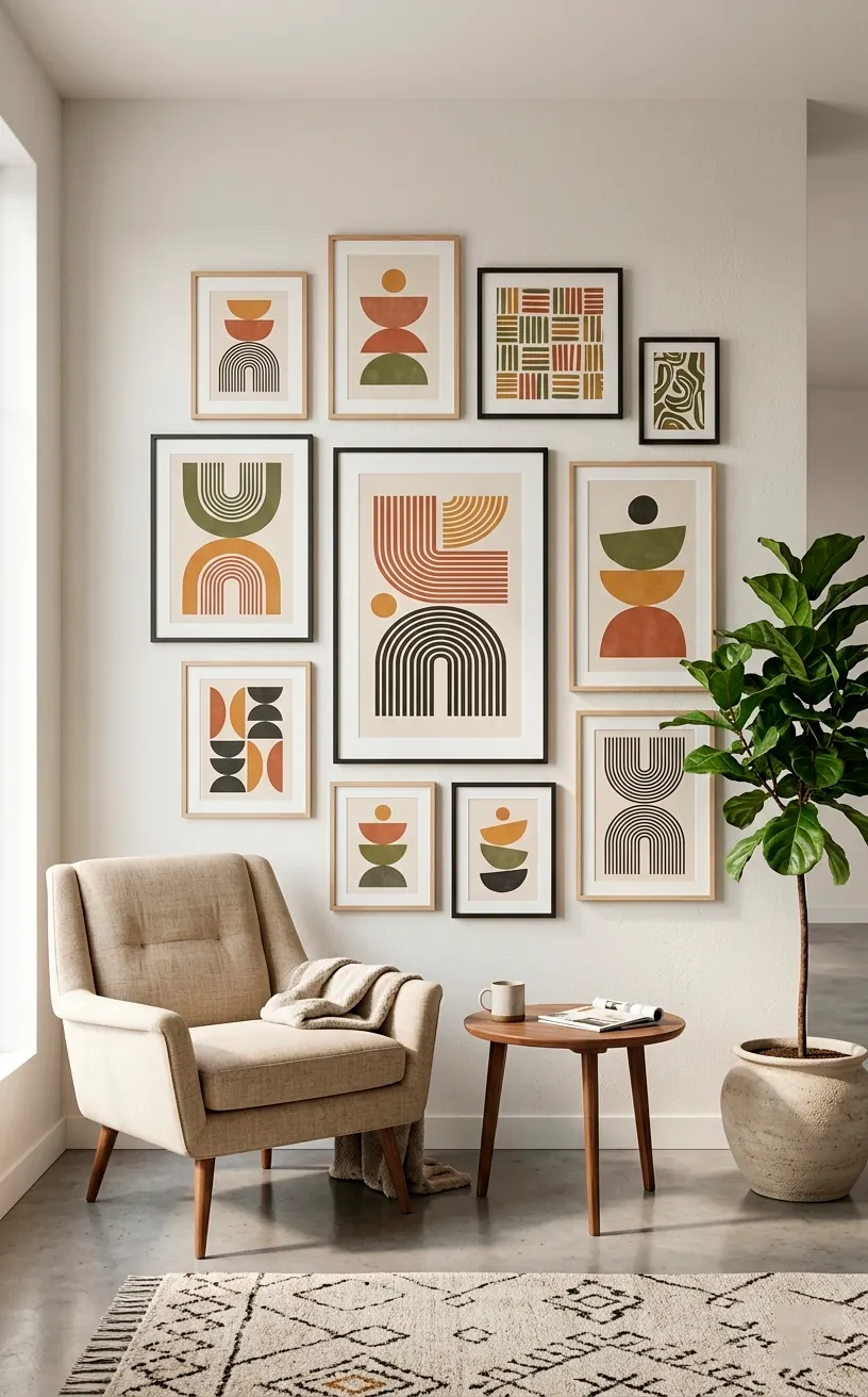
Defining Your Visual Signature
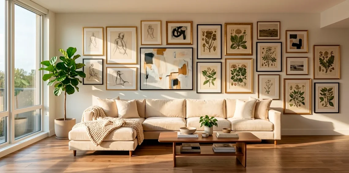
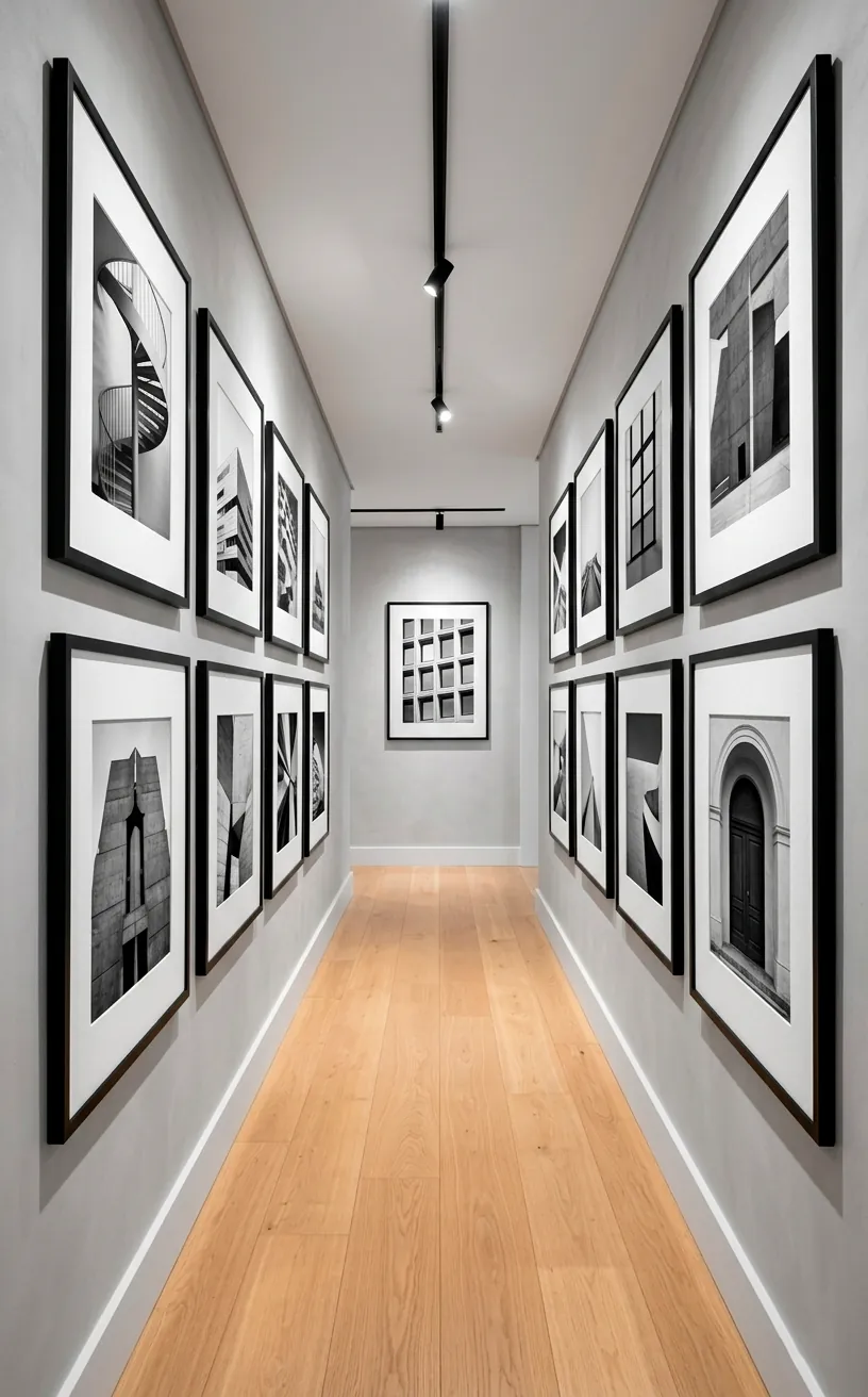
Most people just start hammering nails and hope for the best. Don’t be that person. You need a cohesive theme, whether it’s vintage botanical prints or moody black-and-white photography. Why settle for a chaotic mess when a little planning creates a masterpiece? I usually stick to a specific color palette to keep things looking intentional. This strategy prevents your wall from looking like a cluttered junk drawer. You want a curated collection, not a scrapbooking accident.
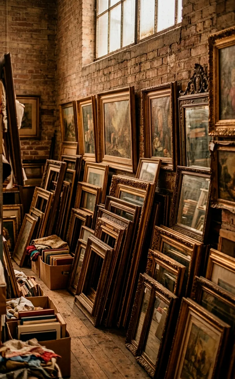
Hunting for Thrifted Treasures
High-end art doesn’t require a high-end price tag. Hit up local thrift stores or Facebook Marketplace for unique frames and forgotten gems. Sometimes the ugliest 80s landscape hiding in a dusty corner has a frame worth its weight in gold. Have you checked the clearance bin at your local craft store lately? You’d be surprised what a $5 can of gold spray paint can do for a tacky plastic frame. IMO, the hunt is the best part of the process. :/
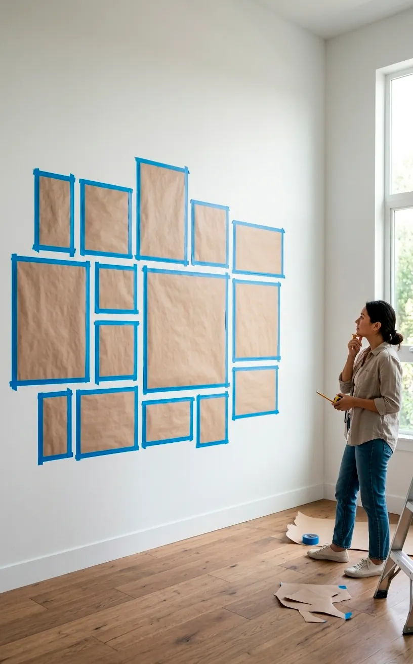
Planning the Perfect Layout
I once turned my wall into Swiss cheese because I skipped this step. Please, use butcher paper or old newspapers to map out your frames first. Tape these cutouts to the wall with painter’s tape to visualize the spacing. Does that large frame look better on the bottom left or dead center? Moving paper is much easier than patching drywall at midnight. This simple trick saves your sanity and your security deposit. It turns guesswork into a science.
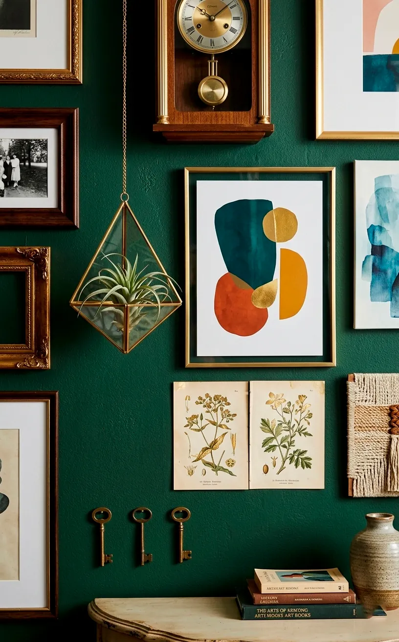
Mixing Textures and 3D Objects
A gallery wall consisting only of flat photos feels a bit one-dimensional. Throw in a small wall planter, a decorative clock, or even a woven basket to add some soul. These 3D elements break up the monotony and give the eye a place to rest. Who knew an old brass key could look so chic next to a modern sketch? Variety is the spice of life, or at least the spice of your decor. It adds a professional layer of depth that flat frames just can’t match.
The Magic of Uniform Framing
Uniform frames look professional, but buying ten matching ones at a boutique will bankrupt you. Buy mismatched frames from the dollar store and unify them with a single color of matte spray paint. Use white mat boards to give even the cheapest postcards a museum-quality look. FYI, a thick white border makes everything look ten times more expensive. It tricks the brain into seeing fine art where you only placed a cool napkin. Consistency is your best friend.
Executing a Level Installation
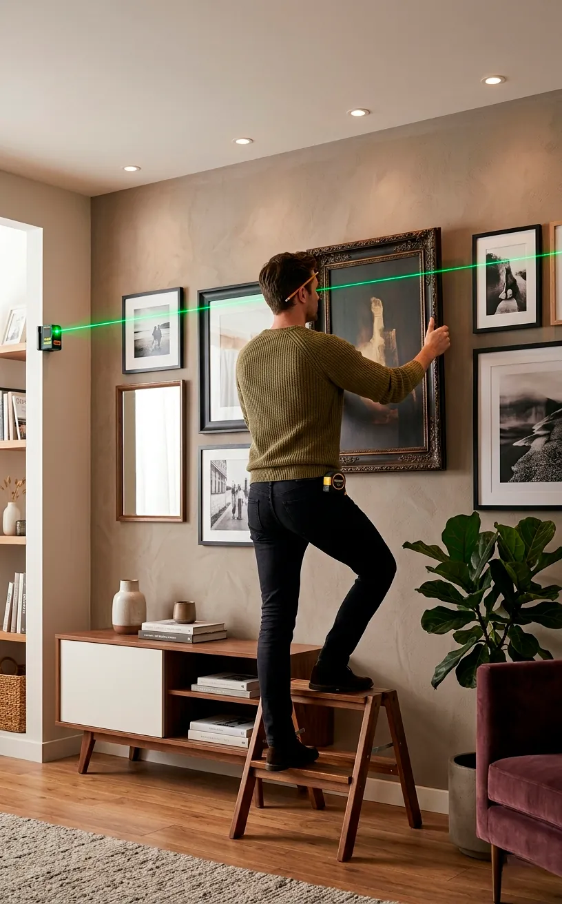
This is where the magic happens. Use a laser level because eyeballing it is a recipe for disaster and a crooked neck. I love using command strips to avoid permanent damage, especially if you’re renting. Ever noticed how a perfectly straight line makes even the weirdest art look curated? Keep a consistent gap between your frames for that professional finish. It looks tight, clean, and intentional. 🙂 Your future self will thank you for the extra effort.
The Final Masterpiece
You don’t need a gallery owner’s budget to create a space that feels like home. Start small, trust your gut, and don’t take the process too seriously. Your wall should tell your story, not a corporate catalog’s. Why not grab that hammer and start today? After all, that giant blank wall won’t decorate itself. Go show it who’s boss! You’ve got this.