You probably think painting your bedroom charcoal will turn it into a literal cave, right? I used to feel the same way until I realized that dark walls actually make a space feel infinite. Forget those boring ‘safe’ neutrals for a second. We’re talking about creating a vibe that feels like a warm hug at the end of a long day. Let’s get you confident.
Debunking the Cave Myth
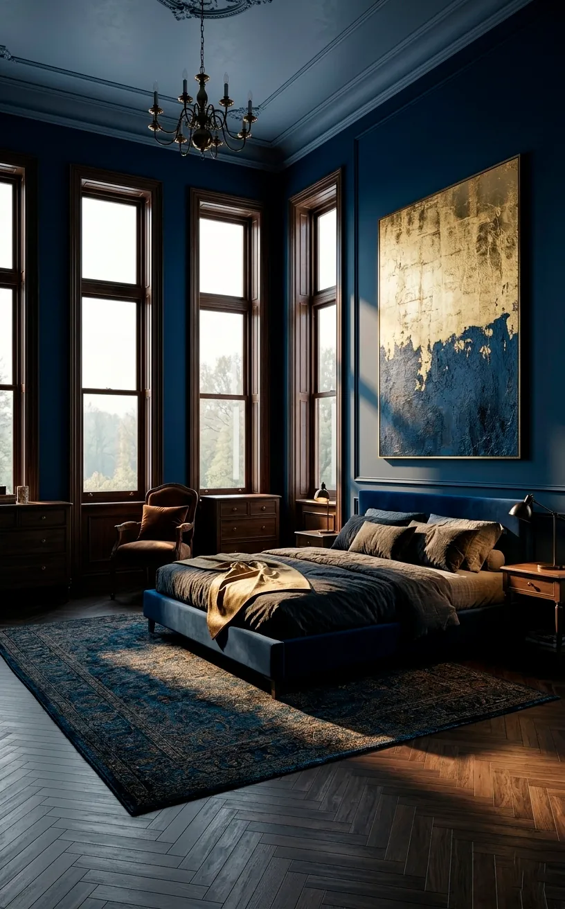
People always tell me they’re terrified of small rooms getting smaller with dark paint. Honestly, that’s just a design old wives’ tale! Dark colors actually blur the edges of a room, making the corners disappear into the shadows. This visual trick creates an illusion of depth that white paint simply can’t mimic. IMO, the ‘cave’ feeling only happens when you forget to balance the room.
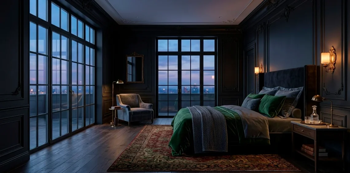
Doesn’t it feel more sophisticated to lean into the mood? 🦇 Instead of fighting the lack of light, you’re basically giving the room a massive personality upgrade. I love how a deep navy or a smoky teal provides a dramatic backdrop for literally anything you put in front of it. It’s not about losing space; it’s about gaining atmosphere.
Lighting is Your Secret Weapon
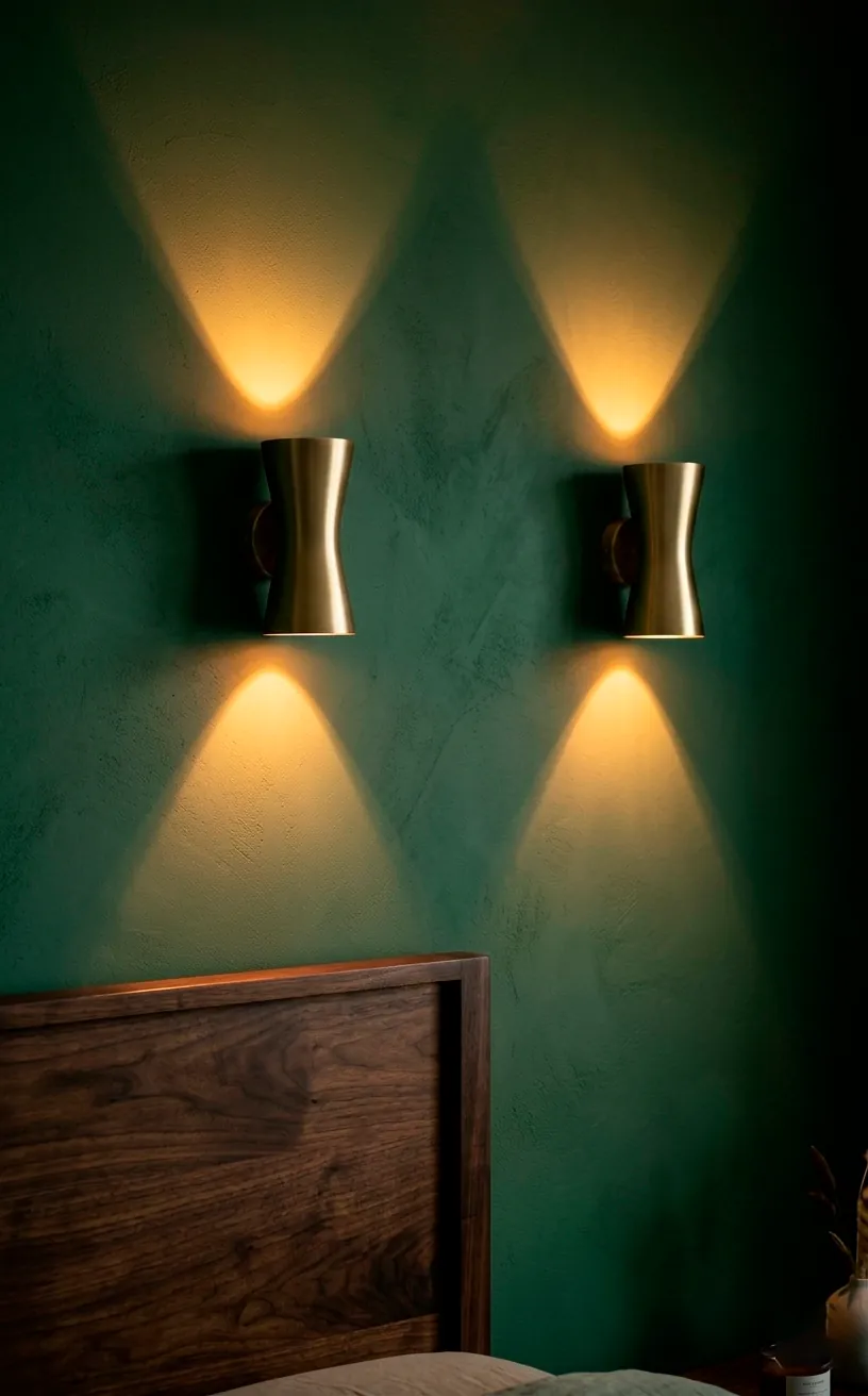
You can’t just slap on some navy paint and keep that single, sad overhead light on the ceiling. It’ll look tragic, trust me. Layered lighting saves the day here. I’m talking about warm sconces, dimmable floor lamps, and maybe a cheeky LED strip behind the headboard. When you control the shadows, you control the magic. Why settle for ‘bright’ when you can have ‘enchanting’? 🕯️ Always choose ‘warm white’ bulbs to keep the dark colors from looking muddy or cold. One well-placed lamp does more for a dark room than five ceiling lights ever could.
Texture Keeps the Room From Looking Flat
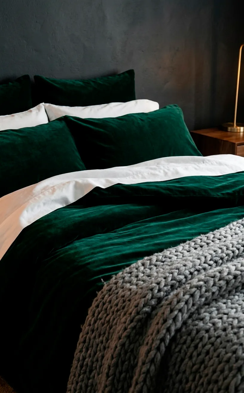
If everything is matte and dark, your room will look like a 2D rendering gone wrong. You need contrast in the actual feel of the materials to bring the space to life.
I recommend these essential texture elements:
- Chunky knit throws for that high-end comfort.
- Velvet pillows that catch the light at different angles.
- A plush jute or high-pile rug to ground the space.
- Linen curtains that offer a breezy contrast to heavy walls.
Velvet is basically a cheat code for moody rooms. It adds depth because it reflects light differently depending on which way you brush it. Ever touched a wall and wished it felt as good as it looked?
Limewash paint or grasscloth wallpaper adds that tactile dimension that plain flat latex just can’t touch. These finishes create movement on the walls, making the dark color feel organic rather than oppressive. Trust me, your hands will thank you as much as your eyes do! ✨
The Ceiling as the Fifth Wall
Most people stop at the crown molding, leaving a bright white ceiling that sticks out like a sore thumb. Huge mistake! I always suggest painting the ceiling the same color as the walls to create a seamless ‘cocoon’ effect. It removes the harsh boundary where the wall ends and the ceiling begins.
It makes the ceiling feel higher, weirdly enough. If you’re feeling extra brave, try a high-gloss finish up there. It reflects the floor lamps and creates a watery, dreamlike reflection that looks incredibly expensive. Have you ever considered that your ceiling might be the most neglected part of your design? LOL, it’s time to fix that.
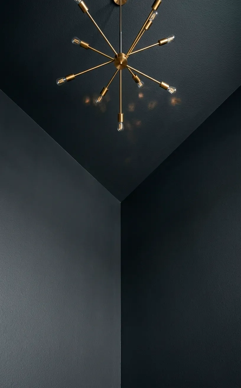
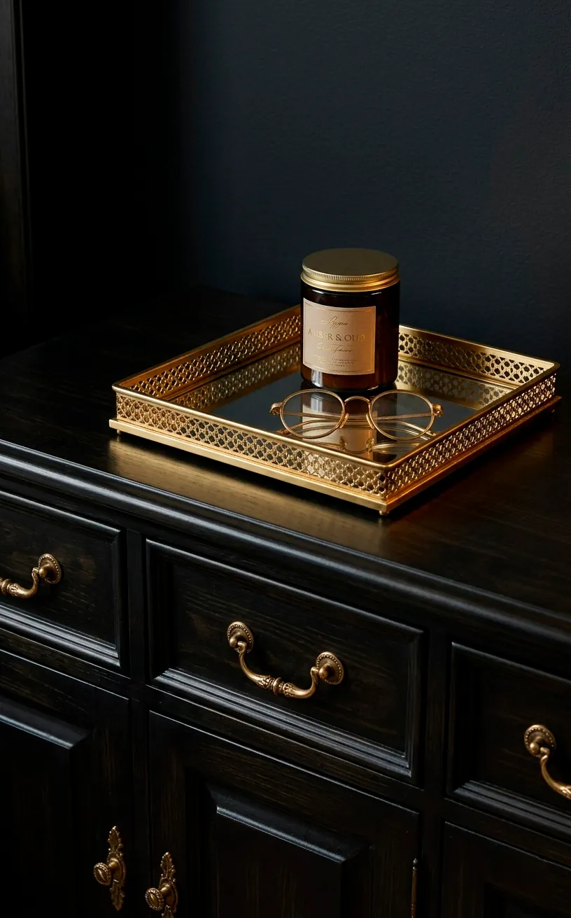
The Power of Metallic Accents
Dark colors need a ‘pop’ to keep them from feeling heavy. Gold, brass, or even copper acts like jewelry for your room. I once used matte black walls with brushed gold sconces, and it felt like a five-star hotel.
Would you wear a black dress without any accessories? Probably not. Your room deserves the same level of attention to detail. 💍
These metallic touches reflect light back into the room, creating tiny focal points that guide the eye. It breaks up the darkness and adds a sense of luxury that silver or chrome often lacks in a moody setting. Keep the metals consistent to ensure the room feels cohesive rather than chaotic.
Choosing Furniture That Pops
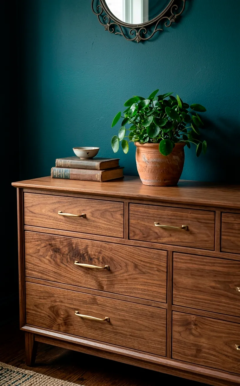
Natural wood tones are your best friend in a moody space. Mid-century modern walnut or even a light oak prevents the room from feeling like a black hole. I love how a warm wood grain stands out against a deep forest green or plum. It brings a bit of nature indoors, which balances out the drama perfectly. Don’t be afraid of a little contrast! A light-colored wood dresser or a rattan headboard can provide just enough ‘breath’ to keep the vibe relaxed and approachable rather than stiff and formal.
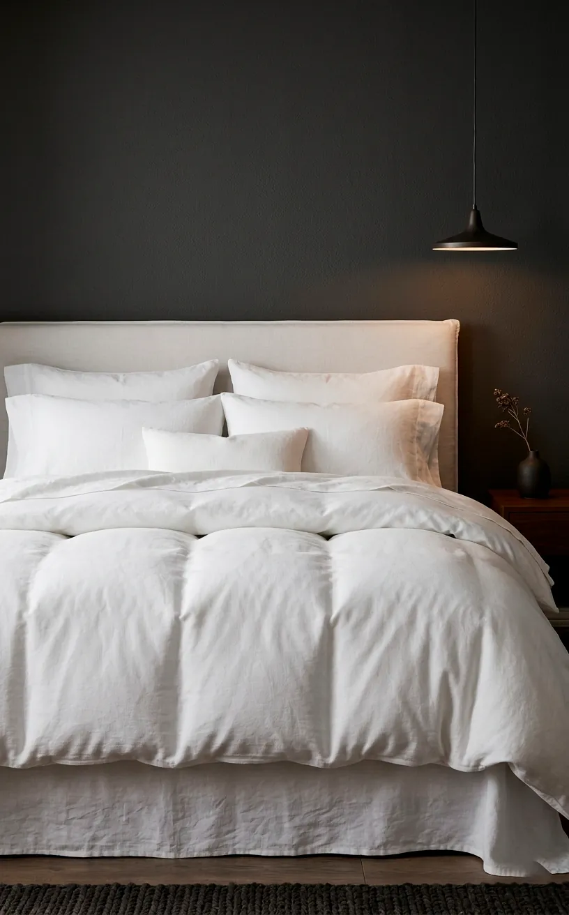
Bedding as the Final Focal Point
Your bed is the centerpiece, so don’t let it get lost in the shadows. Crisp white linens provide a sharp contrast that looks incredibly clean and inviting against dark walls. It’s the classic ‘hotel’ look that never fails.
Alternatively, go full ‘monochrome’ with linens just a shade or two lighter than your paint. This approach feels expensive and very deliberate. FYI, linen fabric specifically adds a relaxed, lived-in vibe that keeps the ‘moody’ look from feeling too stuffy. 🛏️ Which style suits your personality more—the bright contrast or the moody monochrome? Either way, make sure those pillows look plump!
Conclusion
Dark bedrooms aren’t just a trend; they’re a lifestyle choice for people who actually value sleep and style. You’ve got the tools now—lighting, texture, and a bit of courage. Stop overthinking the paint swatches and just go for it! Your future, cozy self will definitely thank you. So, are you team Navy or team Charcoal? Let me know in the comments!