Ever stared at a big, empty wall in your living room and felt personally insulted by its blankness? I’ve been there. You want that ‘designer’ look, but instead, you’re just holding a hammer and feeling overwhelmed. Transforming a wall into a masterpiece doesn’t require a fine arts degree—just a solid plan and maybe a little bit of caffeine. Let’s get your home looking like a curated museum, minus the ‘do not touch’ signs.
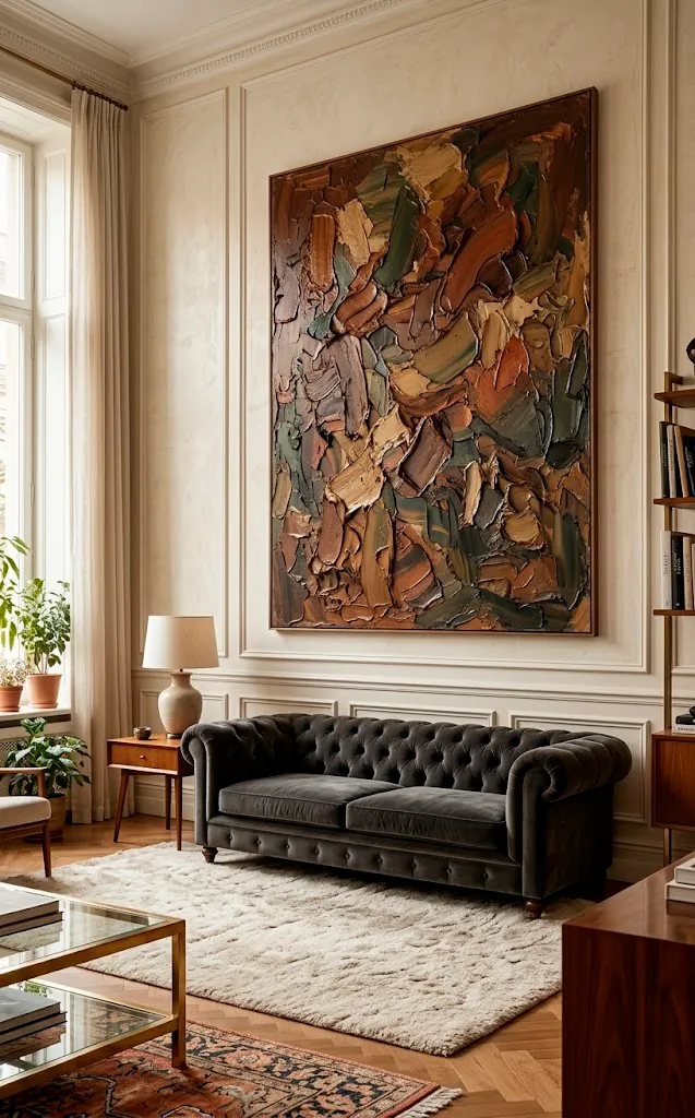
Choose a Strong Anchor Piece
Start with a heavy hitter. I’m talking about that one ‘hero’ piece that commands the room before you even sit down. Why settle for a sea of tiny frames when one massive canvas can do the heavy lifting? This anchor piece sets the scale for everything else. You place it slightly off-center or dead middle, and suddenly, the wall has a pulse. It’s the visual equivalent of a lead singer; everyone else is just the backing band. Seriously, don’t skip this part if you want a professional look. You can find more inspiration for these spaces in our guide to 7 art ideas to fill those awkward blank walls.
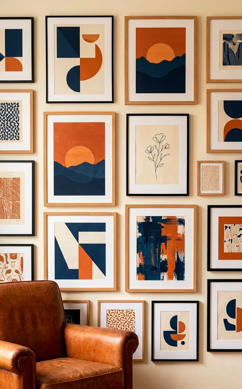
Master the Cohesive Color Palette
Ever noticed how some gallery walls look like a chaotic thrift store explosion? That’s usually because they ignored the color wheel. You don’t need everything to match perfectly—that’s boring—but you do need a common thread. Maybe every piece features a splash of navy, or perhaps you stick to warm sepias and golds. FYI, a unified palette makes even the most random collection of prints look intentional and expensive.
I once tried to mix neon pink with vintage Victorian sketches, and let’s just say my living room looked like a clown’s fever dream. Lesson learned: pick three main colors and stick to them. It keeps the eye moving without causing a headache.
Does your room feel too cold? Bring in some warm-toned art to balance the vibe. If your furniture is already loud, keep the art palette muted to let the room breathe.
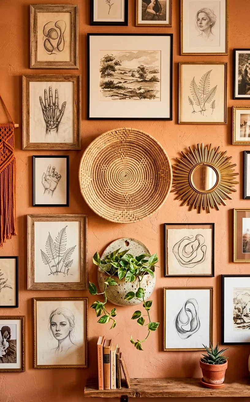
Mix Your Mediums for Depth
If every single thing on your wall is a flat, framed print, you’re missing out on the secret sauce: texture. Why not toss in a woven basket, a small brass sculpture, or even a vintage clock? Adding three-dimensional objects breaks up the monotony of flat glass and paper. It creates shadows and layers that make people want to walk up and really look at your wall.
Think of it as accessorizing an outfit. The prints are the clothes, but the 3D elements are the jewelry. A well-placed object can fill those awkward gaps where a rectangular frame just won’t fit. It’s these little ‘rule-breaking’ moments that turn a generic layout into something truly personal.
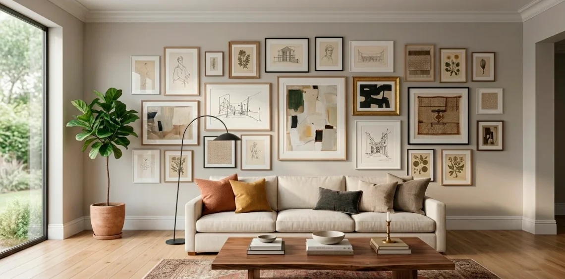
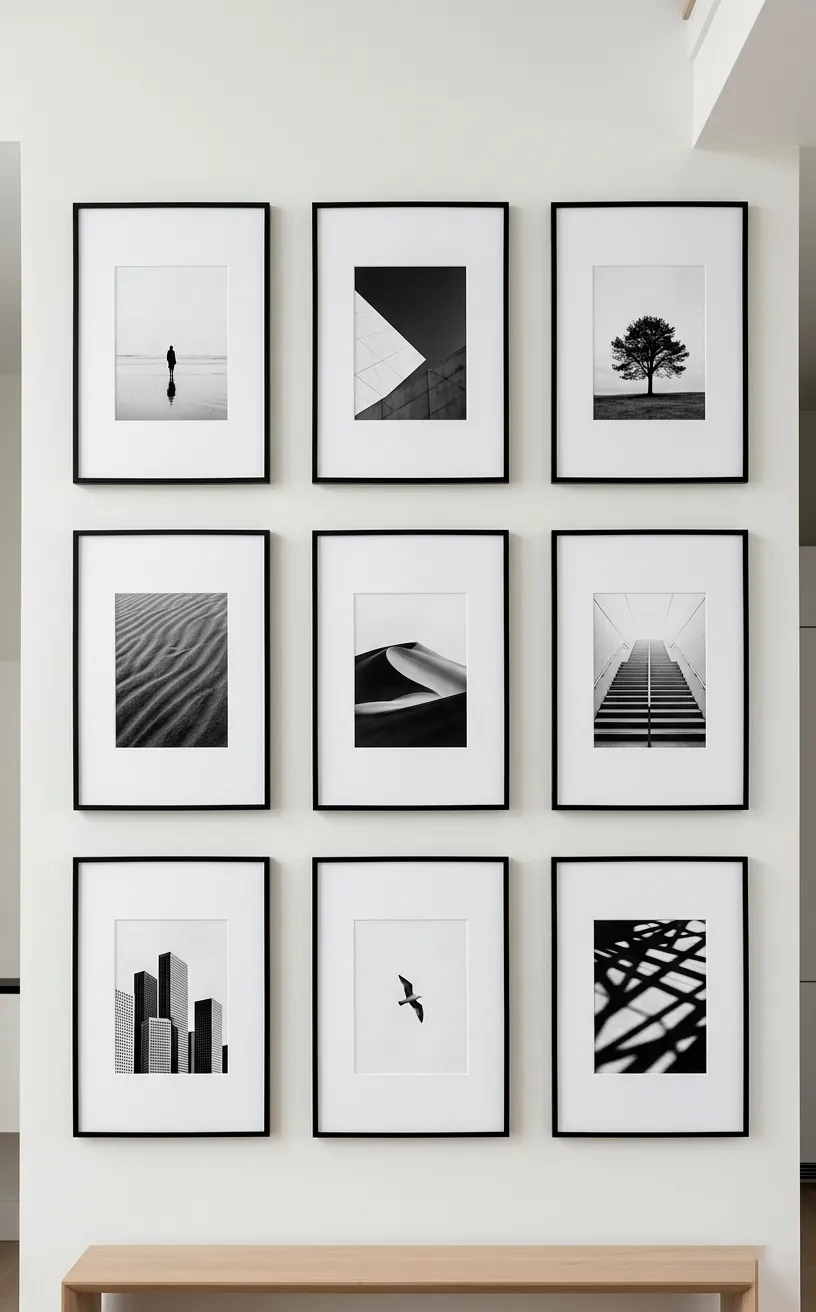
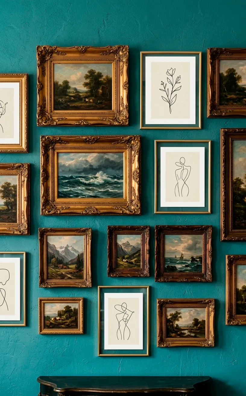
Symmetrical Grids vs. Organic Flow
Are you a perfectionist who needs every line to align, or do you prefer a ‘perfectly messy’ vibe? There is no wrong answer here, but the strategy matters.
A grid layout—think nine identical frames in a 3×3 pattern—is timeless. It’s clean, it’s organized, and it screams ‘I have my life together.’ It works exceptionally well in formal living rooms or above long sideboards where you want to emphasize symmetry.
On the flip side, the organic ‘salon style’ layout is for the rebels. You start with your anchor piece and grow the collection outward. It feels more lived-in and allows you to add new pieces over time without ruining the whole setup.
Ever wondered which style fits your personality better? If you can’t stand a crooked frame, go for the grid. If you love a good treasure hunt, go organic. If you’re struggling with the layout near a television, check out these 10 modern living room tv wall ideas for a seamless integration.
The Frame Game Strategy
Frames are more than just protectors for your art; they are the architectural bones of your gallery wall. IMO, people underestimate how much the frame style dictates the room’s mood. If you want a sleek, contemporary look, go for thin metal frames with oversized mats. It creates a lot of white space and looks incredibly high-end.
Want something more bohemian or vintage? Mix up the finishes! I love pairing a chipped flea-market frame with a sleek modern one. It tells a story and makes the wall feel like it was collected over decades rather than bought in one afternoon. Just remember to keep the spacing consistent—usually about two to three inches—to keep the ‘eclectic’ from turning into ‘cluttered.’
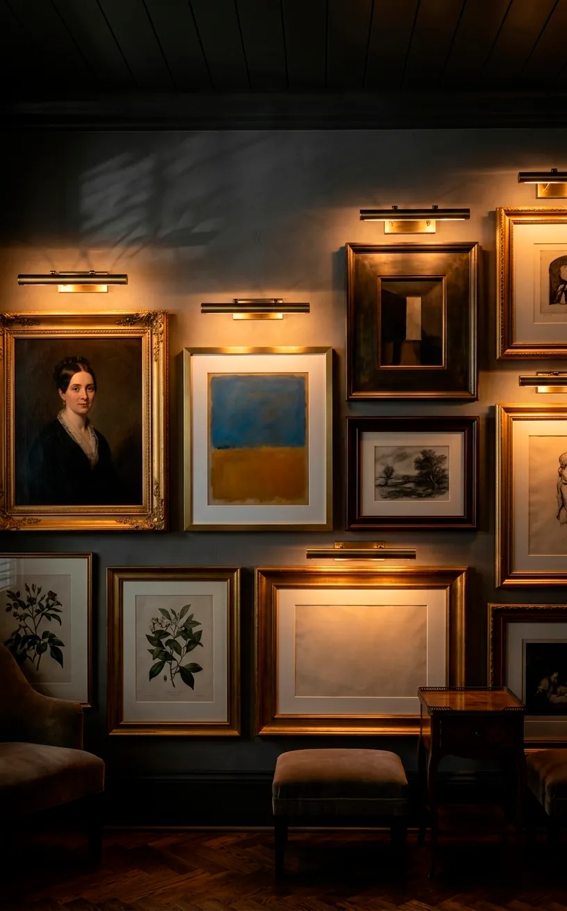
Don’t Forget the Lighting
You’ve spent hours leveling those frames, so why leave them in the dark? Lighting is the difference between a ‘nice wall’ and a ‘stunning focal point.’ A dedicated picture light mounted above your main pieces adds an instant museum-quality glow. If you don’t want to deal with wiring, there are plenty of battery-operated LED options these days that look surprisingly chic. You can also use adjustable track lighting or even a simple floor lamp angled toward the wall to highlight the textures and colors. Trust me, when the sun goes down and those lights flick on, your living room will feel like a five-star lounge.
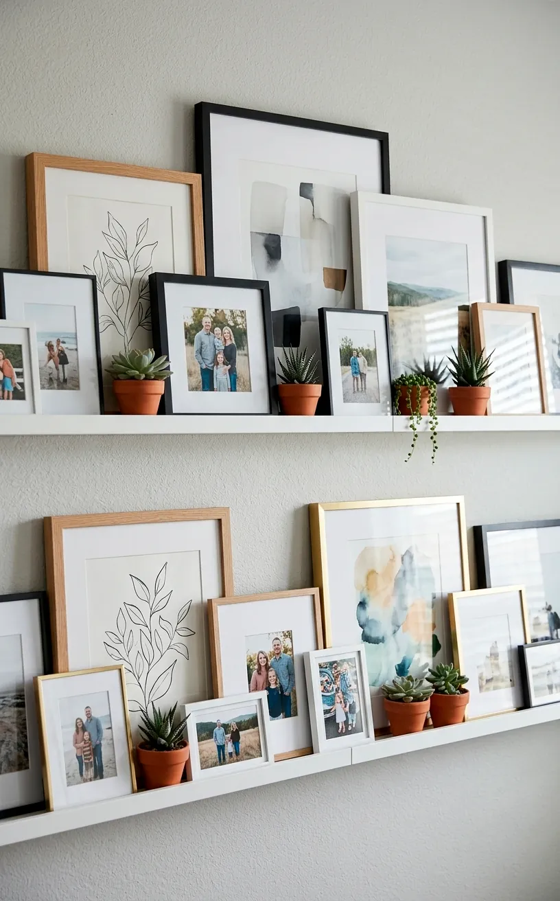
The Ledge Strategy for Commitmentphobes
If the thought of putting twenty holes in your wall makes you sweat, the picture ledge is your new best friend. I swear by these for anyone who likes to change their decor every other week. You install one or two long shelves, and then you just lean your art against the wall.
This strategy allows you to overlap frames, which looks effortlessly cool and adds a lot of visual depth. You can swap out a winter landscape for a bright summer print in about five seconds. Plus, it’s a great way to incorporate taller items that might be too heavy to hang securely.
It’s basically the low-stakes version of interior design. If you decide you hate a certain print, you just move it. No spackle required! Why didn’t we all start doing this sooner?
Conclusion
Creating a gallery wall is basically a giant puzzle where you make the rules. Whether you go for a rigid grid or a wild, textured salon look, the goal is to make your living room feel like you. Don’t be afraid to move things around until it feels right. Which strategy are you going to try first? Let me know in the comments! 🎨