Stop settling for a space that looks like a cardboard box or a forgotten dorm room. You deserve a home that feels like a boutique hotel, even if your current budget suggests otherwise. I spent years trying to make my tiny rental look like a million bucks, and I finally cracked the code. Let’s explore eight vibes that actually work and look pricey.
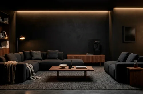
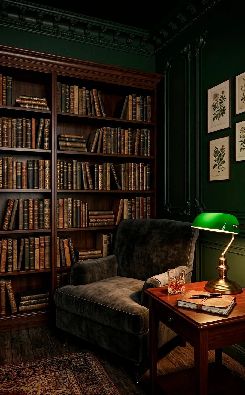
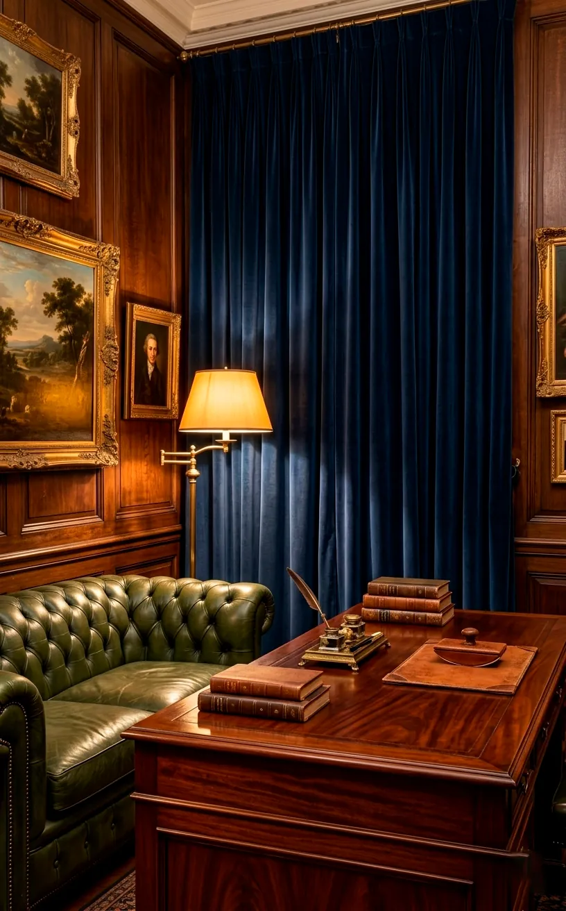
Moody Dark Academia
I honestly think my obsession with Dark Academia started when I realized that messiness looks “academic” if you just add a vintage globe. This vibe relies heavily on deep, moody colors like forest green and navy. Rich textures like velvet and worn leather instantly make a room feel like it has a history. Do you want your apartment to feel like a centuries-old library? I suggest hunting for second-hand brass candlesticks or heavy gold frames. They add a weightiness that plastic decor just can’t touch. IMO, the secret lies in the lighting. Swap those bright LEDs for warm-toned bulbs and let the shadows do the heavy lifting for your aesthetic. 🕯️
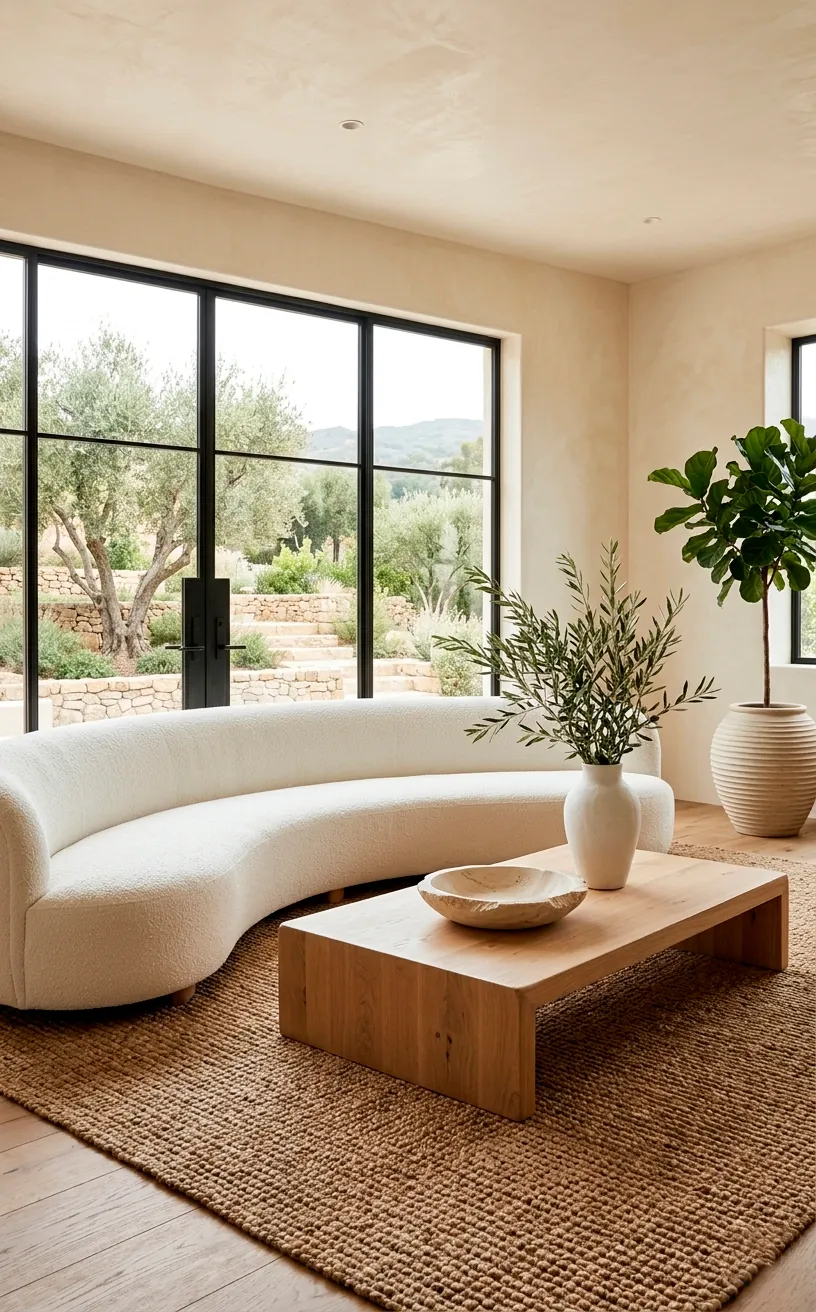
Organic Modern Zen
If you prefer a space that feels like a high-end spa rather than a library, Organic Modern is your best friend. I love how this style mixes clean lines with raw, natural materials. Light-toned woods and stone accents create a grounded atmosphere that feels expensive because it looks effortless.
Ever wondered why some “minimalist” rooms look cheap while others look like a billionaire’s vacation home? It’s usually the textures. You need to layer things like bouclé, linen, and jute. I once bought a cheap stone bowl from a flea market, and it changed the whole vibe of my coffee table. Nature is the ultimate designer here.
Keep your color palette tight. Stick to creams, tans, and soft greys. This consistency makes the eye relax and perceive the space as a cohesive, high-end environment rather than a collection of random stuff. When everything shares a similar tone, the quality of the materials takes center stage. Check out these organic modern mantle tips for more inspiration.
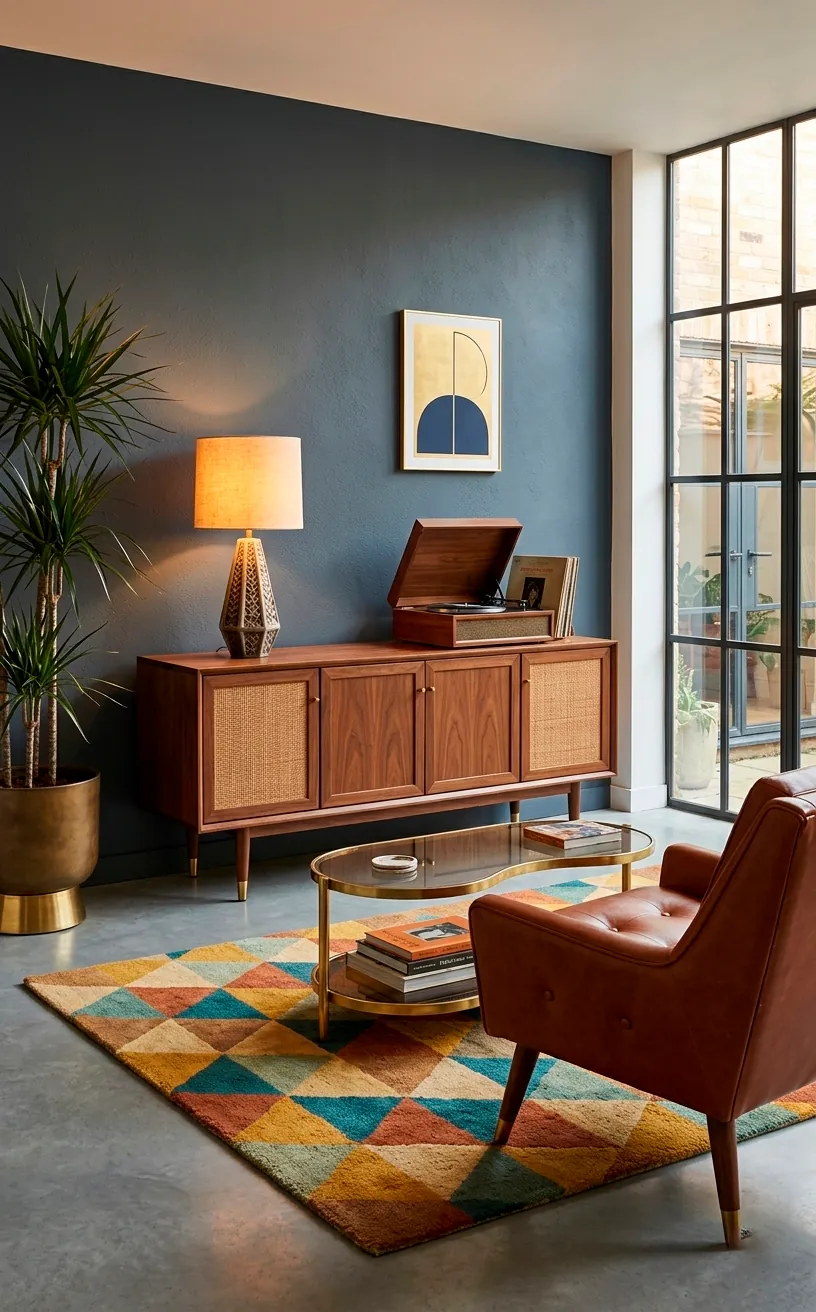
Mid-Century Modern Sophistication
Mid-Century Modern (MCM) is basically the “cool older sibling” of interior design. It’s been popular for decades for a reason: it looks sharp. I’m talking about those iconic silhouettes and tapered wooden legs that make furniture look like it’s floating. If you want your apartment to scream ‘I have my life together,’ go for walnut finishes.
Don’t make the mistake of buying a matching set from a big-box store, please! That’s the fastest way to make your place look like a furniture catalog. Instead, find one standout piece, like a sideboard or a lounge chair, and build around it. Mixing vintage finds with new items adds the soul that a ‘luxury’ look requires. For the perfect anchor, explore these sleek walnut sideboards that define the style.
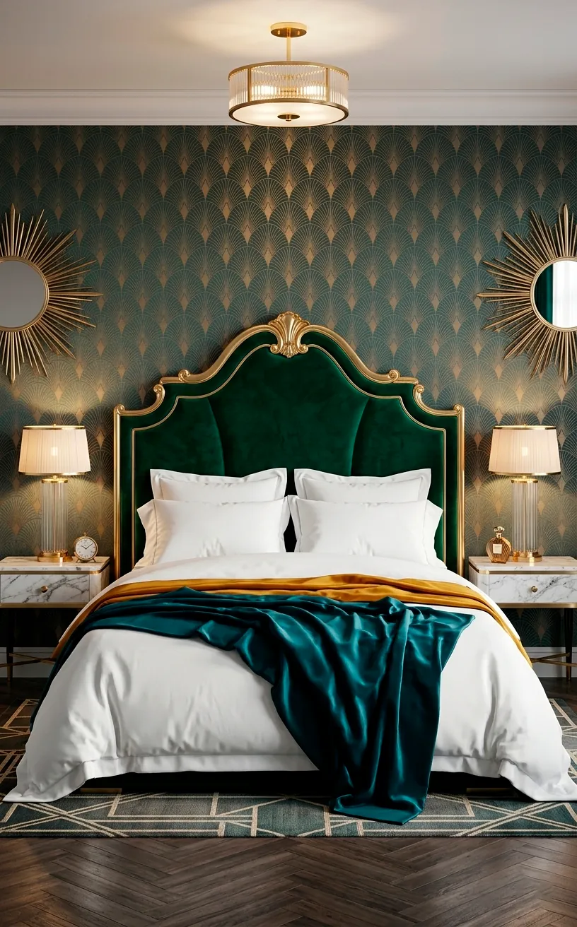
Art Deco Revival
Are you ready to channel your inner Great Gatsby? Art Deco is all about drama and unapologetic luxury. Think velvet, gold accents, and bold geometric patterns. I love this look because it transforms a boring white-walled apartment into a glamorous sanctuary with just a few key swaps.
Start with the metals. Swap out your basic silver hardware for brushed brass or gold. It’s a small change that makes a massive impact. Why settle for a standard lamp when you can have a fluted glass globe that looks like a piece of art? It’s these deliberate choices that separate the pros from the amateurs.
Color is your best friend here. Don’t be afraid of jewel tones like emerald, sapphire, or even a deep burgundy. These colors naturally absorb light in a way that feels expensive. If you think it’s too much for a whole room, start with a single velvet accent chair or some heavy, high-quality drapes.
Finally, look for symmetry. Art Deco thrives on it. Matching lamps on either side of a bed or a perfectly centered gallery wall creates a sense of order that feels very high-end. This guide on Art Deco TV walls shows exactly how to balance velvet and brass. ✨
The Old Money Aesthetic
This style is for anyone who wants their apartment to look like they inherited a villa in the English countryside. The “Old Money” look focuses on timeless quality and traditional patterns like plaid or houndstooth. I think the key here is to avoid anything that looks too “new” or trendy. You want your guests to wonder if that oil painting is a family heirloom.
Invest in dark woods like mahogany or cherry. These materials have a natural depth that instantly elevates a space. I suggest adding some equestrian-themed art or landscape paintings in thick, ornate frames. It’s a bit cliché, sure, but it works every single time to create that established, wealthy atmosphere. 🏇
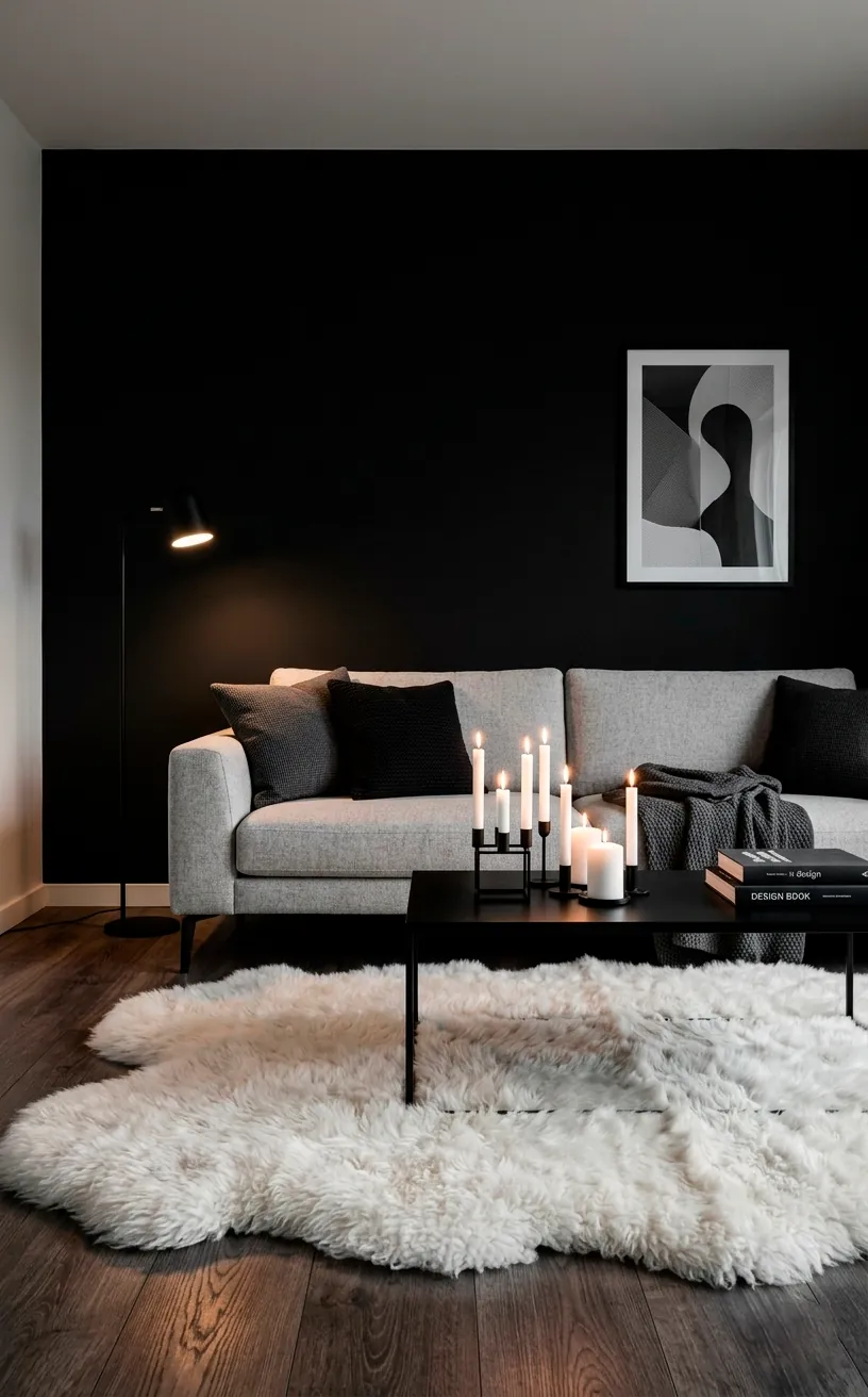
Scandi Noir
Think of Scandi Noir as the moodier, more sophisticated cousin of the bright Scandinavian style we all know. Instead of all-white everything, we use charcoal greys, matte blacks, and deep wood tones. It’s incredibly cozy but looks much more expensive because the dark colors hide the imperfections of a rental apartment. I’ve found that a black accent wall can make even a cheap IKEA dresser look like a designer piece. Just make sure you balance the darkness with plenty of textures like sheepskin rugs or chunky knit blankets to keep it from feeling like a cave. 🕯️
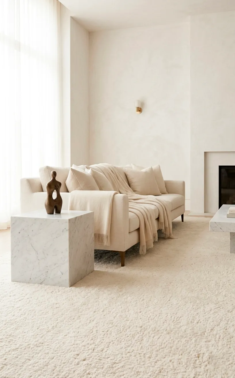
Quiet Luxury Minimalism
Quiet Luxury is the art of looking rich without shouting about it. It’s the “if you know, you know” of interior design. This aesthetic ignores logos and flashy trends in favor of impeccable materials and tonal layering. I love how a room done in this style feels incredibly calm and expensive simultaneously.
Focus on the touch. If you’re buying a rug, get the highest quality wool you can afford. If you’re buying curtains, choose heavy linen. The weight of these fabrics tells your brain that the space is high-end. Have you ever noticed how luxury hotels always have heavy doors and thick towels? It’s all about the tactile experience.
Keep your colors in the same family. If you like beige, use five different shades of beige. Layering different textures in the same color prevents the room from looking flat. It’s a subtle trick, but it’s how designers create those ‘expensive’ spaces that seem impossible to replicate.
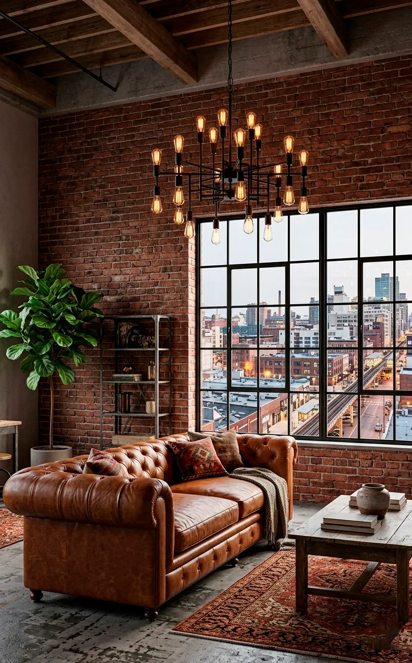
Elevated Industrial Chic
Forget the “cold and unfinished” industrial look of the past. The elevated version is all about the contrast between rugged materials and polished finishes. I suggest mixing exposed brick (or high-quality peel-and-stick) with buttery leather and sleek metal accents. It feels like a high-end Soho loft rather than a construction site.
Lighting is the secret weapon here. Instead of basic fixtures, look for oversized Edison bulb chandeliers or articulating brass wall sconces. The warm glow against a cold metal surface creates a visual tension that looks very intentional and expensive.
Don’t be afraid to go big. In an industrial space, small decor items get lost. IMO, one large piece of abstract art is better than ten small knick-knacks. It grounds the room and gives it a focal point that screams “curated gallery.”
Add some life to the grit with oversized indoor plants. A tall fiddle leaf fig or a monstera looks incredible against a brick wall. The green pops against the red and grey, making the whole space feel lived-in and luxurious. It’s the perfect way to soften the edges of the industrial look.
The Final Touch
You don’t need a massive renovation to make your apartment look like a million bucks. By choosing one of these aesthetics and focusing on high-quality materials, lighting, and texture, you can transform any basic rental into a sanctuary. Which one of these vibes is calling your name? Let me know in the comments below! Happy decorating, my friend.