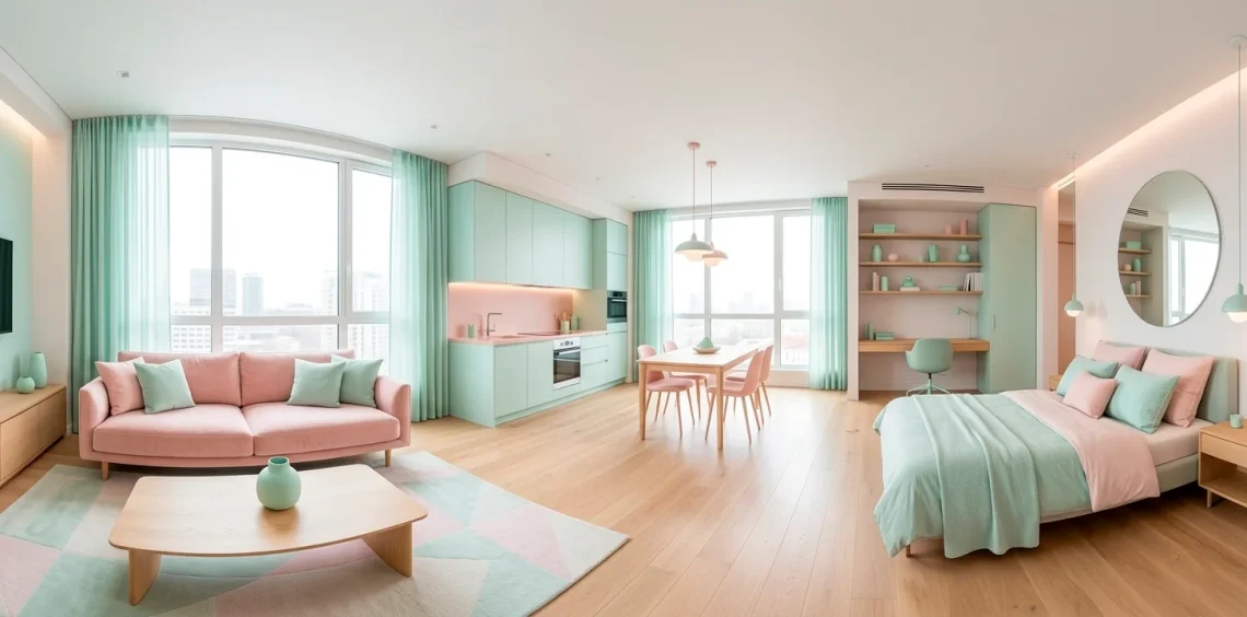
Living in a shoebox doesn’t mean you’re stuck with “landlord beige.” Ever thought about how a splash of mint or dusty rose could actually make your walls feel further apart? I’ve spent way too many hours scrolling through tiny rentals, and trust me, pastels are the secret weapon for cramped quarters. Let’s turn that studio into a candy-colored sanctuary!
The Monochromatic Magic of Mint
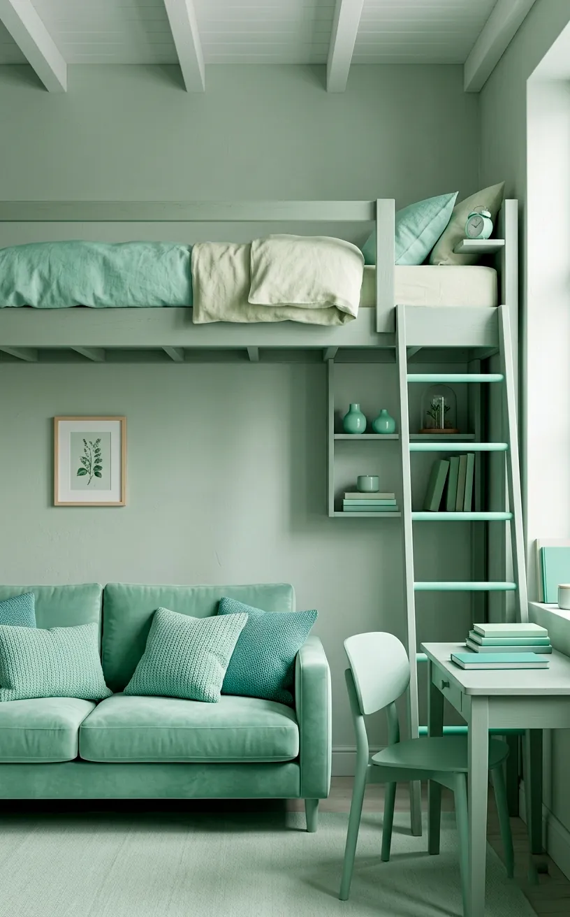
I absolutely swear by monochromatic mint for opening up a room. This cool-toned pastel acts as a neutral but with way more personality than white. By coating your main wall in a soft sage or mint green, you trick the eye into seeing more depth. It’s like the wall is politely backing away to give you some breathing room. Plus, mint looks incredibly high-end when you pair it with light wood furniture.
Why settle for boring when you can have a refreshing mint oasis? I noticed that adding a few velvet mint pillows to a light gray sofa creates a seamless transition that feels intentional, not cluttered. Keep your large furniture pieces in a similar tone to maintain that uninterrupted visual flow. If you want more tips on layout, check out this small studio apartment vertical living guide.
Blushing Zones to Define Your Space
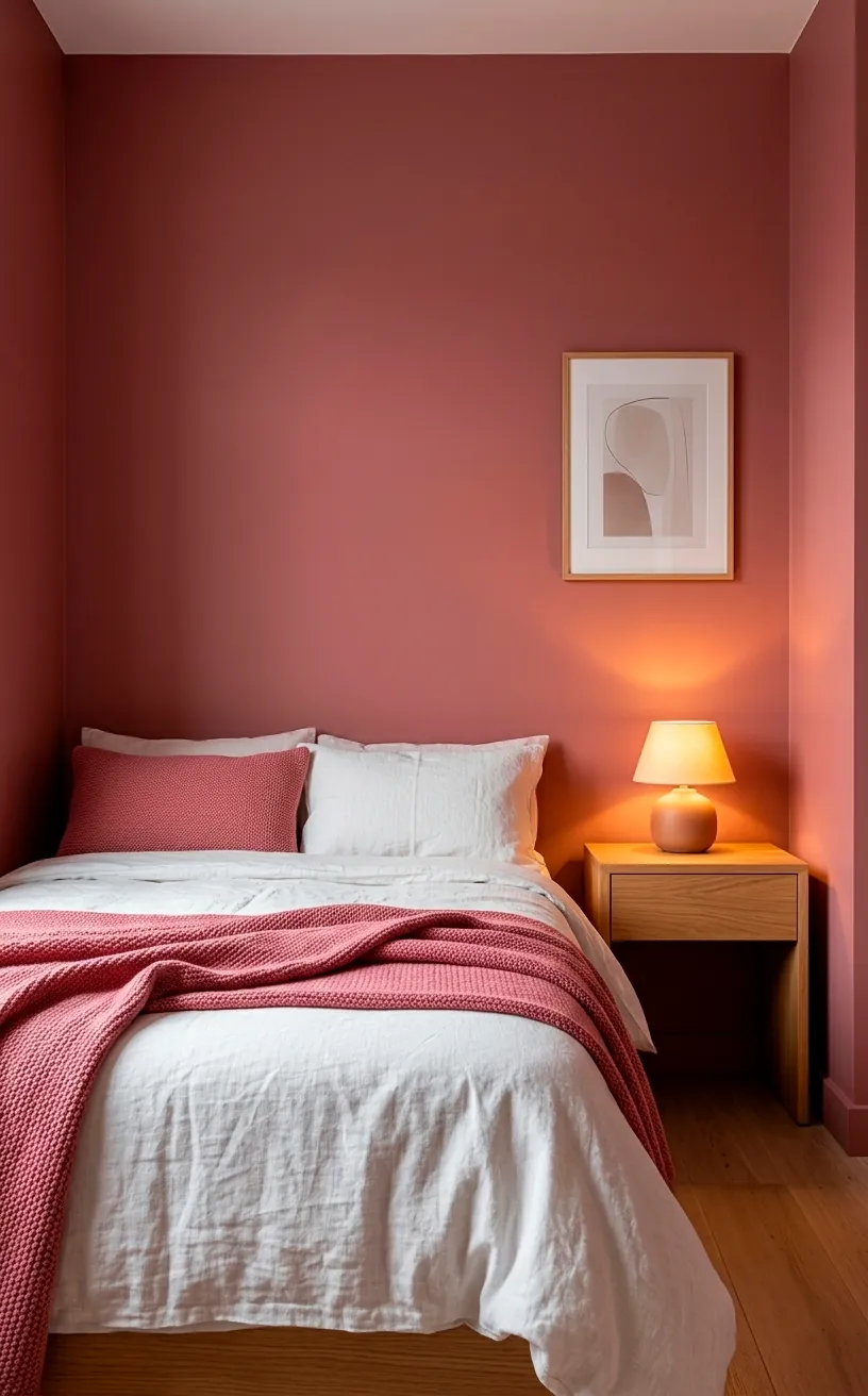
Using blush pink to define specific zones works wonders in a studio. I love painting the area behind my bed in a dusty rose to create a ‘bedroom’ without using clunky dividers. This soft hue provides a cozy backdrop that feels separate from the living area. Have you ever tried color-blocking with pastels? It’s a total game-changer for layout. You simply choose a corner, apply a pastel pink accent, and suddenly your workspace or dining nook has its own identity. It’s cheap, effective, and won’t make you lose your security deposit if you use high-quality peel-and-stick options.
Lavender Lighting for Mood and Scale
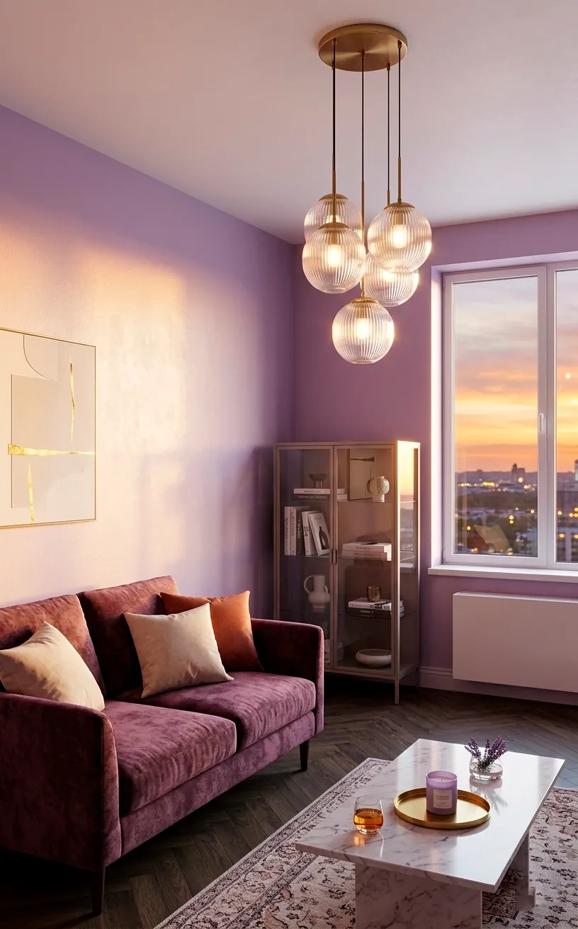
Lighting plays a massive role in how we perceive pastels. I found that lavender hues react beautifully to both natural light and warm LEDs.
During the day, a lavender wall looks crisp and airy. At night, it transforms into a moody, sophisticated retreat. It’s basically two rooms for the price of one paint can.
Don’t forget about your light fixtures. A matte lavender pendant light adds a pop of color at eye level, drawing the gaze upward. This trick makes the ceiling feel miles high, which is a lifesaver in cramped apartments.
Seriously, why do we ignore the ceiling so much? Adding a subtle pastel glow can change the entire vibe. For more ways to brighten up those dim corners, take a look at these easy lighting hacks to brighten dark rental corners.
Sky Blue Storage Solutions
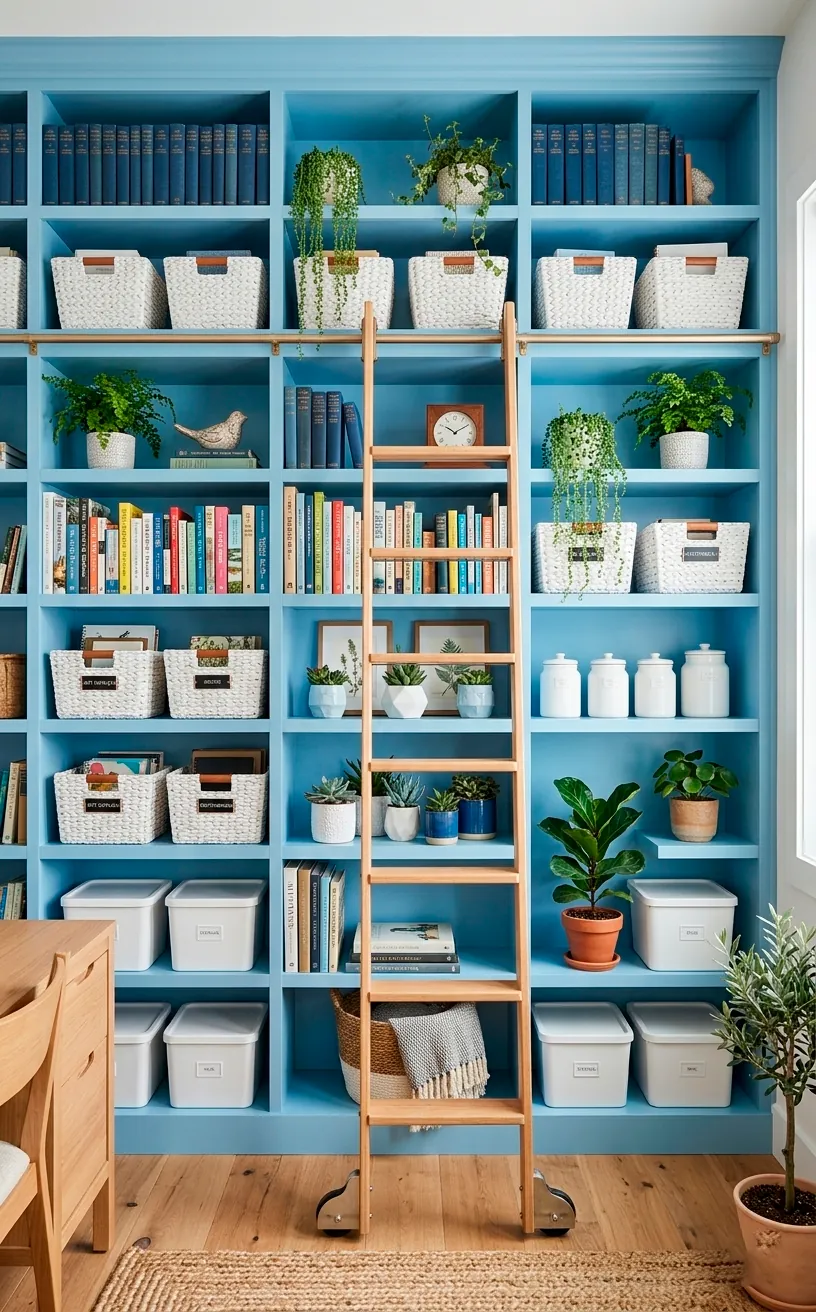
Storage usually looks like a stack of ugly plastic bins, but sky blue changes the narrative. FYI, choosing pastel blue cabinets or shelving keeps the room feeling light rather than heavy. Unlike dark wood or black metal, sky blue recedes visually, so your storage wall doesn’t feel like it’s falling on you. I recommend finding a sky blue bookshelf to house your collection. It provides a serene backdrop that makes even a messy library look intentional. Honestly, looking at a wall of blue is much better for your mental health than staring at a giant slab of dark brown laminate.
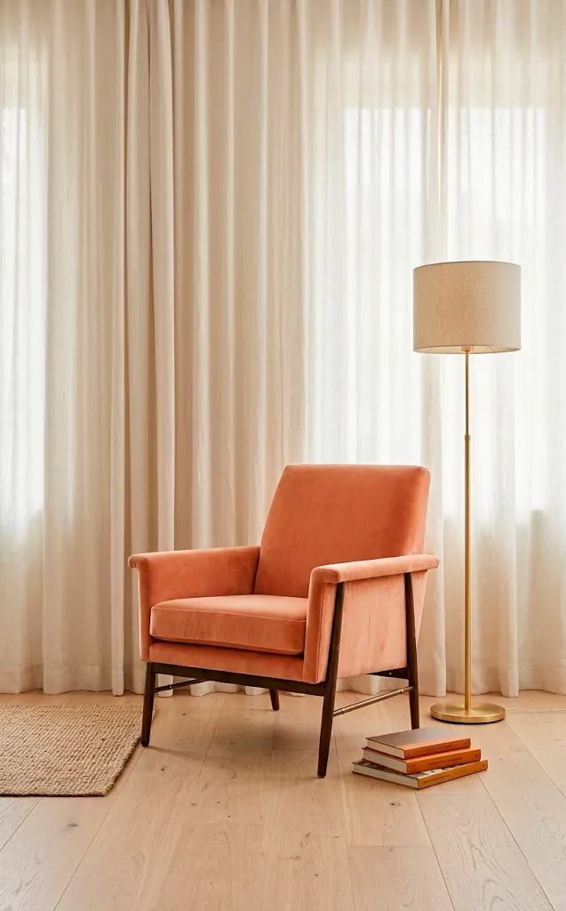
Peach Furniture Pops
Small apartments often lack a clear focal point. I solved this by dropping a peach-colored statement chair right in the middle of my living area. IMO, peach is the most underrated pastel because it adds warmth without the aggression of orange. It feels sunny and inviting, even if your only window looks out at a brick wall.
Pairing peach with gold accents creates a luxe vibe that screams ‘I have my life together.’ Even if you’re just eating ramen on that chair, you’ll feel like royalty.
Keep the rest of the palette simple—think whites and creams—to let that peach furniture really shine. It’s about balance, people! You want a pop of color, not a fruit salad.
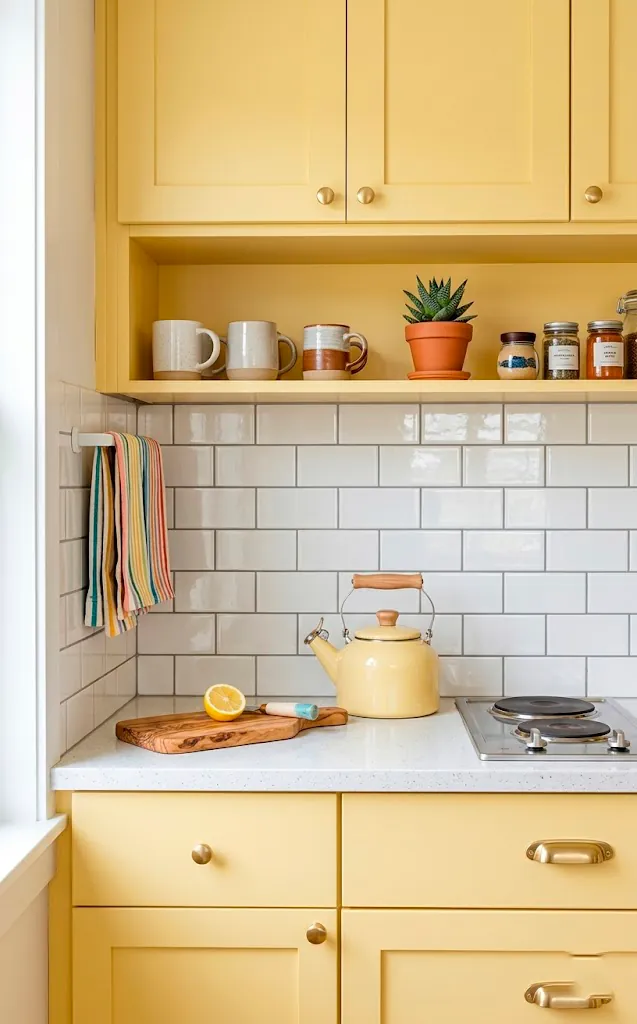
Sunny Yellow Kitchenette Accents
Kitchenettes in studios are usually depressing little alcoves. You can fix that with buttery yellow accents. I started small with a yellow toaster and some lemon-colored dish towels, and the vibe shifted instantly. Yellow reflects light better than almost any other color, making that tiny cooking corner feel twice as large.
If you’re feeling brave, try a pastel yellow backsplash. It provides a cheerful morning boost every time you go to make coffee. Who needs caffeine when your walls are basically a giant hug? Stick to soft, buttery tones rather than neon to keep the space feeling sophisticated and calm.
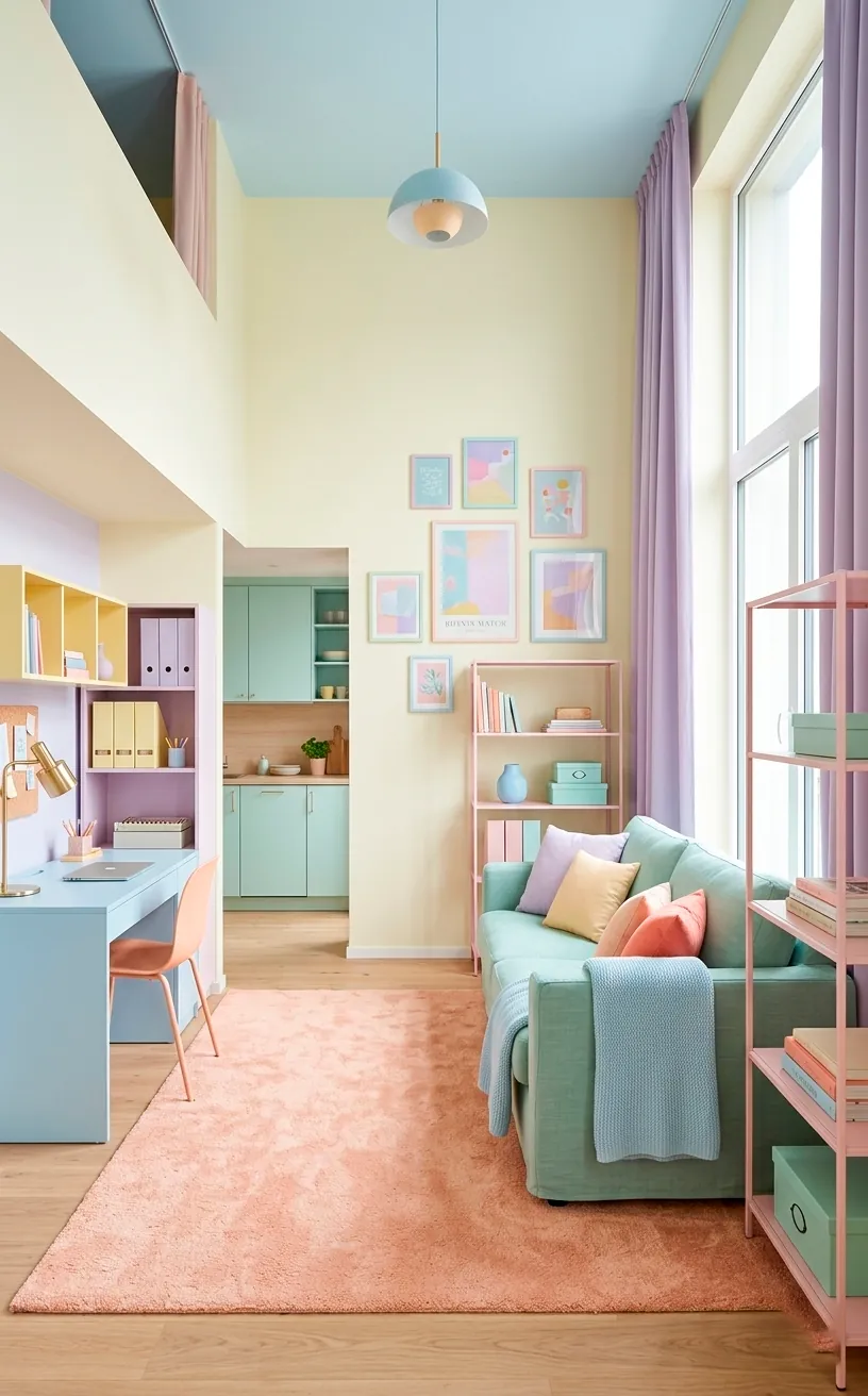
The Ultimate Pastel Mix
Can’t decide on just one color? Join the club. I actually think mixing multiple pastels can work if you keep the saturation levels identical.
Think of it like a bag of marshmallows—everything should be soft and airy. I use a mix of mint, peach, and lavender throughout my studio to create a cohesive but vibrant look.
- Use a lavender rug to anchor the living area.
- Toss some peach pillows on a mint sofa.
- Hang sky blue art on a white wall.
This layering technique adds incredible depth and interest to a small space. It tells a story rather than just filling a room. Ready to start your pastel transformation? ✨
Conclusion
Pastels aren’t just for nurseries; they’re the ultimate hack for tiny studio living. By choosing the right soft hues, you can expand your space, define your layout, and actually enjoy being at home. I hope these ideas spark some serious inspiration for your own rental! Which pastel shade are you grabbing first? Let me know in the comments!