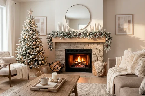
I noticed my living room looked like a hospital waiting room yesterday, so I decided to fix it immediately. Fall is creeping in, and nothing says ‘I actually have my life together’ like a home that glows with warmth. These terracotta and burnt orange palettes aren’t just colors; they’re an entire mood. Ready to turn your apartment into a cozy autumn sanctuary?
The Classic Earthy Duo
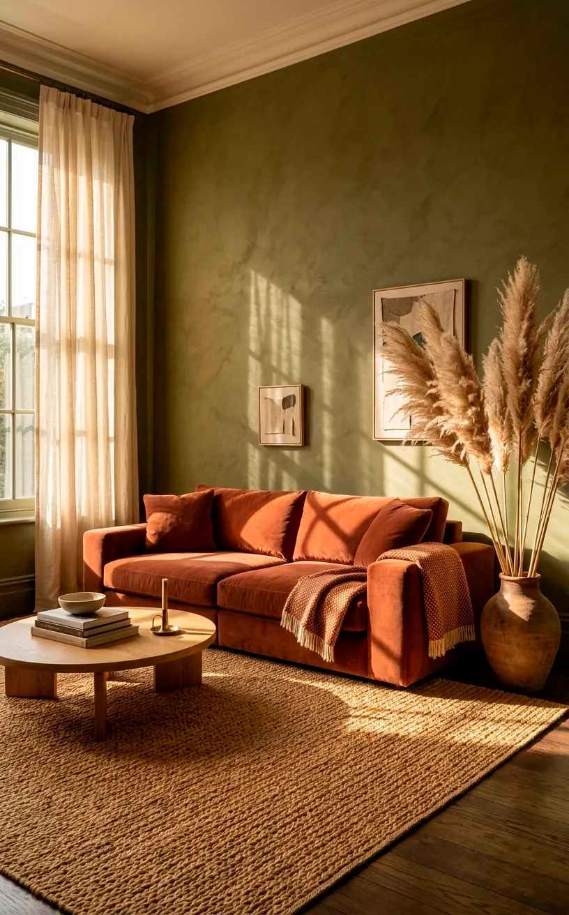
Why mess with a masterpiece? Pairing deep terracotta with olive green feels like a warm hug from Mother Nature herself. I personally love how the muted green tones ground the fiery orange vibes without making the room look like a literal pumpkin patch. It’s sophisticated, organic, and honestly, quite hard to mess up. Ever wondered why this combo feels so balanced? The secret lies in the natural contrast between warm clay and cool forest floor tones.
Essential design accents:
- Matte terracotta floor vases
- Olive green linen throw blankets
- Natural jute area rugs
- Hand-painted ceramic planters
- Woven rattan wall art
Sunset Glow and Dusty Pinks
If you want something a bit more ‘Instagram-chic’, try mixing burnt orange with dusty rose. IMO, this is the ultimate ‘grown-up’ way to do pink. The terracotta keeps the pink from feeling too sugary, while the rose adds a softness that plain orange just can’t achieve on its own. It reminds me of a desert sunset in Santa Fe, minus the actual scorpions. You can easily pull this off with a few velvet pillows and maybe a chunky knit throw. It’s high-key gorgeous and makes every golden hour feel ten times more magical. ✨
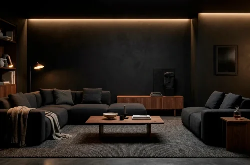
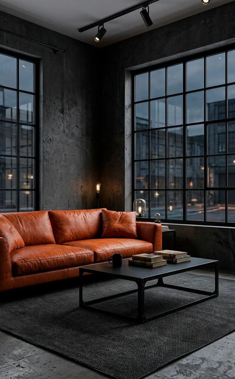
Industrial Spice with Charcoal
Want to keep things a bit gritty? Charcoal gray provides the perfect backdrop for burnt orange accents. This combo screams ‘cool city loft’ even if your view is just the neighbor’s brick wall. I find that the dark, moody gray prevents the terracotta from feeling too rustic, giving it a modern, urban edge that I absolutely adore.
How do you balance such strong colors?
- Keep the large furniture pieces neutral gray.
- Use orange for the ‘pops’ like art or cushions.
- Incorporate black metal finishes to tie it together.
- Add a touch of wood to prevent it from feeling cold.
This look is basically the interior design version of a leather jacket—timeless and effortlessly cool. If you are struggling with a dark apartment, you might want to check out these sleek industrial reading nook ideas to brighten things up.
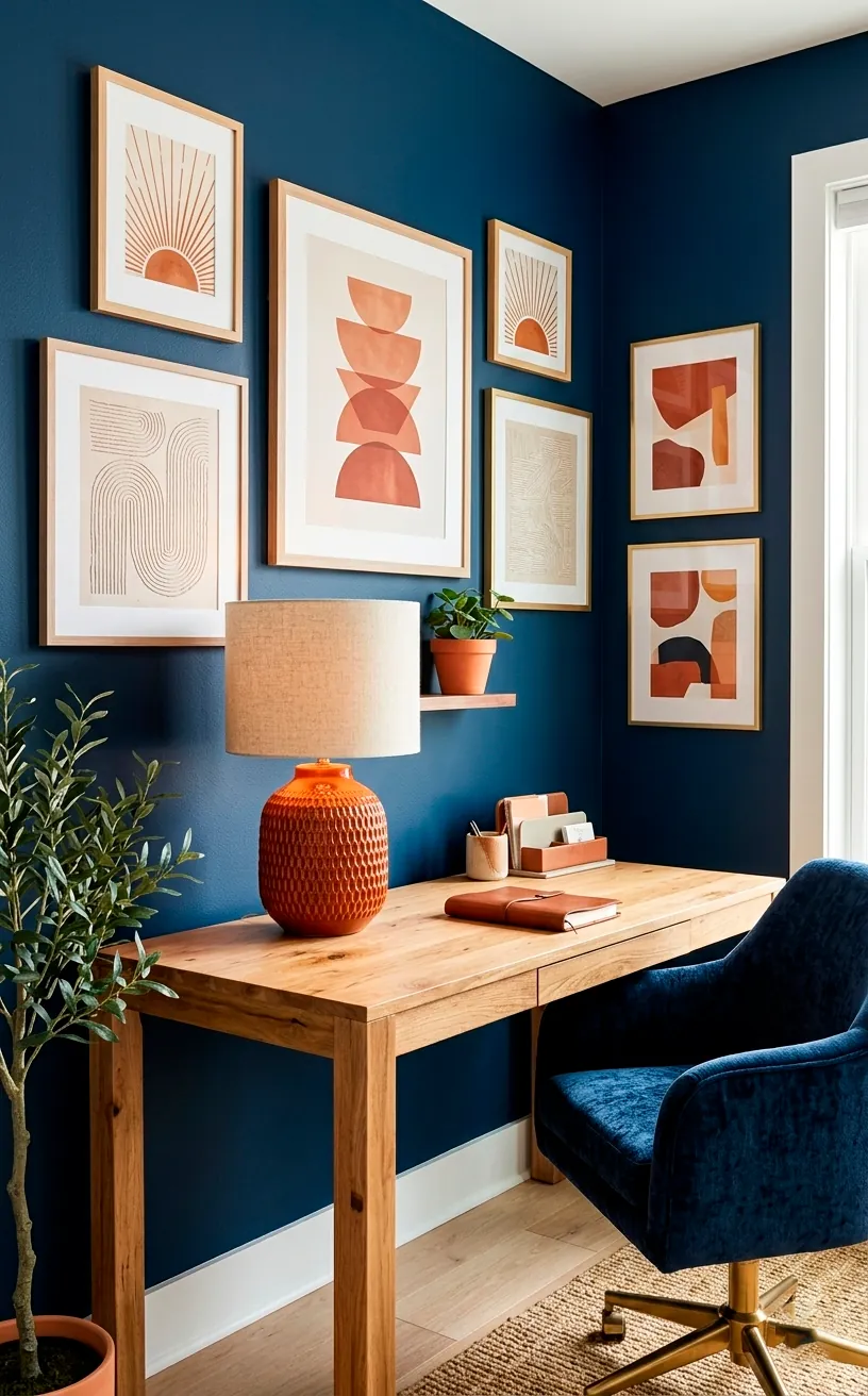
Midnight Harvest
Opposites attract, right? Navy blue and burnt orange sit across from each other on the color wheel, which is why they look so dang good together. It’s a high-contrast look that feels incredibly regal. TBH, I was skeptical about this one until I saw a navy accent wall paired with a terracotta leather chair. It was game over. The blue makes the orange look even brighter and more saturated. It’s like the colors are having a very polite argument about who is more beautiful, and frankly, they both win. FYI, this palette works wonders in home offices where you want to feel focused but cozy.
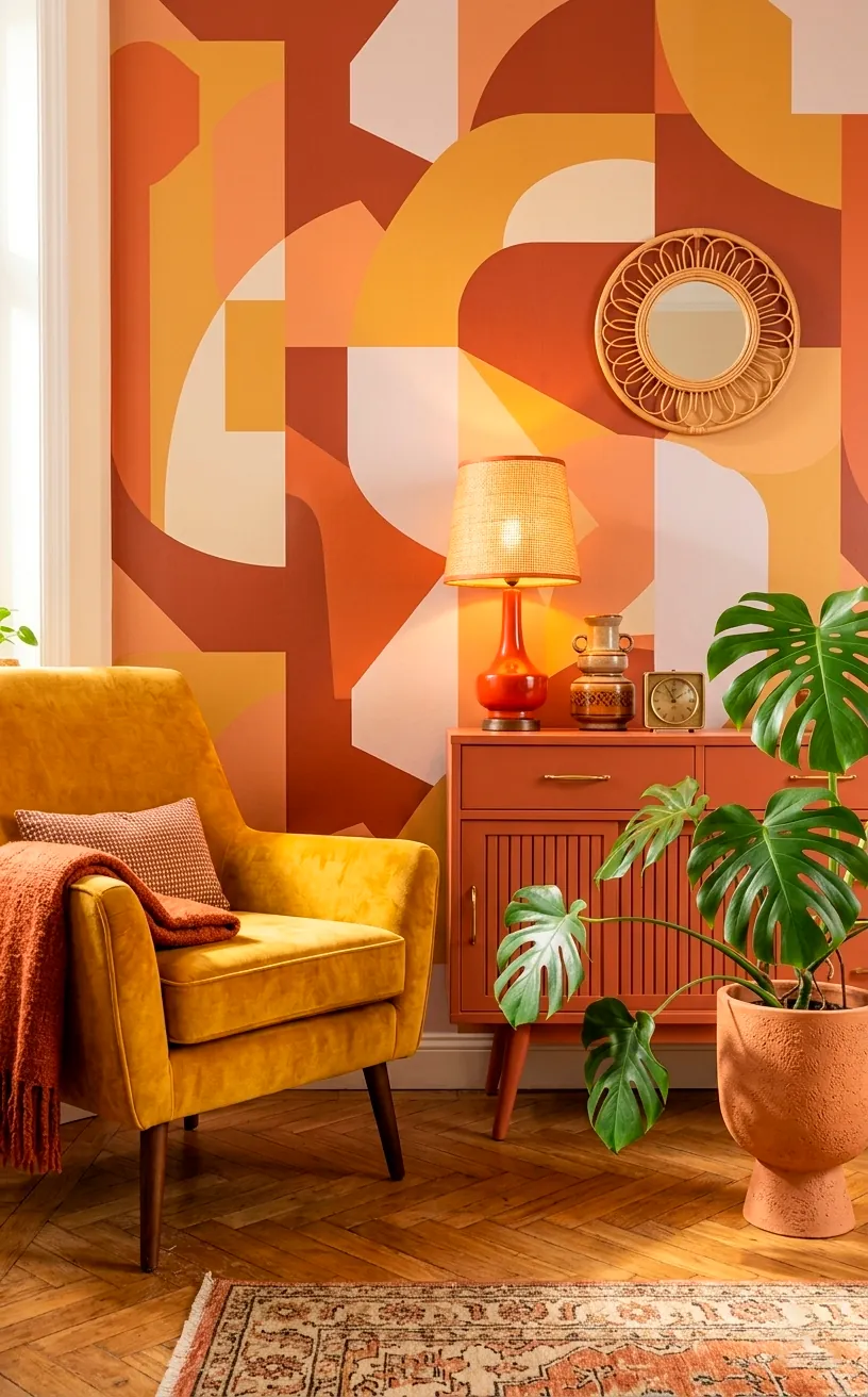
Retro Rust and Mustard
Take a trip back to the 70s without the questionable hair choices. Combining terracotta with mustard yellow creates a retro vibe that is surprisingly fresh for 2026. It’s sunny, it’s warm, and it’s impossible to be sad in a room this bright. I suggest keeping the patterns simple so you don’t go full ‘grandma’s basement’ by accident.
Color palette elements:
- Ochre yellow velvet poufs
- Rust-colored linen curtains
- Geometric terracotta rugs
- Mid-century modern wood accents
You will find that these colors play off each other beautifully when you introduce plenty of natural light. It’s the perfect way to fight off the impending winter blues before they even start. Don’t let FOMO stop you from trying this bold look!
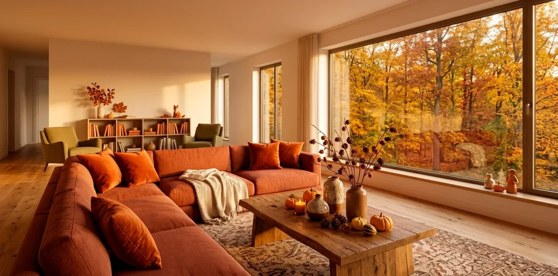
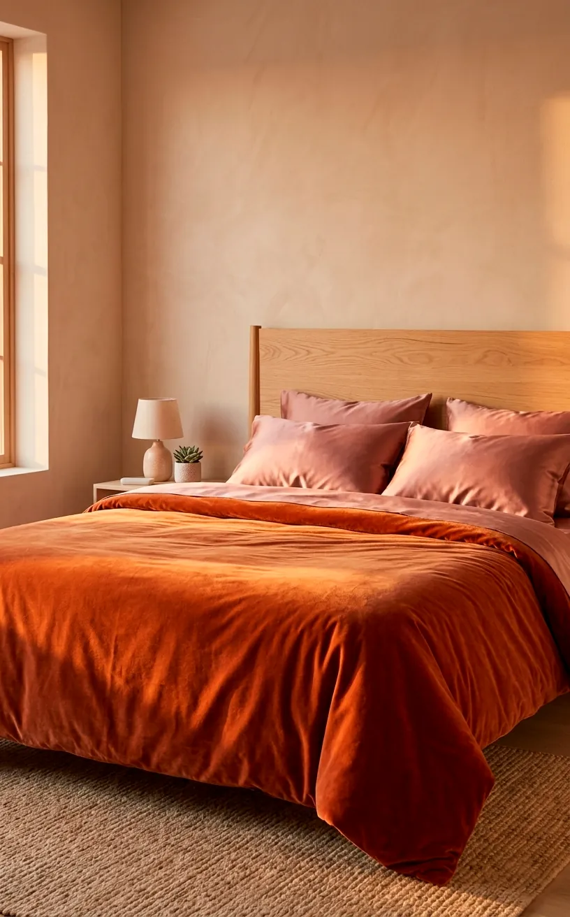
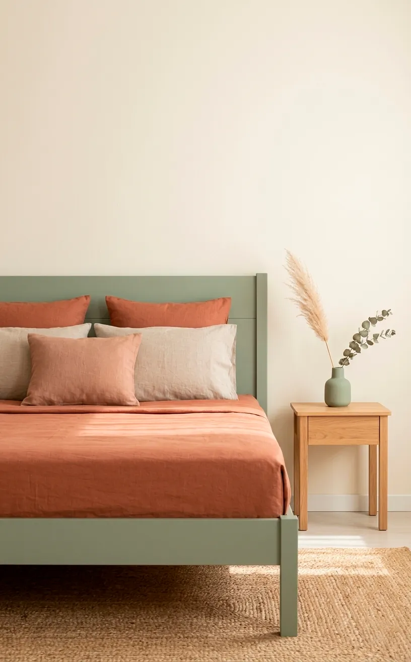
Sophisticated Clay and Sage
For those who find burnt orange a bit too ‘loud’, try terracotta and sage green. This is the more soft-spoken cousin of the olive green palette. Sage has this incredible ability to calm down the heat of the clay tones. It feels very spa-like and high-end. I recently swapped my bright white bathroom towels for a mix of sage and terracotta, and suddenly I felt like I was at a luxury resort. Does anyone else feel like their towels dictate their entire personality? Just me? Okay then. This palette is perfect for creating a serene bedroom environment where you can actually relax after a long day.
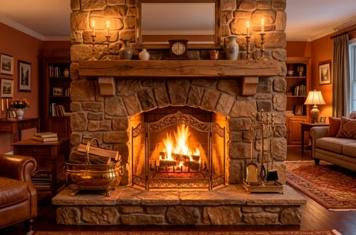
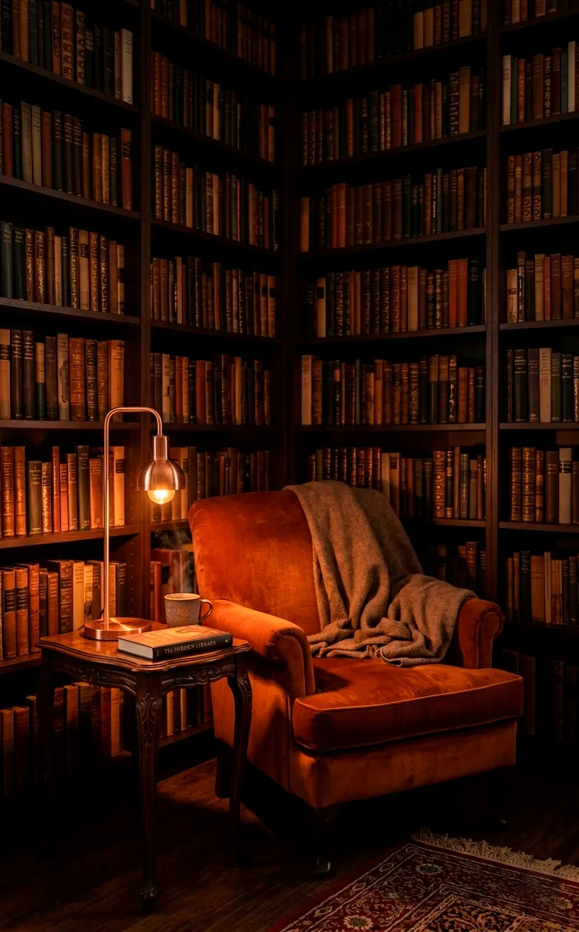
Copper and Clove
If you want your apartment to feel like a high-end chocolate shop, burnt orange and espresso brown are your best friends. This is a deep, dark, and delicious combination. It’s all about rich textures—think dark wood floors, chocolate leather, and pops of bright burnt orange silk. It’s incredibly moody and perfect for those long autumn nights when you just want to curl up with a book and a glass of wine. Why go out when your living room looks this expensive? The orange acts like a spotlight, pulling the dark brown out of the shadows and giving it a much-needed glow. It’s moody, it’s sexy, and it’s totally timeless.
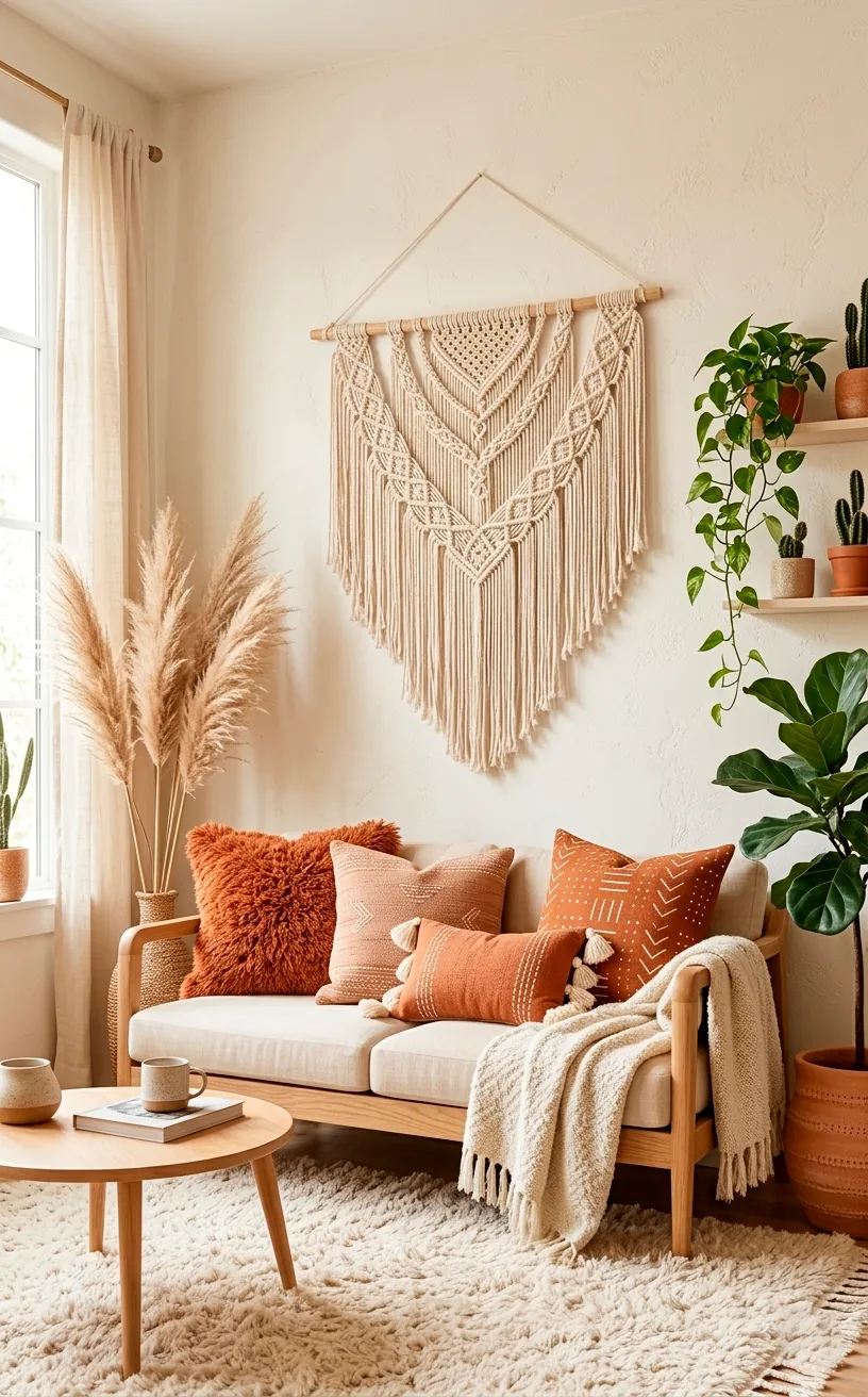
Bohemian Sun and Cream
The terracotta and cream palette is for the minimalists who still want a bit of flavor. It’s light, airy, and very boho-chic. By keeping the background cream or off-white, the terracotta elements really stand out without overwhelming the space. It’s a great way to make a small apartment feel much larger than it actually is.
Boho design elements:
- Macrame wall hangings
- Cream-colored shaggy rugs
- Terracotta-toned throw pillows
- Light oak furniture
I love how this palette feels like a summer memory fading into fall. It’s effortless and always looks clean, even if you haven’t dusted in a week (we’ve all been there). If you love this vibe, you might enjoy these boho reading nook ideas with macrame to complete your space.
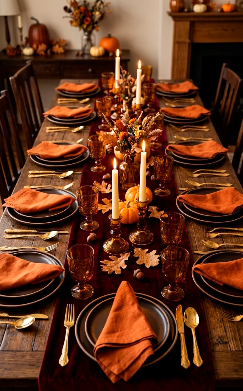
Harvest Berry and Burnt Orange
Feeling bold? Try burnt orange and burgundy. This is the ultimate fall harvest palette. It’s rich, regal, and deep enough to sink into. It works best when you mix different textures like wool, velvet, and silk. I found that adding a few gold accents really levels up this look from ‘pretty’ to ‘palatial’. It’s definitely a statement, but isn’t that the point of decorating? You don’t want your home to be boring. Ever felt like your room was missing that ‘wow’ factor? This is it. The deep red tones of the burgundy pull out the hidden warmth in the burnt orange, making the whole room feel like it’s glowing from the inside out.
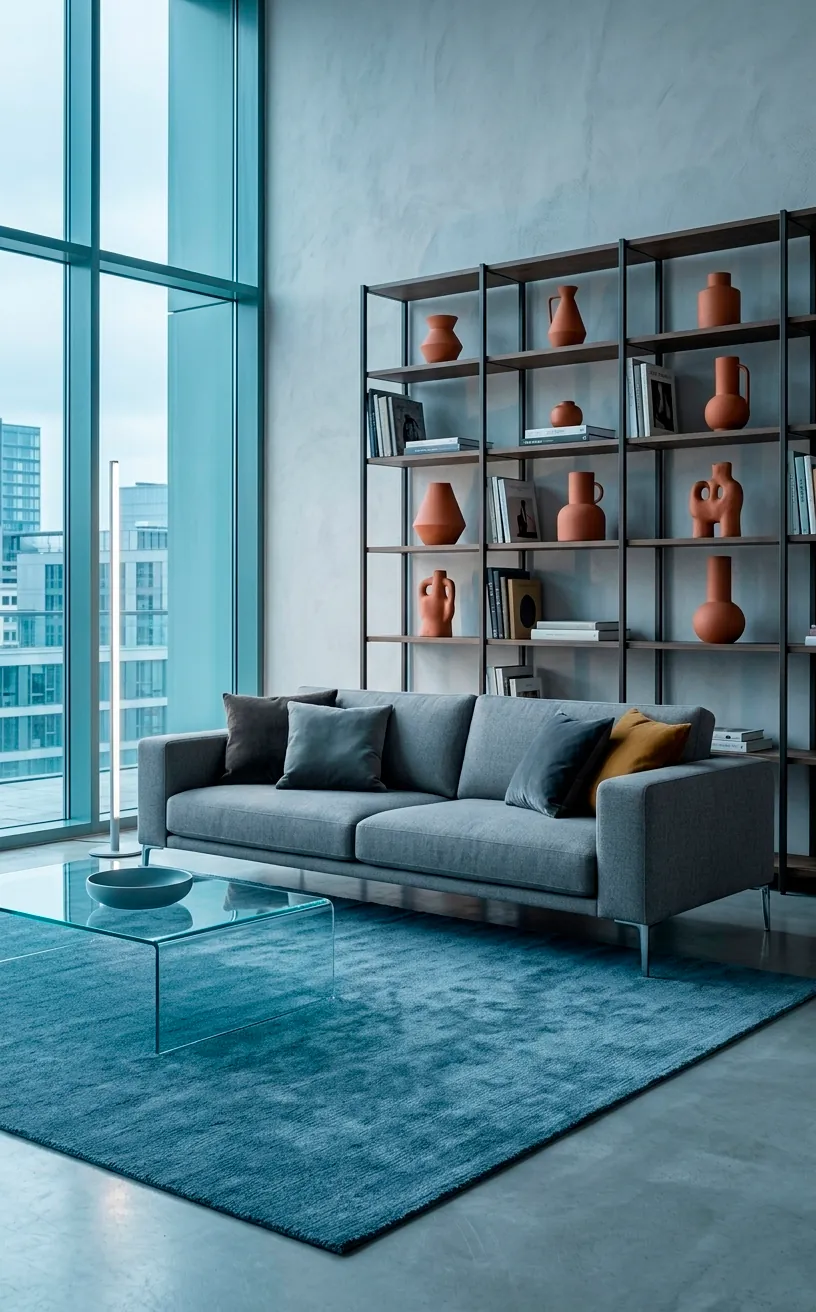
Urban Slate and Terracotta
Finally, we have terracotta and steel blue. This is for the modernists who like a little contrast. The coolness of the blue acts as a perfect foil to the heat of the terracotta. It feels very architectural and intentional. I think it’s the perfect way to transition your apartment from summer to fall without making it look like a craft store exploded.
Tips for this palette:
- Use steel blue for large area rugs.
- Incorporate terracotta in ceramic decor.
- Use light gray as a transitional neutral.
This combo feels very ‘New York City apartment’—sleek, smart, and just a little bit edgy. It’s a great way to use fall colors without being too literal about the whole ‘leaves and pumpkins’ thing. It’s sophisticated enough for a formal living room but cozy enough for a bedroom.
Conclusion
You now have 10 incredible ways to bring that terracotta and burnt orange magic into your apartment. Whether you go for the gritty industrial look or the soft bohemian vibe, your home is going to look absolutely fire—literally. Which one of these palettes are you grabbing first? Let me know in the comments! Now, if you’ll excuse me, I have a sudden urge to go buy ten more orange pillows I definitely don’t have room for. Happy decorating!