Skip to content
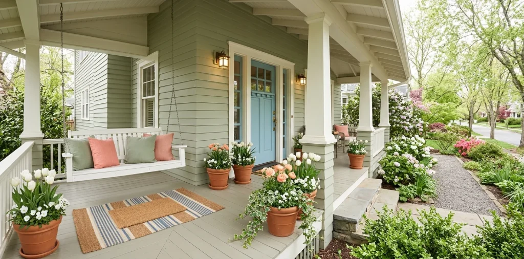
Ever stand on your sidewalk wondering why your spring porch looks like a yard sale instead of a magazine cover? I spent years buying random pink flowers and cute pillows that clashed horribly with my brick. Good news: you only need a smart color plan to pull every planter, cushion, and wreath into one cohesive spring front porch decor.
Start With Your Home’s Fixed Exterior Colors
Before you grab a single tulip flat, look closely at the permanent colors already living on your house. Your brick, stone, roof shingles, and siding set the non-negotiable rules for your entire spring front porch palette. Warm beige stone fights against icy pastel blues, while cool gray siding begs for crisp whites, soft lavender, or sage instead of muddy yellows. Match your seasonal accents to your home’s existing undertones first, and half your design battle disappears immediately. Trust me, ignoring warm orange brick only triggers regrettable color clashes!

Follow the 60-30-10 Porch Color Rule
Designers swear by the 60-30-10 color rule, and honestly, it saves porches daily.
Give 60% of your space to a dominant neutral base like white trim, light siding, or natural wood decking. Dedicate 30% to a supporting hue through painted shutters, outdoor rugs, or matching planters. Finally, reserve the last 10% for lively spring pops like sunny throw pillows and fresh wreaths.
A useful little gift for your home
🎁 Free Plant Finder Tool
Filter 250+ houseplants by 6 smart criteria to find your perfect green companion.
We’ll email you the link. Plus, you’ll join our newsletter!
This simple ratio stops bright accents from screaming over each other. IMO, keeping bold hues in that tidy ten percent slice makes your whole entryway feel intentional instead of chaotic. 🌸

Pick a Front Door Shade That Anchors Everything
Your front door commands attention from the street, so treat it as your color anchor. Classic robin’s egg blue, soft sage, or warm coral instantly wakes up a sleepy facade without forcing you to repaint the whole house. Why settle for builder-grade beige when one quart of exterior paint changes everything?
FYI, learn from my past mistake before you fall for a neon swatch. I once painted my door a hyper-bright turquoise that practically glowed in the dark and bullied every delicate pastel flower nearby. Pick a slightly muted shade with gray or earthy undertones so your florals and wreaths shine right beside it.

Bridge Indoors and Outdoors With Repeating Undertones
Step inside your foyer, crack the door open, and peek back out.
Notice how jarring a sunny yellow stoop looks if your entryway sports moody navy wallpaper. When you echo one or two indoor hues outside, your home flows effortlessly from the welcome mat straight into the hallway.
Pull a muted blue from your foyer rug or repeat the warm oak tone of your console table.
That subtle indoor-outdoor color bridge tricks the eye into seeing a bigger, calmer space the second guests walk up. Need crisp inspo for classic blue palettes? Check out these blue and white outdoor design ideas.

Layer Fresh Spring Florals Without Creating a Rainbow Mess
Garden centers turn into pure chaos every April, and yes, I also black out and buy six clashing petunia flats sometimes. Still, restraint makes your floral display look expensive. Stick to two bloom colors maximum, then weave in plenty of lush green foliage like ferns, sweet potato vine, or trailing ivy to calm everything down. Grouping peach tulips with creamy whites and deep fern greens looks way sharper than jamming purple, pink, orange, and magenta into one poor window box. Your neighbors will think a landscaper stopped by—TBH, you just showed a little self-control.

Ground Bright Pastels Using Natural Textures
Pastel pink, mint, and baby blue feel super sweet in spring, yet too many sugary shades together can make your porch look like an oversized Easter basket.
Balance those airy colors with earthy organic materials that pull everything back down to earth. Raw terracotta pots, chunky woven seagrass baskets, and warm teak rockers add instant weight so soft tones read crisp and grown-up rather than overly delicate.
Think of wood and rattan as visual denim—they make bright colors look effortlessly cool every single time, no matter how bold your floral picks get.

Coordinate Planters, Cushions, and Doormats Intentionally
Buying a matching five-piece patio set feels safe, yet it quietly drains all the personality right out of your entryway. Instead, repeat your key colors across varied materials so every piece chats naturally with its neighbors without looking like a sterile catalog page.
Use these simple pairing swaps for effortless visual balance:
- Pull one soft accent shade from your layered patterned rug into two solid bench pillows.
- Echo the warm tan tone of your coir doormat with woven wicker lanterns beside the steps.
- Match your wreath ribbon directly to the subtle stripe on your outdoor lumbar cushions.

Test Your Palette in Real Morning and Afternoon Light
That dreamy buttercream swatch inside the brightly lit hardware store aisle might turn weirdly fluorescent once real sunlight hits your porch. Deep roof overhangs cast cool blue shadows all morning, then blast warm golden glare by four o’clock. Always tape large paint samples and fabric scraps onto your siding and watch them shift across a full day before buying gallons or cushions. Spending twenty minutes on a real-light test saves you from that painful moment when your soothing spa green suddenly screams radioactive lime from the curb.

Balance Warm Metals and Matte Hardware Accents
Wait—do house numbers, sconces, and door knockers actually count as colors?
Yes, a hundred times yes! Warm aged brass brings instant cozy sunshine to cool blues, lavender, and slate grays, while matte black iron sharpens sweet pastels like blush or soft mint so they never veer too sugary.
Stick to one dominant metal finish across your lights, mailbox, and planter stands, or mix at most two complementary tones with clear intention.
Throwing shiny chrome, oil-rubbed bronze, brushed nickel, and rose gold onto one tiny stoop just creates visual static. Clean hardware pulls the whole color palette together like jewelry! ✨

Swap Small Accents to Evolve Your Palette Through Late Spring
You don’t need a massive budget to keep your porch looking fresh from March clear through June. Lock in your timeless 60% and 30% base layers—your door color, rugs, neutral planters, and sturdy seating—so they work effortlessly across the whole season.
When warmer weather rolls in, swap just the 10% accent layer by trading early tulip wreaths for peony garlands or changing pastel pillows to sunnier coral tones. Ready to stretch that refresh even further? Check out our guide to transitioning spring decor into Mother’s Day.

A useful little gift for your home
🎁 Free Plant Finder Tool
Filter 250+ houseplants by 6 smart criteria to find your perfect green companion.
We’ll email you the link. Plus, you’ll join our newsletter!
Conclusion
Great porch design comes down to repeating your home’s undertones, honoring the 60-30-10 rule, and grounding bright blooms with rich natural texture. Once you nail that base, swapping pillows and flowers feels effortless! Which spring shade are you painting or planting first—let me know in the comments so we can geek out over swatches together. 🌿