Skip to content

Winter officially overstayed its welcome, and I am entirely ready for sunshine. You probably feel the exact same way. Swapping out heavy winter textiles for fresh pastel throw pillows offers the fastest way to wake up your living room. We crave that effortless spring aesthetic, so I gathered ten foolproof color combos you can steal right now.
1. Blush Pink and Crisp Mint
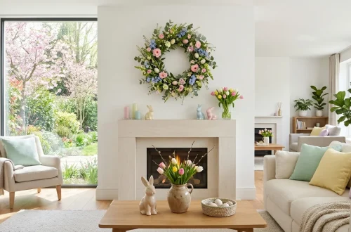
Ever wondered why some spaces just scream spring the second you walk in? Designers usually rely on the ultimate seasonal power couple. Blush pink and crisp mint green create a fresh, vibrant atmosphere that instantly lifts your mood. I vividly remember styling my first apartment with these shades, and it completely transformed a dreary gray sofa.
You must balance the warmth of the pink with the cool, icy undertones of the mint. Toss a chunky white throw blanket into the mix, and you suddenly achieve a magazine-worthy setup. IMO, this combo never misses when you need a quick seasonal refresh that guests will compliment endlessly.

2. Lavender and Buttery Yellow
Nothing says “I survived February” quite like bringing sunny yellows indoors. When you pair buttery yellow with soft lavender, you bring a subtle French countryside vibe straight into your living room.
I prefer keeping the lavender pieces matte and the yellow pieces slightly glossy or textured. This smart contrast prevents the colorful setup from looking exactly like a giant Easter egg basket.
A useful little gift for your home
🎁 Free Plant Finder Tool
Filter 250+ houseplants by 6 smart criteria to find your perfect green companion.
We’ll email you the link. Plus, you’ll join our newsletter!
Try incorporating different fabric weights. A heavy yellow cotton pillow looks fantastic next to a lightweight lavender silk option. Playing with texture elevates the entire arrangement from basic to breathtaking. I promise, your couch will thank you for the upgrade.

3. Powder Blue and Sandy Beige
If you desperately fear loud colors, I have the perfect solution for you. Powder blue paired with sandy beige delivers a coastal spring aesthetic without overwhelming your senses. I love using this combo in rooms that already feature a lot of natural wood or woven rattan elements. The beige grounds the airy blue, creating a calm, restorative environment. You essentially get a relaxing beach vacation right in your living room, minus the annoying sand tracking everywhere. Simply grab two oversized beige linen pillows and layer one smaller powder blue lumbar pillow right in front. You get instant coastal charm without trying too hard.

4. Soft Peach and Sage Green
Let us talk about warmth. Soft peach brings an incredibly flattering, cozy glow to any room.
When you introduce sage green to the mix, you ground that peachiness with an earthy, organic tone. I bought a set of sage pillows last spring, and they literally matched everything I own.
To pull this off flawlessly, search for these specific pillow features:
- Textured peach corduroy fabrics
- Fringed sage linen edges
- Neutral canvas piping details
These small details turn a basic couch into a botanical retreat. If you want to carry this relaxing vibe into other corners of your home, check out these serene sage cozy reading nook decor hacks.

5. Lilac and Muted Terracotta
Want something slightly more unexpected? Throw lilac and muted terracotta together. The cool, floral essence of lilac clashes beautifully against the baked earth vibe of terracotta. This bold combination mimics a vibrant spring sunset right on your sofa.
I absolutely adore using velvet for this pairing because the fabric catches the light and deepens both colors. Always place the darker terracotta pillow behind the lighter lilac one to create visual depth. You can add a brass reading lamp nearby to highlight the rich velvet textures during the evening hours. It gives the room a moody yet fresh personality.

6. Pale Lemon and Sky Blue
Sometimes you just need your living room to feel like a cloudless May morning. Pale lemon and sky blue deliver exactly that energetic, cheerful aesthetic.
FYI, if your living room lacks natural light, these two colors work incredibly hard to fake it. They reflect whatever ambient light you have, making the space feel instantly larger and brighter.
I suggest skipping heavy patterns here. Stick to solid colors or very subtle stripes. Let the bright, happy hues do all the heavy lifting instead of confusing the eye with busy geometric prints. Clean lines and solid colors make this specific pairing truly shine.

7. Dusty Rose and Dove Gray
We all appreciate a sophisticated, grown-up take on spring pastels. Dusty rose and dove gray strike the perfect balance between seasonal cheer and modern elegance. I frequently recommend this pairing for minimalist homes that need a touch of warmth without compromising their sleek aesthetic. The gray mutes the pink just enough to keep things looking chic rather than overly sweet. Imagine a soft gray bouclé couch holding two crisp dusty rose cotton pillows. It looks incredibly expensive, requires zero design skills, and completely transforms a boring corner into a chic focal point.

8. Seafoam and Coral
Ready for a subtle tropical twist? Seafoam and coral bring immediate vacation energy to your living room.
Coral injects a vibrant punch of energy, while seafoam cools everything down. I accidentally discovered this combo while tossing random pillows into my laundry basket, and it looked so good I immediately put them back on the couch.
Keep these styling tips in mind:
- Use coral sparingly as an accent
- Let seafoam act as your base color
- Incorporate woven natural textures nearby
This smart balance prevents the bright coral from overpowering your space. You get a lively, vibrant room that still feels incredibly relaxing to sit in.

9. Pistachio and Cream
Pistachio green currently rules the interior design world, and I completely understand the hype. When you pair this nutty, muted green with rich cream, you achieve a creamy, dreamy spring palette. It feels incredibly soothing and effortlessly luxurious.
Avoid stark white when using pistachio. Bright white creates a harsh contrast, whereas cream seamlessly blends the two tones together. Toss a tufted cream pillow next to a smooth pistachio velvet one for maximum tactile appeal. The subtle contrast makes your seating area feel professionally styled. Need more neutral inspiration? I highly recommend exploring these neutral elegance cream beige coffee bar ideas.

10. Mixed Pastel Gingham and Florals
Minimalists, look away now. For the rest of us, mixing pastel gingham with vintage floral prints offers the ultimate dopamine hit. ✨
You might think mixing patterns looks chaotic, but it actually works beautifully if you keep the pastel tones consistent. Match a blush pink floral print with a baby blue gingham check.
The trick involves varying the scale of your patterns. Pair a tiny, delicate floral print with a large, bold gingham pattern. Your living room will instantly look like a whimsical English cottage, and frankly, we all deserve that kind of joy after surviving another dreary winter season.

A useful little gift for your home
🎁 Free Plant Finder Tool
Filter 250+ houseplants by 6 smart criteria to find your perfect green companion.
We’ll email you the link. Plus, you’ll join our newsletter!
Conclusion
Swapping out your throw pillows gives you an entirely new living room for a fraction of the cost of buying new furniture. You easily inject color, life, and that much-needed spring energy into your daily routine. Which of these pastel combos are you grabbing first? Drop your favorite pairing in the comments below so we can discuss it!