Skip to content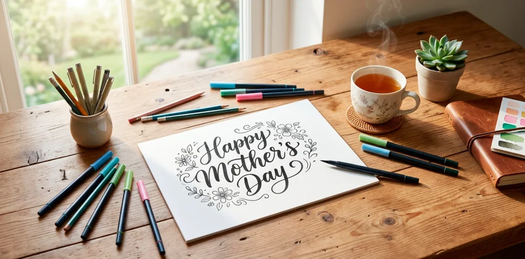
You already know the drill. You stand in the greeting card aisle for twenty minutes, read a bunch of cheesy poems, and pay eight dollars for folded paper she will eventually recycle. Let’s stop the madness. Hand-lettering your own Mother’s Day cards shows you actually care enough to invest time, not just cash. Ready to make her cry happy tears? 🥹
Gathering Your Weaponry
You cannot create a masterpiece with that crusty ballpoint pen sitting at the bottom of your junk drawer. We need proper tools. Invest in quality materials.
Heading phrase:
- Hard-tipped brush pens (much easier to control)
- Premium smooth cardstock (protects your pen tips)
- A high-quality polymer eraser
Smooth paper is absolutely essential because rough, textured paper shreds delicate brush tips instantly. Trust me, I ruined three expensive pens before figuring that little detail out. Better materials simply make the learning curve infinitely flatter.

The Mighty Pencil Draft
Ever wondered why professional lettering looks so perfectly centered? They cheat. They sketch everything out in pencil first. Never skip the drafting phase. Lightly draw a baseline and block out where your words will sit. This saves you from that embarrassing moment when you run out of room and squish the last three letters together. FYI, you get to fix wonky spacing before applying actual ink. Erasing a light pencil line beats starting over completely. Grab a good ruler and map out your masterpiece.
A useful little gift for your home
🎁 Free Plant Finder Tool
Filter 250+ houseplants by 6 smart criteria to find your perfect green companion.
We’ll email you the link. Plus, you’ll join our newsletter!

Mastering the Basic Strokes
The entire secret to beautiful modern calligraphy lies strictly in pressure control.
It boils down to one golden rule. You press hard when your pen moves down, and you barely touch the paper when your pen pulls upward.
Practice creating thick downstrokes and razor-thin upstrokes on a scrap sheet until your hand catches the rhythm. Keep your wrist locked and move from your arm.
Do your early strokes look like a shaky seismograph reading? Do not panic. My first attempts honestly looked like spider webs, but smooth consistency always arrives with dedicated repetition.

Picking the Perfect Phrase
You do not have to write an entire novel to make an impact. Sometimes less truly is more, especially when you hand-letter a piece of art. Pick a short, meaningful phrase she will appreciate. ‘Best Mom Ever’ or ‘Love You Mom’ works flawlessly because short phrases allow you to focus on making each letter absolutely stunning. Writing a twenty-word poem requires insane stamina, and you will likely lose steam halfway through. Keep it punchy, make it pretty, and let your gorgeous letterforms do all the heavy lifting.

Faux Calligraphy Tricks
What happens if you do not own a fancy brush pen? Faux calligraphy instantly becomes your new best friend.
You achieve the exact same elegant look using a regular fine-liner or a standard gel pen. First, write out your word in your best cursive. Next, draw a second line parallel to every single downstroke you made. Fill in that empty gap with solid ink.
This clever technique provides total control over the precise thickness of your letters. Honestly, nobody will ever know you completely faked the brush effect unless you explicitly confess your secrets.

Adding Flourishes and Details
Plain letters look nice, but adding a few well-placed flourishes makes your card scream custom luxury. Extend the crossbar of your ‘t’ or loop the tail of your ‘y’ slightly longer than usual.
Just remember restraint. If you add aggressive loops to every single letter, your beautiful message quickly becomes an unreadable, tangled mess. Pick two or three letters to highlight and leave the rest completely alone. A tiny drop shadow or a metallic gold halo also adds a spectacular pop without overwhelming the main design.

Mixing Fonts for Contrast
You need to pair a flowing script with a stark, blocky print.
Contrast creates immediate visual interest. If you write your entire phrase in one swirly cursive font, the design often feels a bit monotonous and heavy.
Try lettering your smaller words in simple, tiny sans-serif capital letters, and blast the most important word across the center in huge, sweeping calligraphy.
This intentional hierarchy tells the eye exactly where to look. It directly mimics the composition techniques professional graphic designers use daily to balance layout weights.

Choosing a Color Palette
IMO, black ink on white paper always looks classic, but Mom deserves some color. Instead of throwing every shade from the rainbow onto the page, pick a tight, cohesive palette. Navy blue and rose gold create a beautifully sophisticated vibe, while soft sage green paired with a warm yellow feels fresh and spring-like. I personally love blending a soft watercolor wash in the background and lettering over it in crisp black ink once it dries completely. Mom deserves a beautiful card, especially if you pair it with other handmade gifts like these delightful spring craft ideas.

Fixing Inevitable Mistakes
You misspelled a word. Or your pen slipped and left an ugly ink blob right on the front. Do not throw the card away just yet.
We embrace creative problem-solving here. Turn that stray ink mark into a delicate little flower or a floating heart. If the spacing went completely haywire, trim the paper down and mount it onto a larger, differently colored card base as a raised centerpiece. Mistakes usually force you to create a much more interesting final layout anyway. You got this. Never surrender to a tiny smudge.

The Envelope Presentation
Your gorgeous card deserves an equally spectacular vessel. Do not stuff your handmade masterpiece into a flimsy, transparent white envelope from the dollar store.
Find a colored envelope that matches your ink palette perfectly. Address it using the exact same lettering style, and maybe add a matching floral doodle near the return address area.
A custom-lettered envelope elevates the entire gifting experience. She will recognize exactly how special this gift is before she even breaks the wax seal.

A useful little gift for your home
🎁 Free Plant Finder Tool
Filter 250+ houseplants by 6 smart criteria to find your perfect green companion.
We’ll email you the link. Plus, you’ll join our newsletter!
Conclusion
Hand-lettering your Mother’s Day cards absolutely changes the gifting game. You save money, learn a gorgeous new skill, and give her a deeply personal keepsake she will likely frame forever. Grab your pens, trust the process, and embrace the wild imperfections of handmade art. Which color combo are you trying first? Let me know in the comments!