Skip to content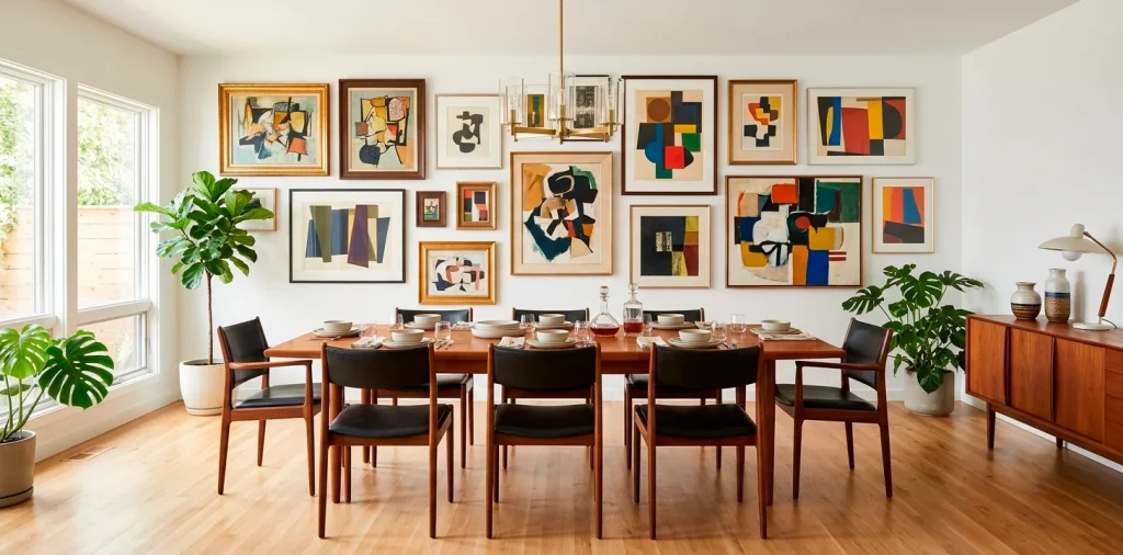
Staring at that blank dining room wall, wondering why it feels so cold? I’ve been there. A mid-century modern aesthetic begs for personality, and nothing delivers that quite like a killer gallery wall. Grab your hammer and a cup of coffee. We are transforming that sad, empty space into a vibrant conversation starter that practically begs for dinner party compliments.
Grasping the Mid-Century Vibe
You cannot just slap random pictures on drywall and call it mid-century modern. This era demands intent. We want clean lines, organic shapes, and a heavy dose of retro swagger. Think less cluttered dorm room, more Mad Men boardroom.
Does your dining space already feature a sleek teak credenza? Perfect. The art you choose needs to complement that warm wood, not fight it. I spent weeks trying to force neon pop art into my own dining room before realizing it looked completely ridiculous. We need balance, folks. When you nail the vibe, every meal feels like a chic 1960s dinner party.

Finding Your Anchor Piece
Every great arrangement starts with a star player. You need one massive, show-stopping piece to ground the entire collection. I usually hunt for a large abstract canvas featuring mustard yellows or muted teals to anchor the look. Once you nail that giant focal point dead center, you simply build outward. Ever wonder why some gallery walls look chaotic while others look curated? The secret always lies in that central anchor. It dictates the color story and commands the room’s attention instantly.
A useful little gift for your home
🎁 Free Plant Finder Tool
Filter 250+ houseplants by style, size, and care level to find your perfect green companion in seconds.
We’ll email you the link. Plus, you’ll join our newsletter for fresh home inspiration.

The Frame Game
Let’s talk borders. Uniformity kills the mid-century vibe instantly.
You want a curated mix of textures. Throw in a slim matte black metal frame next to a chunky walnut one.
Frame variations:
- Sleek brass borders
- Solid teak or walnut woods
- Minimalist black gallery frames
Why does this work so well? Mixing materials creates a layered, collected-over-time aesthetic. IMO, perfectly matched frames just scream “I bought a kit at a big box store.” We want authentic character, not a sterile catalog showroom.

Balancing Art and Spacing
FYI, spacing your art correctly separates the pros from the amateurs. You must leave exactly two to three inches between each frame. Grab a tape measure and a level, because eyeballing it never works out. I learned this the hard way after drilling fourteen holes in my pristine drywall. Maintain consistent gaps, but allow the outer edges of your gallery to form an organic, jagged shape. This structural tension keeps the eye moving gracefully across your stunning mid-century modern dining room setup. If you want a deep dive into the math behind this, check out this guide to planning perfect gallery wall.

Incorporating Typography and Abstract Shapes
Don’t just stick to family portraits or standard landscapes. Mid-century design heavily relies on bold typography and geometric shapes.
I love throwing a sharp, minimalist Bauhaus poster into the mix. It immediately injects that authentic 1950s intellectual vibe into the room. You can also hunt down vintage exhibition prints.
Does your arrangement feel a bit stale? A bold pop of typographic art usually fixes that instantly. It adds a graphical element that breaks up traditional paintings and adds serious visual interest.

Adding 3D Elements to the Mix
Who said a gallery wall only holds flat pictures? Break the rules and mount something physical. A brass starburst clock or a sculptural wooden wall hanging completely transforms the dynamic of your display.
These three-dimensional objects catch the light differently and cast fascinating shadows during evening dinner parties. They bridge the gap between flat art and the furniture below. Plus, a vintage clock keeps your guests from overstaying their welcome! 🕰️ Honestly, finding a cool brass accent completely revived my own dining room layout. It brings unexpected texture that flat prints simply cannot offer.

Harmonizing with Your Dining Furniture
Your wall art does not exist in a vacuum. It must talk to your dining table and chairs.
Got a tulip table? Play up those curves with circular frames or arched canvases.
Furniture synergy elements:
- Walnut sideboards matching wooden frames
- Brass chair legs echoing metallic matting
- Upholstery colors popping up in abstract prints
Make sure the bottom edge of your lowest frame sits roughly six to eight inches above your credenza. This creates a visual bridge, locking the furniture and the art into one cohesive design statement.

Playing with Asymmetry
Symmetry bores the modern eye. Mid-century design thrives on slightly off-kilter, asymmetric balance. You must distribute visual weight evenly, even if the shapes don’t perfectly align. Put a heavy, dark painting on the bottom left and balance it with two smaller, brightly colored pieces on the top right. It requires a bit of trial and error, but the result feels incredibly dynamic. You basically create a puzzle where every unique piece perfectly locks into place. I always lay my arrangement out on the floor first. This simple trick saves you from endless wall patching and guarantees that your funky, asymmetrical vision actually translates beautifully to the vertical space.

Letting the Collection Evolve
Do not rush the process. A truly stunning gallery wall evolves over years, not a single weekend.
Start with five core pieces and intentionally leave empty spaces. As you travel, visit flea markets, or discover new artists, you fill those gaps.
This slow-burn approach guarantees your wall tells a genuine story. Rushing out to buy twenty generic prints just leaves you with a soulless display. Patience yields a dining room that genuinely reflects your personality and your unique design journey.

Nailing the Lighting
You spent all this time curating art; now you must illuminate it properly. Standard overhead lighting usually washes out your carefully chosen mid-century color palette.
Install a sleek, brass picture light above your anchor piece, or angle some ceiling track lights to wash the wall softly. Good lighting highlights the textures in your frames and makes the colors pop during evening meals. Seriously, proper illumination elevates your setup from a basic DIY project to a high-end interior design masterpiece. If you want more inspiration on framing a space with cool metallic details, browse these 15 art deco sunburst mirrors glam options.

A useful little gift for your home
🎁 Free Plant Finder Tool
Filter 250+ houseplants by style, size, and care level to find your perfect green companion in seconds.
We’ll email you the link. Plus, you’ll join our newsletter for fresh home inspiration.
Conclusion
Mastering the mid-century modern gallery wall boils down to mixing textures, embracing bold colors, and trusting your own quirky style. You now possess the blueprint to turn that boring dining room into a striking mid-century masterpiece. Which bold anchor piece are you grabbing first? Let me know in the comments below!