Skip to content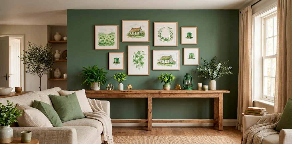
Let’s be honest, finding St. Patrick’s Day decor that doesn’t look like a tacky party store exploded in your home is practically a competitive sport. I used to dread the sea of shiny plastic shamrocks! But subtle watercolor prints completely changed my seasonal styling game. Ready to ditch the glitter and elevate your spring walls? These 15 magical art pieces bring that perfect Irish charm right into your living space, zero leprechaun traps required.
1. The Misty Emerald Isle Landscape
Craving a subtle nod to the homeland? A misty Irish landscape watercolor perfectly captures that brooding, magical vibe of the rolling hills. You get the lush greens of St. Patrick’s Day without screaming it from the rooftops. I hung one in my hallway last year, and it instantly anchored the space with its moody elegance.
Who wouldn’t want a daily view of the Cliffs of Moher? Look for prints blending deep forest greens with soft greys. Design details to watch for:
- Soft brushstrokes that blur the horizon.
- Muted color palettes for versatility.
- Matte paper finishes to absorb glare.

2. Subtle Shamrock Botanicals
Ditch the neon green cutouts and upgrade to vintage-inspired botanical shamrock illustrations. These beauties look like they were pulled straight from an antique field guide, bringing an educated, earthy feel to your seasonal decor. I love scattering these smaller prints across a gallery wall for just a whisper of festivity. They blend seamlessly with existing plant-themed art, making them the ultimate lazy decorator’s dream. Honestly, they look so good you might just leave them up year-round! 🍀
A useful little gift for your home
🎁 Free Plant Finder Tool
Filter 250+ houseplants by style, size, and care level to find your perfect green companion in seconds.
We’ll email you the link. Plus, you’ll join our newsletter for fresh home inspiration.

3. The Whimsical Wandering Sheep
Let’s talk about the unsung heroes of the Irish countryside: the fluffy, chaotic sheep. Watercolor sheep prints inject instant personality and humor into your home.
Ever noticed how a simple animal sketch can completely soften a room’s vibe? I grabbed a print featuring a single, confused-looking sheep last March, and it sparked more conversations than my actual furniture. The bleeding watercolor technique gives their wool a dreamy, cloud-like texture that feels incredibly cozy.
Keep the framing simple. A thin, raw oak frame lets the whimsical artwork do all the heavy lifting without distracting from the charming subject matter.

4. Fading Celtic Knots
Want something with deeper meaning? Watercolor Celtic knots offer stunning geometry softened by fluid, messy brushstrokes. Traditional sharp knots can sometimes feel a bit heavy or gothic, but the watercolor medium completely transforms them into ethereal, floating designs.
I highly recommend finding prints that use a monochrome green or indigo palette. They feel modern, sophisticated, and incredibly tranquil. Perfect for a home office where you need a little luck and a lot of calm focus!

5. The Solitary Four-Leaf Clover
We can’t celebrate St. Paddy’s without a nod to absolute luck.
A solitary four-leaf clover painted with loose, abstract watercolor drops feels fresh and contemporary. It completely avoids the cliché trap!
The beauty of abstract watercolor lies in its imperfections. The way the green pigment pools and fades creates a wonderful sense of fluid movement on the paper.
Pro tip: mount it with an oversized white mat. It elevates the simple subject matter, making a tiny clover look like an expensive piece of modern gallery art.

6. Cozy Cottagecore Irish Pubs
Nothing captures the communal joy of March 17th quite like a charming watercolor painting of a traditional Irish pub. These prints usually feature brightly colored doors, flower boxes spilling over, and cobblestone streets. I snagged one for my kitchen, and it instantly warmed up the sterile white cabinets. It’s like installing a tiny magical window directly into Galway! The vibrant pops of mustard yellow and crimson red in the facades break up the typical green overload perfectly, adding rich, inviting layers to your space.

7. Moody Rainclouds Over Dublin
Let’s embrace the authentic Irish weather! Watercolor raincloud prints bring a cozy, hygge atmosphere to any room in your house.
You might think rain sounds depressing, but the soft washes of indigo and grey watercolor are incredibly soothing. They invite you to curl up with a chunky knit blanket and a good book. I absolutely adore placing these moody pieces in quiet reading nooks.
Pair this art with warm brass accents in your lighting or picture frames to balance the cool, stormy tones of the rain. If you love this dark, relaxing aesthetic, check out this guide to style a moody indigo reading nook bedroom.

8. Wild Irish Spring Florals
Skip the shamrocks entirely and focus on wild spring florals native to Ireland. Think delicate bluebells, vibrant primroses, and subtle hawthorn blossoms captured in fluid watercolor. This approach nods directly to the season of St. Patrick’s Day while offering supreme longevity for your spring decor.
I mix these delicate floral prints right in with my everyday art. They whisper “spring renewal” rather than shouting “holiday theme.” It’s an effortless, elegant way to keep your walls looking cultivated and fresh long after the holiday passes.

9. The Abstract Emerald Splash
For the ultra-modern minimalist, an abstract emerald watercolor splash is the perfect solution. Imagine a bold, sweeping brushstroke of deep emerald green on stark white paper. It packs a massive visual punch while remaining completely non-representational. You get that festive punch of color without committing to recognizable holiday motifs. IMO, this is the smartest way to decorate for a holiday. I swapped my usual monochrome art for a vibrant green abstract piece last year, and it completely woke up my living room.

10. Whimsical Leprechaun Hats (Done Right!)
Wait, hear me out! You actually *can* do leprechaun hats without looking cheesy.
A loose, impressionistic watercolor sketch of a top hat tucked into wild grass looks artistic rather than cartoonish. The trick lies entirely in the painting style.
Avoid anything with hard, graphic lines or bright neon colors. You want the paint to bleed and blend, giving the hat a worn, vintage, almost forgotten feel in the landscape.
It feels like a subtle nod to ancient folklore rather than a cheap party favor.

11. Claddagh Ring Symbolism
The Claddagh ring represents love, loyalty, and friendship—a beautiful sentiment to display in your home year-round. A watercolor rendition of the Claddagh hands, heart, and crown transforms traditional jewelry into striking, meaningful wall art.
Look for talented artists who use metallic gold watercolor accents to highlight the crown. The subtle shimmer catches the natural light beautifully in a sunny room, adding a much-needed touch of luxe to your festive decor. Why this design works so well:
- Deep meaning: It celebrates authentic Irish heritage elegantly.
- Textural contrast: Matte watercolor paper meets shiny metallic paint.
- Ultimate versatility: Works perfectly in bedrooms, entryways, or living rooms.

12. Pints of Stout
Bring on the pub vibes! A moody watercolor painting of a pint of dark stout is playfully sophisticated. It’s absolutely perfect for a home bar or an entertaining dining area. 🍻
The stark contrast between the deep, espresso-colored liquid and the creamy white foam head looks incredible when rendered in soft watercolor. It’s a very clever “if you know, you know” nod to classic Irish celebrations without using a single green clover.
I framed a tiny 5×7 print of a stout glass for my bar cart, and it’s the cutest seasonal swap ever. If you’re upgrading your pouring station, dive into these ideas for a sophisticated grey home bar with stone accents.

13. Celtic Harps in Gold and Ochre
The harp is the official emblem of Ireland, making it a stellar choice for authentic, grown-up decorating. A watercolor Celtic harp painted in warm ochres, rich siennas, and flashes of gold leaf brings an incredible, glowing warmth to your walls. The curving, elegant lines of the traditional instrument naturally lend themselves to fluid watercolor brushstrokes. This is the exact kind of piece that commands attention over a fireplace mantel, offering a majestic yet completely understated nod to beautiful Irish heritage.

14. Ethereal Fairy Rings
Tap into the deep well of Irish mythology with a watercolor fairy ring. These circular mushroom formations are steeped in fascinating folklore and earthy magic.
A soft, pastel-toned watercolor of a fairy ring feels enchanting without skewing juvenile. FYI, it’s perfect for adding a touch of whimsical storytelling to a hallway or even a guest bedroom. I love how the delicate mushroom caps look when painted with translucent washes of layered color. Just maybe don’t step inside it, right?

15. The Cozy Aran Sweater Texture
Can you actually paint a sweater? Absolutely. Watercolor studies of Aran knit patterns are blowing my mind lately.
Incredibly talented artists are using monochromatic washes to create the brilliant illusion of folded, cabled wool. It brings an insane amount of visual texture to a completely flat wall!
This is the ultimate hygge St. Patrick’s Day decor choice. It celebrates rich Irish craftsmanship while maintaining a completely neutral, cozy, and minimalist aesthetic.
Hang this print near a textured throw blanket to create a perfectly coordinated, snug little reading corner.

A useful little gift for your home
🎁 Free Plant Finder Tool
Filter 250+ houseplants by style, size, and care level to find your perfect green companion in seconds.
We’ll email you the link. Plus, you’ll join our newsletter for fresh home inspiration.
Conclusion
Swapping out your everyday art for a few of these whimsical watercolor prints is the absolute easiest way to celebrate St. Patrick’s Day. You get all the magic and heritage of the Emerald Isle without sacrificing your carefully curated home aesthetic. Whether you lean toward moody rainclouds or a cheeky wandering sheep, these subtle touches make a massive visual impact. Which print are you grabbing first? Drop your favorite in the comments below!