Skip to content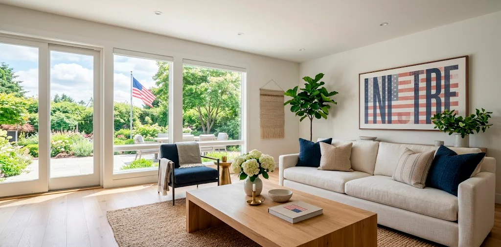
Let’s face it, Memorial Day decor usually screams plastic bunting and aggressive red-white-and-blue everything. I prefer honoring the holiday without turning my living room into a discount party store. Styling subtle typography art offers the perfect chic alternative. Ready to give your space a sophisticated patriotic nod? Let’s swap out the loud flags for something better.
The Beauty of Understated Patriotism
Ever wondered why modern homes feel so effortlessly cohesive even during holidays? The secret lies in restraint. Subtle typography art anchors your space with meaningful words without overwhelming your everyday aesthetic. Think minimalist quotes about freedom or simple dates set against crisp white backgrounds. You control the narrative and the color palette.
Honestly, discovering this approach completely saved my interior design sanity. I just swap out a single framed print, and my living room instantly feels festive yet refined. Try grabbing a sleek black frame and slipping in a bold serif quote!

Decoding Typography Styles for Modern Vibes
Navigating the world of font styles feels intimidating, right? Don’t panic 😅! You just need to match the typography to your room’s current vibe. Serif fonts bring an air of historic weight and tradition, making them perfect for profound quotes from founding fathers. Conversely, clean sans-serif fonts scream contemporary chic. I personally love pairing a very stark, thin sans-serif font with a slightly textured canvas. This contrast elevates the subtle Memorial Day decor from basic to custom-curated. Just remember to keep the text legible from across the room!
A useful little gift for your home
🎁 Free Plant Finder Tool
Filter 250+ houseplants by style, size, and care level to find your perfect green companion in seconds.
We’ll email you the link. Plus, you’ll join our newsletter for fresh home inspiration.

Mastering the Art of Framing
The frame literally makes or breaks the artwork.
A flimsy frame completely ruins the sophisticated look we want. Invest in solid wood or high-quality metal frames with a distinct profile. Thick matte boards add instant luxury to inexpensive prints. I always order oversized frames for smaller typography pieces because that negative space draws the eye directly to the words.
Great finishes for custom framing:
- Choose natural ash wood for a softer, airy feel.
- Grab brushed brass to add a touch of warmth.
- Stick to matte black for maximum contrast.
What finish fits your space best? You really can’t go wrong if you match your existing hardware.

Strategic Placement Around the House
Placement dictates the impact of your decor. Anchor your typography art in high-traffic zones. Entryways provide the perfect stage for setting the tone immediately.
Alternatively, rest a medium print on your mantel. Layering it behind a vintage candlestick adds phenomenal depth. Mantels naturally command attention, so let your art shine there.
Need a creative spark for those blank awkward walls? Try mixing your text pieces into an existing arrangement for a seamless seasonal transition, much like we discussed in my modern home office bold geometric wall art ideas.

Hacking the Patriotic Color Palette
You definitely do not need neon primary colors to celebrate this holiday. Embrace muted, sophisticated variations of the classic palette. Swap bright cherry red for a deep, earthy terracotta or brick red. Trade royal blue for a rich, moody navy or faded indigo. These subdued hues feel incredibly expensive and transition flawlessly throughout the summer months.
Honestly, I bought a faded indigo canvas last year, and I still haven’t taken it down! It just acts as a fantastic neutral backdrop in my dining room. IMO, you get way more value out of decor that survives past a single weekend.

Single Words vs. Full Quotes
Deciding between a single impactful word or a lengthy quote completely changes the energy of the room. A large canvas featuring just the word ‘Liberty’ in a heavy serif font creates a striking, modern focal point. It feels bold yet perfectly restrained. On the flip side, framing a thoughtful excerpt from a historical speech adds an intimate, vintage touch. I prefer mixing both approaches throughout the house for variety. Use the single bold words in expansive rooms, and tuck the longer, delicate quotes into cozy reading nooks or powder rooms where guests linger.

Mixing Typography with Traditional Art
Text alone can feel a bit sterile if you overdo it. You need to soften those hard letterforms with actual imagery.
Pair your subtle Memorial Day decor with landscape paintings or abstract pieces in complementary tones. Imagine a crisp typography print hung directly beside a moody, vintage oil painting of an open field. The juxtaposition of clean text and textured brushstrokes creates visual magic. The text modernizes the landscape, while the painting warms up the text.
Have you tried this combo yet? I often source cheap vintage landscapes from thrift stores and pair them with crisp, modern text prints I make myself.

Styling the Dining Room Focal Point
The dining room naturally becomes the gathering hub during holiday weekends. Capitalize on this by creating a massive typography moment right above your bar cart or buffet. A large, oversized horizontal print instantly commands the space and sets a celebratory mood without cluttering the table. Keep the table decor incredibly minimal to let the wall art do the heavy lifting.
FYI, clearing the table clutter makes hosting so much easier. You have way more room for the actual food, which pairs perfectly with my favorite 15 color coordinated memorial day desserts spread.

The Magic of Textural Layering
Flat art on a flat wall sometimes falls flat.
You must introduce texture to bring your subtle Memorial Day decor to life. Lean your framed typography against woven baskets, or drape a chunky knit throw over the chair sitting beneath it. Layering physical textures against the visual texture of text creates an incredibly dynamic space.
Try these textural additions:
- Woven rattan or seagrass baskets.
- Faded, vintage linen runners.
- Raw, unglazed terracotta pottery.
These organic elements ground the modern text, giving the whole vignette a relaxed, lived-in feel.

DIY vs. Buying Prints
Should you buy professional prints or just print them yourself? Honestly, I do both depending on the size. For massive statement pieces, I absolutely invest in professional canvas or high-quality giclée prints. The ink quality simply looks superior, and the paper weight prevents warping. However, for smaller 5×7 or 8×10 frames, DIY is the way to go! You can design a beautiful quote on your computer, print it on some thick, textured watercolor paper from the craft store, and pop it into a gorgeous frame. No one will ever know you printed it at home.

Perfecting the Lighting
You spent all this time curating the perfect subtle Memorial Day decor, so please don’t leave it sitting in the dark! Proper lighting completely transforms how typography art looks. Install a sleek, battery-operated picture light above your main frame. It washes the text in a warm, inviting glow and makes the art look like a million bucks.
Seriously, those wireless LED picture lights are a game-changer. They install in seconds with just two screws, and they instantly elevate the entire room’s ambiance. Doesn’t that sound better than dealing with messy hardwiring?

A useful little gift for your home
🎁 Free Plant Finder Tool
Filter 250+ houseplants by style, size, and care level to find your perfect green companion in seconds.
We’ll email you the link. Plus, you’ll join our newsletter for fresh home inspiration.
Conclusion
Styling subtle Memorial Day decor entirely changes how you experience the holiday at home. Typography art offers that perfect blend of respect and modern sophistication without cluttering your space with plastic novelties. Grab a chic frame, pick a meaningful quote, and let your walls do the talking! Which font style are you grabbing first? Let me know in the comments! ✨