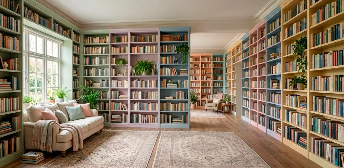
Forget those dark, dusty libraries that look like a scene from a Victorian ghost story. I finally traded my mahogany shelves for a soft, airy vibe, and my reading game changed forever. Want a space that feels like reading on a literal cloud? I’ve gathered the best pastel combos to help you build a sanctuary that actually sparks joy. 🙂
Cloud Nine White and Sky Blue
This palette makes me feel like I’m floating. I paired crisp white shelving with the softest sky blue accents to keep things bright. It’s perfect if your room lacks natural light but you still want that high-end spa energy. Why settle for a gloomy corner when you can have a sky-high sanctuary? I honestly think this is the goat of airy designs for any bibliophile.
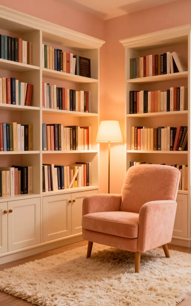
Peachy Keen and Creamy Vanilla
I used to think peach was just for grandmas, but I was so wrong. When you mix warm apricot tones with creamy vanilla whites, the whole room glows like a permanent sunset. It creates a cozy warmth that practically begs you to stay for just one more chapter. Have you ever seen a room that looks like a literal hug? This is it, IMO.
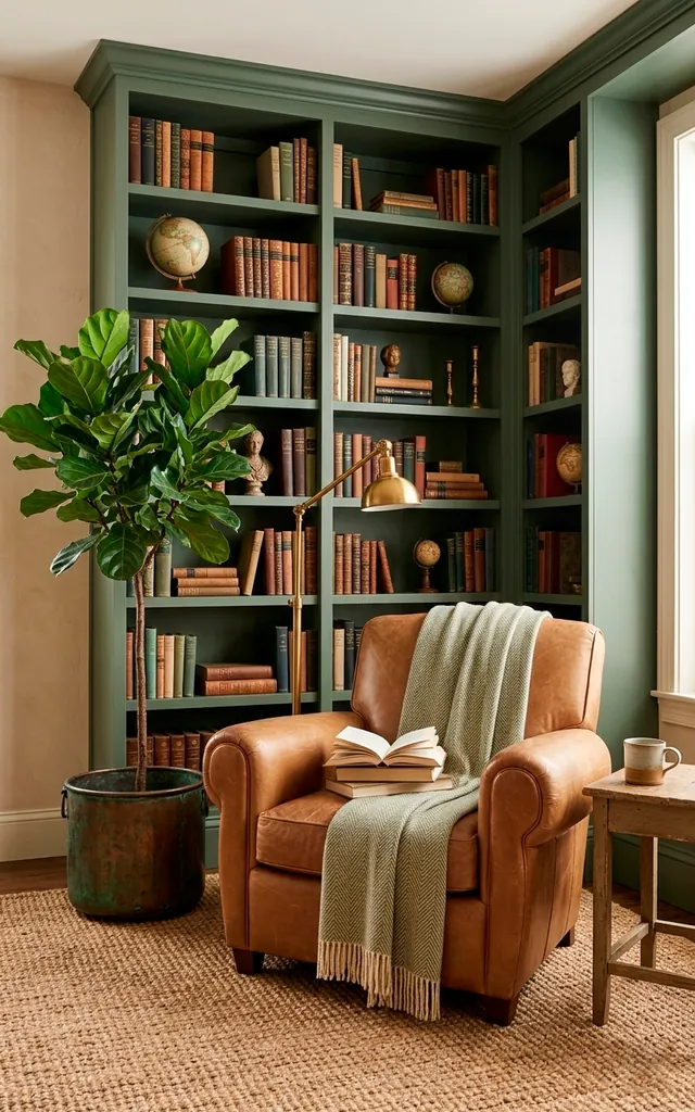
Sage Advice and Sandstone
Green is basically a neutral at this point, right? I love how sage green grounds a library without making it feel heavy. I paired it with sandy beige tones to bring a bit of the outdoors inside. It’s the ultimate calm-down palette for anyone with a chaotic reading list. Who knew a simple paint color could lower your heart rate so effectively?
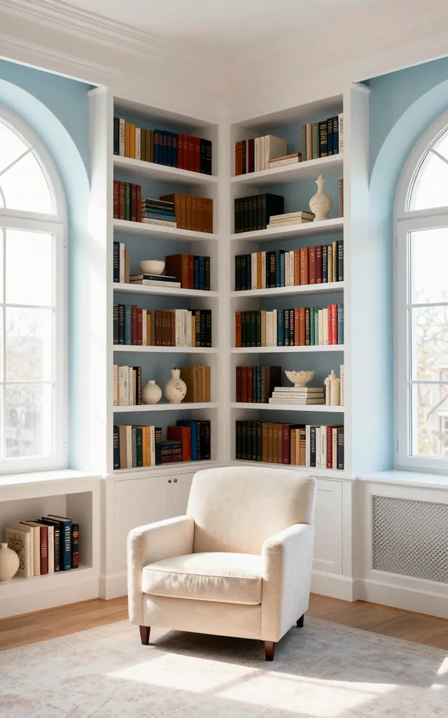
Lavender Fields and Cool Grey
Lavender isn’t just for your bath bombs. I mixed soft lilac with a sophisticated dove grey to create a space that feels regal yet relaxed. It’s a bit moody but stays firmly in the dreamy category. Do you want your library to feel like a secret garden at dusk? This combo delivers that whimsical energy without looking like a nursery.
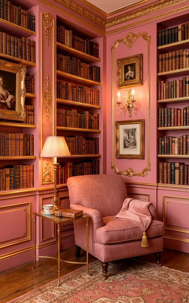
Dusty Rose and Muted Gold
This is the palette for my fellow hopeless romantics. I adore how dusty rose adds a touch of vintage charm without being too over-the-top. Adding some muted gold hardware or frames makes the whole library look incredibly high-end. It’s basically the interior design version of a Jane Austen novel. Does it get any more aesthetic than this? :/
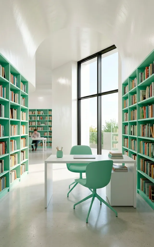
Minty Fresh and Pearl White
If you want a library that feels crisp and revitalizing, mint is your best friend. I combined it with pearlescent whites to catch the light beautifully. It feels modern, clean, and surprisingly sophisticated. Ever wondered how to make a small room feel twice as big? This high-contrast pastel duo is the secret weapon you’ve been looking for.
Buttercream Yellow and Pale Oak
Nothing beats the cheerfulness of a soft yellow library. I paired buttercream walls with pale oak furniture to keep the vibe organic and grounded. It’s like a shot of caffeine for your home office or reading nook. Why work in a boring beige box when you could bask in artificial sunshine? It’s a total mood booster, FYI.
Conclusion
Building a dream library doesn’t require a massive budget or a castle. I’ve found that the right pastel palette does all the heavy lifting for you. Pick a color that makes you want to curl up with a book and never leave. Ready to grab a paintbrush and start your soft-girl library era? You’ve got this!