Facing a giant, blank living room wall feels exactly like staring at a blank page when you have a term paper due—intimidating and slightly soul-crushing. You want that ‘wow’ factor, but you’re terrified of hanging something that looks like a postage stamp on a billboard. I’ve definitely been there, holding up a tiny frame while my husband gives me that ‘really?’ look. Getting the scale right changes everything. It turns a cavernous room into a curated sanctuary. Let’s fix that empty space together with some actual designer secrets that won’t require a degree in architecture. 🎨
Obey the Golden Two-Thirds Rule
I usually tell people to start with basic math, even if it brings back bad high school memories. If you hang a piece of art above a sofa or sideboard, it needs to look like it actually belongs there. I aim for the art to span roughly two-thirds to three-quarters of the width of the furniture below it. Anything smaller makes the furniture look bulky and the art look like an afterthought. It’s all about creating a cohesive visual block rather than a scattered mess.
Don’t just eyeball it from the doorway and hope for the best. Grab a measuring tape and mark the boundaries with painter’s tape first. If your art is too narrow, you lose the balance. I love how a properly sized piece anchors the entire seating area, making the room feel intentional and expensive. Trust me, your wall will thank you for not making it look awkward.

Go Massive with a Statement Piece
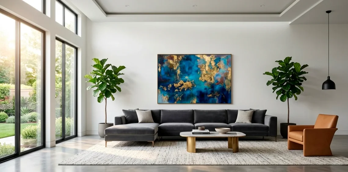
Sometimes, the best solution involves one giant, unapologetic piece of art. I’m talking about something so big it practically has its own zip code. A single oversized canvas eliminates the need for complex arrangements and creates an instant focal point that commands the room. Just make sure the frame or the canvas edge feels substantial enough to hold its own against the vastness of the wall. IMO, a massive minimalist piece works wonders in a high-ceilinged space because it draws the eye upward without cluttering the environment.

Master the Art of the Grid Gallery
If you can’t find one massive piece that you love (or can afford), create a ‘pseudo-giant’ piece using a grid. I find that a 3×3 or 4×4 grid of identical frames looks incredibly sophisticated and clean. It’s like a puzzle where every piece is a win. Use the same frame style and consistent spacing—usually about 2 to 3 inches apart—to keep it looking like a single unit rather than a bunch of random photos.
This technique works perfectly for travel photos or botanical prints. You get the scale of a huge installation with the flexibility of smaller prints. Make sure you use a level because even a tiny tilt will drive you crazy every time you walk past it. I once spent three hours leveling a grid, and I still see that one crooked frame in my dreams.
Check out these textured gallery wall ideas if you want to add some depth to this look.

The Power of the Triptych
Triptychs are the ‘cheat code’ of the interior design world. I love how three vertical panels can cover a massive amount of horizontal space while remaining easy to hang and transport. They naturally guide the eye across the wall, creating a sense of rhythm and movement. You want to keep the gap between the panels small—usually around 2 inches—so the image still feels connected.
I often see people hang triptychs with way too much space between the panels, which totally kills the vibe. It breaks the visual flow and makes the art look disjointed. Keep them tight and aligned. When the scale is right, a triptych can make even the most boring wall look like a high-end gallery installation.

Mind the Eye Level Height
Here is a pro tip that people ignore way too often: hang your art at eye level. Unless you’re hosting a gallery for ants or giants, the center of the piece should be about 57 to 60 inches from the floor. I see so many ‘floating’ pieces that are practically touching the ceiling. It looks like the art is trying to escape the room. Stop it. Just stop.
Lowering the art connects it to the furniture and the people living in the space. It creates an intimate feel, even on a massive wall. If you have super high ceilings, you can go slightly higher, but always prioritize the relationship with the furniture below.
I usually grab a friend to hold the piece while I sit on the sofa. If I have to crane my neck like I’m watching a plane take off, it’s too high. FYI, this is the most common mistake I see in home decor, and it’s the easiest one to fix.
Use a pencil to mark the center point before you start hammering away like a maniac. Your drywall will thank you for the lack of ‘oops’ holes.

Anchor Art with Furniture
Art shouldn’t just float in a sea of drywall like a lost buoy. I always anchor my large pieces by placing them above a substantial piece of furniture. Whether it’s a long sofa, a console table, or even a low bookshelf, the furniture provides a visual ‘base’ for the artwork. This creates a vertical column of interest that makes the wall feel structured. If you have a weirdly empty corner, try pairing a tall vertical piece with a cozy armchair and a lamp to create a dedicated ‘nook’ vibe. This is a great way to handle small functional living room layouts where every inch counts.

Mix and Match with a Salon Wall
For those who hate symmetry and love a bit of chaos, the salon wall is your best friend. I love mixing different frame styles, sizes, and even mediums—think canvases mixed with framed sketches and maybe a decorative plate or two. The trick to scaling this for a large wall is to start with your largest ‘anchor’ piece in the center and build outwards.
Keep the spacing relatively consistent between the different pieces to avoid it looking like a junk shop. I find that 2 inches of breathing room works best. It fills the wall with personality and allows you to add to it over time. It’s a living installation that grows with your collection.

Use Negative Space Wisely
Don’t feel the need to cover every single square inch of your wall. Sometimes, the ’empty’ space around a large piece of art is just as important as the art itself. I call this ‘breathing room.’ It allows the viewer’s eyes to rest and focus entirely on the masterpiece you’ve chosen.
If you crowd a large piece with too many small decorations nearby, it loses its impact. Let the art be the hero of the story. I often see people try to ‘fill the gaps’ with tiny shelves or wall decals, but that usually just creates visual noise.
Keep the surrounding area clean. A large wall with a perfectly centered, oversized piece and plenty of white space looks incredibly high-end and modern. It’s the difference between a busy flea market and a sleek boutique.

Layer Your Art on Shelves
If you’re a renter or just hate commitment, picture ledges are a lifesaver. I love leaning large frames against the wall on a long ledge rather than hanging them. This allows you to overlap pieces of different sizes, which adds incredible depth and a ‘curated’ feel. It’s much easier to swap things out when you get bored—no new holes required! Just ensure the ledge is deep enough to hold the weight of your largest frames safely.

Incorporate Vertical Lighting
You can have the most beautiful art in the world, but if it’s sitting in the dark, nobody cares. I always suggest adding dedicated lighting to scale the art’s presence. A sleek, battery-operated LED picture light mounted above the frame instantly elevates the piece. It says, ‘Hey, look at this, I’m important.’
Lighting also helps the art feel like a permanent part of the architecture. I prefer warm white light to avoid that cold, sterile office vibe.
If you can’t hardwire a light, those rechargeable ones with magnetic mounts are absolute game-changers. I’ve used them in three different apartments and they never fail to impress. Plus, they double as a great mood light for movie nights.
Experiment with the angle of the light to highlight the texture of the canvas or the brushstrokes. It adds a 3D quality that you just don’t get with standard overhead lighting. It’s the ‘cherry on top’ for any large wall installation.

Play with Texture and Material
Scale isn’t just about height and width; it’s about visual weight. I find that a large textile hanging or a macrame piece feels ‘heavier’ and more substantial than a flat print of the same size. If your room feels a bit cold, a giant woven wall hanging can add much-needed warmth and soften the acoustics of a large, echoing room. Mixing a framed print with a textile piece on the same wall can create a really dynamic, professional look.
Don’t be afraid to step away from traditional canvas. Metal art or wooden wall sculptures can offer a unique scale that breaks up the monotony of rectangular frames. It adds a touch of the unexpected that keeps the eye moving.

Lean Art for a Relaxed Vibe
For a truly effortless, ‘I just moved in from Paris’ look, try leaning a massive piece of art directly on the floor. I love this for oversized mirrors or giant canvases that are almost too heavy to hang. It feels casual yet incredibly chic. Just make sure you have a rug or some furniture nearby so it doesn’t look like you simply forgot to hang it. It works best in rooms with a bit of a minimalist or industrial edge where ‘perfect’ isn’t the goal.

Coordinate Colors for Continuity
When you’re dealing with a large wall, color choice is crucial for scaling the impact. I usually pick one or two colors from the art and repeat them in smaller accents around the room, like pillows or vases. This ‘pulls’ the art off the wall and integrates it into the entire living space. If the art is very colorful, I keep the wall neutral to let the colors pop.
Conversely, if you have a dark, moody wall, a bright piece of art will look much larger and more significant because of the high contrast. I love using contrast to manipulate how big a piece feels.
Check the undertones of your wall paint before buying a massive piece. A cool blue painting might look a bit ‘muddy’ on a wall with warm yellow undertones. IMO, getting the color harmony right is the secret sauce to making the scale feel natural and balanced.

The Magic of Multi-Panel Mirrors
Mirrors are technically ‘art’ too, especially when they come in large, interesting shapes. I often use a set of mirrors to fill a large wall because they reflect light and make the room feel twice as big. If your living room feels a bit cramped, a large window-pane style mirror can trick the eye into thinking there’s another opening in the room. It’s a classic designer hack for a reason—it works every single time.

Use Oversized Photography
Black and white photography is my go-to for a large wall when I want something sophisticated but not overwhelming. A giant, high-contrast landscape or a close-up portrait in a simple black frame looks incredibly professional. Because it lacks color, it doesn’t compete with the rest of your decor, allowing you to go much bigger than you might with a colorful painting. It’s timeless, classy, and basically foolproof.
I find that large-scale photography adds a sense of ‘story’ to the room. It invites people to come closer and look at the details.
Just make sure the print quality is high enough that it doesn’t look pixelated at that size. Nobody wants to look at a giant, blurry photo of a mountain.
I recommend using non-reflective glass if your room gets a lot of direct sunlight, otherwise, you’ll just be looking at a reflection of yourself instead of the art. And while I’m sure you’re great, that’s not the goal here!

Conclusion
Scaling art for a large wall doesn’t have to be a nightmare. Whether you go for one massive statement piece or a perfectly aligned grid, the key is to respect the proportions of your furniture and keep that eye-level height in mind. Don’t be afraid to experiment with textures or mirrors to fill the space creatively. Which of these tips are you going to try first to kill that empty wall vibe? Let me know in the comments! Now go grab that hammer and make your living room look like a million bucks. 🏠