I bet your library shelves are screaming for more personality beyond just dusty hardbacks. Look, we all love a good book hoard, but a wall of spines can feel a bit flat without some visual breathing room. Curating the perfect gallery wall inside your library turns a storage space into a soulful sanctuary. Ready to stop staring at blank spots and start decorating? 📚
Define Your Library’s Visual Soul
Before you start hammering nails into your expensive paneling, ask yourself: what story does this room tell? I always suggest picking a vibe that complements your reading taste. If you’re into gritty noir, go for moody charcoals and sharp photography. If you’re a classic romance fan, maybe lean into soft watercolors.
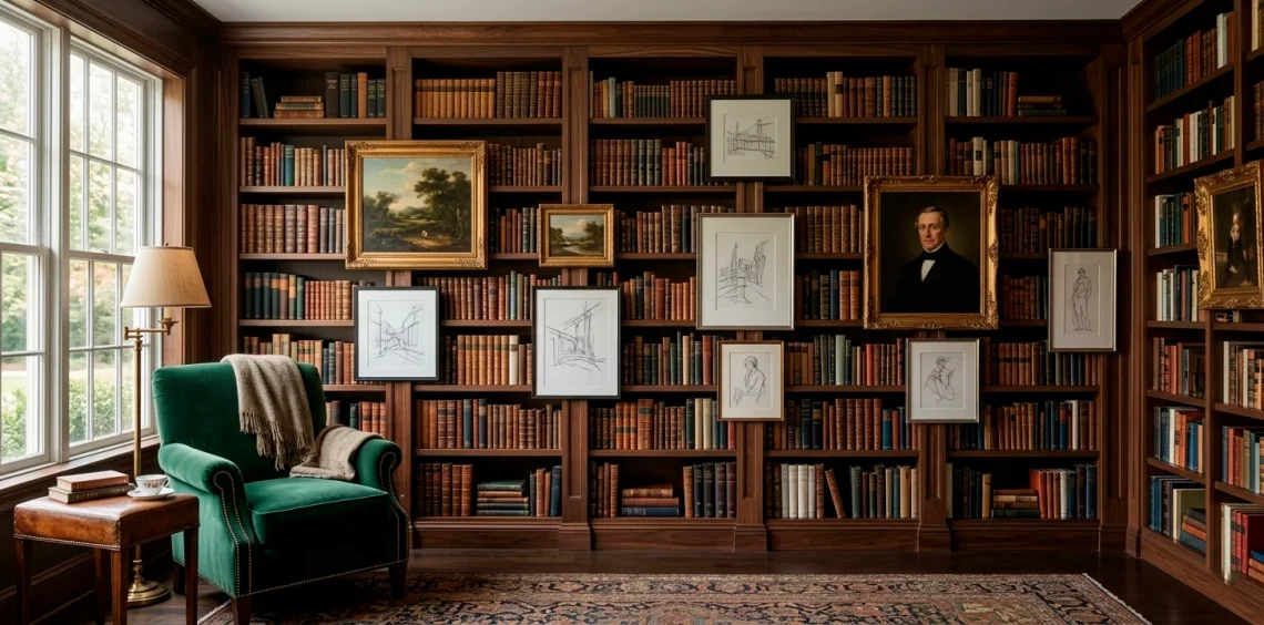
Your library gallery wall shouldn’t look like a random garage sale happened in your house. Consistency creates a professional finish. I personally love mixing old-world sketches with high-contrast modern prints to keep the eye moving. Does your current collection feel cohesive, or is it a bit of a chaotic mess? IMO, a little curation goes a long way. ✨

The Art of the Anchor Piece
Every great gallery needs a boss—a central piece that commands attention. Select one large artwork to serve as your focal point. I usually place mine slightly off-center to avoid that stiff, symmetrical look that belongs in a waiting room. This anchor dictates the height and spacing for every other smaller piece you add later. Why settle for a sea of tiny frames when one bold statement can ground the entire wall? Just make sure it’s not so big that it swallows your books whole. Sarcasm aside, size definitely matters here. 😉

Mixing Mediums for Texture
Flat paper is boring. If you want a designer-level look, you need to mix your mediums like a pro. Think beyond standard prints. I love tucking 3D objects into the mix—maybe a small wall-mounted bust or a vintage clock.
Texture elements to include:
- Framed textiles or vintage scarves
- Pressed botanical samples
- Small decorative wall mirrors
- Architectural fragments or wooden carvings
Mixing these pieces prevents the wall from looking like a catalog page. It adds history. Do you really want a library that looks like it was bought in one click?
FYI, heavy frames add weight while frameless canvases feel airy. Contrast is your best friend here. If you want more tips on this, check out these textured gallery wall ideas.

The Frames Define the Mood
Frames are the outfit your art wears, and nobody wants a fashion disaster in their library. Match your frame finishes to your library hardware. If your bookshelves have brass library lights, use brass frames to tie the room together. I think mixing wood tones can work, but keep them in the same family. Using ten different neon plastic frames in a mahogany-filled room is a choice… but probably the wrong one. High-quality frames make even a cheap postcard look like a masterpiece. 🖼️

Plan the Layout on the Floor
Please, I beg you, do not start putting holes in your wall without a plan. Layout paralysis is real, but there’s a cure. Lay your entire gallery out on the floor first. This allows you to swap pieces around until the visual weight feels balanced.
I usually snap a photo of the floor arrangement before I move anything to the wall. It’s a total lifesaver.
Pro tips for layout:
- Keep 2-3 inches of space between frames.
- Align the bottom edges of your lowest row.
- Balance heavy dark frames with lighter ones.
Does the arrangement feel top-heavy? Fix it now, not after you’ve ruined your paint job. Your future self will thank me later. Trust the process!

Lighting the Masterpiece
What is the point of a gallery wall if you can’t see it? Good lighting is the difference between a museum vibe and a dark basement. Install battery-operated picture lights above your main pieces. They give that sophisticated glow without the nightmare of hiring an electrician to rewire your whole house.
I also love how a well-placed floor lamp can cast shadows that make 3D art pop. Avoid harsh overhead lights that create annoying glare on the glass. Who wants to squint at their own art? Not me. FYI, warm white bulbs are the only way to go for a library. Keep it cozy, folks. 💡

Negative Space Matters
Sometimes, the best part of a gallery wall is where there is absolutely nothing. Don’t feel pressured to cover every square inch of wall. If your library is already packed with books, a crowded gallery wall can feel suffocating.
I leave “breathing room” around the edges of my clusters. This highlights the art rather than hiding it in a clutter-storm.
Visual balance checklist:
- Is one side way heavier than the other?
- Are the books competing with the frames?
- Can you see the wall color behind the art?
If the wall looks like a Tetris game gone wrong, take a piece away. Less is often more, even in maximalist designs. Why stress your eyes when you’re trying to read a book? Keep the flow natural.

Integrating Art and Shelves
The secret to a truly custom library is making the art feel like part of the furniture. I don’t just hang things on the wall; I lean them on shelves too. Overlap art with your book rows. This creates depth and makes the gallery feel integrated rather than just “stuck on” at the end.
I often place a small framed sketch right in front of a row of less-attractive paperbacks. It’s a genius way to hide clutter while adding style.
If you want to master the art of the shelf, you should definitely read about how to style bookshelf home library ideas for more inspiration.

The Evolution of the Wall
Your library should grow with you. Don’t treat your gallery wall like a permanent monument. Use easy-change frames or ledges to swap art seasonally. I personally change out my prints when the weather shifts—bright botanicals for spring and moody landscapes for winter. This keeps the space feeling fresh and prevents you from getting bored of your own decor. If you find a new favorite artist, just swap it in! It’s your house, not a rigid museum. Have some fun with it! 🎨

Color Coordination Secrets
Color can make or break the harmony of your library. I look for one or two colors in my art that match the book spines on the shelves. Repeat colors across the wall to create a visual thread. If you have a lot of blue books, find a print with a splash of navy.
You don’t have to be matchy-matchy, but a little coordination prevents visual whiplash.
Quick color tips:
- Neutral art calms down colorful book collections.
- Bold art pops against uniform white or black book covers.
- Use metallic frames to bridge the gap between different palettes.
Does your color palette feel intentional? If not, a quick frame swap can fix almost anything. IMO, a cohesive palette is the ultimate library hack.

Final Thoughts on Library Curation
Curating a gallery wall in your home library is about more than just filling space; it’s about creating a narrative. By mixing textures, choosing a solid anchor, and keeping your layout flexible, you’ll build a room that feels both sophisticated and lived-in. Which piece are you hanging first to break the ice? Let me know in the comments and happy decorating! 🥂