Forget those ‘safe’ all-white kitchens that look like a doctor’s office. You want a space with personality, right? I recently swapped my bland cupboards for high-contrast tones, and honestly, the vibe shift is wild. High contrast creates depth and makes your appliances actually pop. Ready to make your neighbors a little bit jealous? 🙂
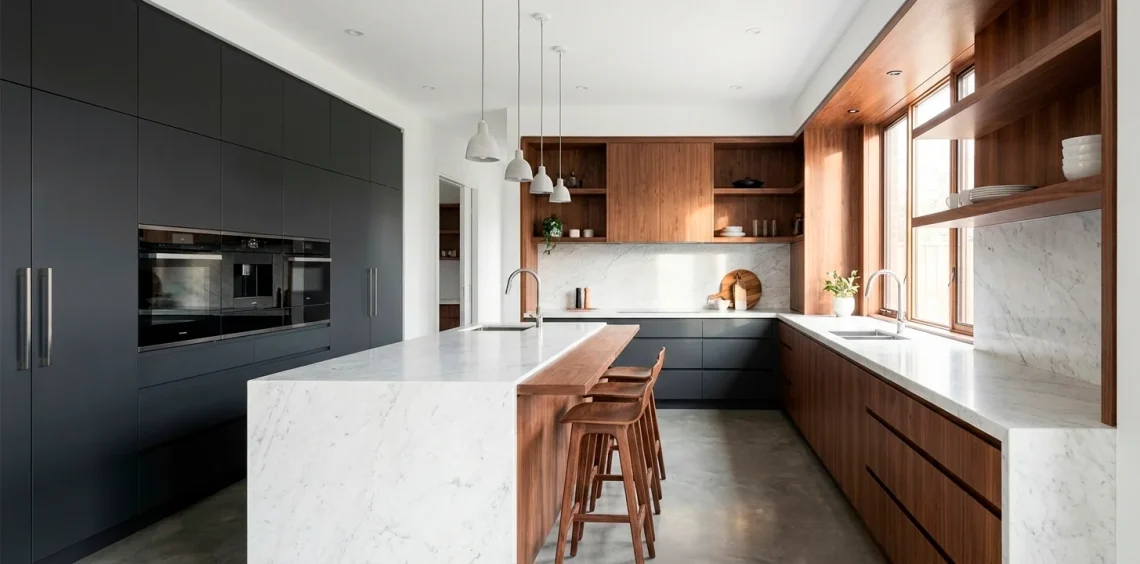
1. Matte Black & Natural Oak
Matte black cabinets scream sophistication, while natural oak keeps the room from feeling like a sterile lab. I love how the raw wood grain softens the bold black surfaces. It creates a balance between ‘high-end gallery’ and ‘actual home where people eat.’ Ever noticed how a black island anchors a room? It’s a total power move for your decor.
- Bold black hardware
- Light oak flooring
- Recessed LED lighting
This combo hides messes surprisingly well. I found that matte finishes don’t show every single water spot like glossy ones do. It’s a total game changer for busy families.

2. Navy Blue & Crisp White
Navy and white is the tuxedo of kitchen design. It never goes out of style and looks incredibly expensive without trying too hard. I used this combo in a rental once, and it made the tiny space feel massive. Why settle for grey when you can have this much depth? Personally, I think navy is the new neutral.
- Navy blue island
- Crisp white quartz
- Silver or chrome fixtures
I adore how the blue grounds the room while the white keeps everything airy. It feels classic but carries a modern edge that’s hard to beat. It’s perfect for a crisp, nautical-inspired vibe.

3. Emerald Green & Burnished Brass
If you want luxury, emerald green is your best friend. Pair it with brass handles, and you’ve got a kitchen that looks like a high-end cocktail bar. I find that deep greens hide those annoying fingerprints way better than white does. Plus, brass adds that warm glow everyone craves. Does it get any classier than this?
- Emerald green cabinetry
- Burnished brass hardware
- White marble backsplash
I love how the green feels organic yet sophisticated. It turns a standard cooking space into a dramatic centerpiece. It works beautifully with natural wood accents too.

4. Charcoal & Pale Terracotta
Charcoal grey provides a moody backdrop, but terracotta brings the soul. This isn’t your grandma’s orange kitchen; it’s a sophisticated, earthy contrast. The warmth of the clay balances the industrial feel of the grey perfectly. Who knew clay colors could look this modern?
- Charcoal matte cabinets
- Terracotta tiled floor
- Concrete grey countertops
I adore how grounded this feels. It’s perfect for someone who wants a dark kitchen but fears it might feel too cold. The terracotta acts like a cozy blanket for your eyes.

5. Forest Green & Calacatta Marble
Forest green is deep, moody, and looks stunning against heavy white veining. I love how a white marble backsplash cuts through dark cabinetry like a lightning bolt. It’s dramatic, organic, and feels very ‘country estate goes to the city.’ Ready to embrace the dark side?
- Dark forest cabinetry
- Calacatta marble island
- Matte black accents
I’ve seen this look in several high-end lofts lately, and it never fails to impress. The deep green acts as a lush backdrop that makes the white marble literally sing with brightness.

6. Deep Plum & Industrial Concrete
Okay, hear me out—plum is the underdog of the kitchen world. When you pair a dark purple with industrial concrete, the result is unexpectedly chic. It’s bold, sure, but it feels incredibly intentional and unique. Why follow the herd when you can lead with plum? :/
- Plum or aubergine cabinets
- Raw concrete surfaces
- Minimalist grey hardware
I find that this palette works best in spaces with tons of natural light. The concrete keeps the purple from looking too ‘royal’ and brings it back down to earth.

7. Midnight Blue & Warm Copper
Midnight blue is nearly black but has that subtle ‘oomph’ when the light hits it. Copper accents provide a fiery contrast that makes the blue feel even deeper. FYI, copper sinks are a total game changer for this look. They age beautifully over time and add character.
- Midnight blue paint
- Polished copper hardware
- Light grey stone floors
I love the warmth that copper brings to cool blue tones. It feels like a cozy night sky. It’s a fantastic choice for anyone who loves high contrast but wants a touch of metallic flair.

8. Stark White & Dark Walnut
This is the ultimate mid-century modern throwback. Crisp white walls and dark walnut cabinets create a sharp, architectural line that I absolutely adore. It feels clean, organized, and very high-end. Do you prefer wood or white? Luckily, you get both here.
- Stark white upper cabinets
- Dark walnut lower units
- Minimalist white counters
I love how the walnut grain adds a natural texture to the sterile white. It’s a timeless look that feels fresh every single morning. It’s the perfect balance of light and dark.

Conclusion
Choosing a high-contrast palette isn’t just about color; it’s about creating a mood. I’ve found that the best kitchens reflect the person cooking in them—bold, layered, and a little bit daring. Whether you go for moody plum or classic navy, make sure it makes you smile every morning. Which palette are you grabbing for your renovation?